It’s opening night! The 100th National Hockey League season gets underway tonight with four games, the first at 7pm ET when the Toronto Maple Leafs travel to Ottawa to take on the Senators. First game and the first new logo debuts, well done NHL schedule makers!
What we’ve done here is gone through the thousands upon thousands of votes you guys have cast, rating logos from a scale of 1 to 10, over the past decade, and ranked every primary logo in the NHL based on their average rating score. What’s remarkable about the NHL is that every single logo is rated above 5.0/10, meaning in the eyes of logo fans everywhere there’s not a single bad design in the league today. Incredible!
This is the first time we’ve done this for the NHL, we’ve done it once previously with Major League Baseball going into this 2016 season, you can see those rankings here. If you disagree with the rankings, that’s fine, just make sure you’re casting your votes (details at the end of this post) to make sure your opinion is counted if we do this again next year.
We’ll begin at the bottom of the list with number 30 and we’re working our way up to number 1, the score you see in the parentheses below each image is that logo’s average rating out of ten.
Enjoy!
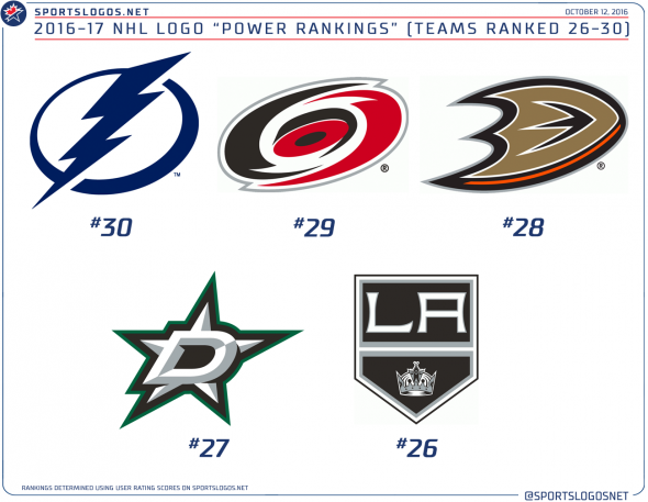
RANKED 26TH THROUGH 30TH
30. TAMPA BAY LIGHTNING (5.33 out of 10) — This is a bit of a surprise to me, but for some reason the voters don’t like the most recent identity of the Lightning. Is it because it’s too simple for a modern franchise? Not enough colours? Let’s be honest, if this were an Original Six club it’d be ranked much higher, and that doesn’t seem fair. By comparison, their previous logo scored a 6.4/10 which would have been ranked 21st in today’s NHL.
29. CAROLINA HURRICANES (5.51) — This one’s been panned for as long as I’ve been running this website, so needless to say I expected to see this one lingering near the bottom. The red and black stylized hurricane with a hockey puck in the eye has been compared, often, to an overhead view of a toilet flushing. Of course, it doesn’t help at all that this replaced arguably the greatest logo of all-time.
28. ANAHEIM DUCKS (5.79) — Hockey logo fans made it clear they wanted to see the Ducks drop their wordmark logo and make the “D” on its own the primary logo. Yet, here it now sits, third from the bottom. Well, in all fairness, the full wordmark logo – which was finally replaced in 2013 – was rated an abysmal 3.9/10, which would have put it in last place by quite some distance. Perhaps it’s just time for another total makeover in Orange County.
27. DALLAS STARS (5.89) — “It needs a little gold!” is the common complaint I hear about the current look of Texas’ only NHL team. The Stars took the name, logo, and colour scheme from Minnesota when they relocated in 1993 and it wasn’t until 2014 that they decided to give the team a look of its own, and that included replacing the gold, which had been a franchise colour in various shades for nearly 50 years, with silver. That’s all it takes to have fans turn on a logo, the previous logo scored a 6.7, well above the newer one.
26. LOS ANGELES KINGS (5.91) — Sometimes it takes more than a couple of Stanley Cup banners to see some love for your logo, the Kings flipped their primary and secondary logos and removed purple from their colour scheme just in time for their first Cup win in 2012. They don’t exactly have the best history of highly rated logos, all hovering around the 5.5-6.0 number, their best (according to the votes) is their Gretzky-era mark from 1988-98 at 6.6, which would barely get out of the bottom third of today’s NHL.
RANKED 21ST THROUGH 25TH
25. WASHINGTON CAPITALS (6.01) — It seemed like a good idea at the time, as most moves retro do, but this logo just hasn’t survived the test of time. The Capitals are a team who just can’t seem to get it right, their mid-90s re-design resulted in a serious logo upgrade but the colour change to teal, black, and bronze was just too drastic for a team who had played in the red, white, and blue for twenty years. I’d like to see their current secondary mark used as a primary in some fashion, that’s a winner right there.
24. BUFFALO SABRES (6.12) — Another step back in time falls in at number 24, the Buffalo Sabres seemingly tip-toed around the loud cries of their fans begging for a return to the blue and gold of the 70s and 80s for years before reaching what appears to be some sort of compromise here. Despite the darkening of colours and the inexplicable addition of a silver outline to everything; fans quieted up when they must have figured “hey, this could be a lot worse… again“.
23. OTTAWA SENATORS (6.19) — What I love about the Senators is that they’ve kept the same basic visual idea throughout their history, one of the few teams to only modernize and tweak here and there over the course of their existence. Having said that, they’ve picked the wrong logo to be their primary mark. Designated as an alternate logo, this beauty is just sitting on the bench practically ignored by the team, it’s scoring much higher at 7.9/10 which would have put it on the edge of the Top 5 in the league in 2016/17.
22. COLUMBUS BLUE JACKETS (6.23) — If it looks like an alternate logo, that’s because it is… originally, anyways. The Blue Jackets introduced this logo to be worn on the front of their alternate uniform in 2003 before making it their full-time look in 2007. While it rates higher than the previous logo (which was the only logo to use neon colours in NHL history) it still ranks in the bottom third of the NHL. I wouldn’t mind seeing something new… soon… please?
21. NEW YORK RANGERS (6.25) — The worst of the “Original Six” team logos, as rated by you guys, is the New York Rangers, a fairly plain and simple shield with the team name laid upon it. It’s a formula which has been shamelessly replicated or ripped off by hockey teams all over North America. The Rangers have the distinction of being the only team in the NHL to not wear their primary logo on their jersey (and haven’t done so since 1978).
RANKED 16TH THROUGH 20TH
20. ARIZONA COYOTES (6.45) –You say you miss the “Kachina” logo they introduced upon arriving from Winnipeg, but your votes say something else. Arizona’s howling coyote logo, introduced originally in 2003 and carried over when they changed their name in 2014 actually ranks higher than the original logo used by the club. The old logo may be unique, and “retro”, but it’s a bit of a mess as a full-time primary logo (six colours in one logo?!), this one, at #20, is a clear upgrade.
19. COLORADO AVALANCHE (6.75) — Aside from a minor colour tweak in 1999, the Avalanche have kept the same logo around since their franchise relocated from Quebec in 1995. Designed by the Joe Bosack during his time at Nike (no, there’s no hidden swoosh in there… but I bet you’ll find one anyways), the Avs quickly won two Stanley Cups with this set, including one in its very first year of use. Because of that, it’s likely going to stick around for a while.
18. VANCOUVER CANUCKS (6.77) — The Canucks have yet to introduce a primary logo which I’ve liked. Identity challenged, the club has completely overhauled their colour scheme four times in the past 35 years. It seems they may have finally settled on the odd combination of the 1998 logo and 1970 colours. Hey, whatever makes you happy, right? The orca whale, first introduced with red elements in it, was updated in 2007 to make it fit with the switch back to a team colour scheme of green and blue. Where’s the green, you may be asking? Nowhere in the logo, that’s for sure.
17. WINNIPEG JETS (6.88) — When the Thrashers announced they were moving to Winnipeg in 2011 I said, “I bet they’ll shove a maple leaf in there somehow”. Hey, look at that. There is at least justification for the maple leaf, as the Jets 2.0 logo is a direct homage to the symbol used by the Royal Canadian Air Force, which is basically the Jets logo minus the jet. This logo rates about the same as the logo the original Jets used just before relocating and a few points higher than their 1980s look.
16. PHILADELPHIA FLYERS (6.90) — Kudos to the Flyers for lasting half a century now without changing their logo (like the Avs, aside from a very small colour tweak in 1999). That’s something else! The Flyers logo is a “P” with a wing attached to it, the orange dot represents a hockey puck. Very simple but very effective. One of those logos people would absolutely hate if it were introduced today. Shame.
RANKED 11TH THROUGH 15TH
15. CALGARY FLAMES (6.99) — The Flames seem to be set on bringing back the retro colours (what they wear now, minus black) slowly over the course of the next few seasons. For this year they’ve officially scrapped their alternate scripted wordmark uniform in favour of their 1980s road red uniform, usually step one (see Oilers, Penguins, Sabres, Islanders) in a return to an old look full-time. In the meantime, the Flames look pretty good here on the logo with black being used only as a trim colour to help the yellow pop a bit. Calgary added black in 1994 to the set they inherited from Atlanta in 1980.
14. EDMONTON OILERS (7.13) — Heading north on Alberta’s Highway 2 and you’ll find the Edmonton Oilers sliding in the top half of the NHL’s logo power rankings. Edmonton’s flirtation with mid 90s colour darkening (which lasted way longer than it should have) finally came to an end in 2011, but at least they stuck with the same logo design through all that. It was close folks, remember that silver experiment circa 2002? Yeah, a lot of people forgot about that. We almost had another Isles Fisherman-level disaster there.
13. BOSTON BRUINS (7.22) — Boston’s done a great job of tweaking their logo over the years, every change is very slight and every change improves the overall look of the logo. The most recent adjustment coming in 2007 when a serif was added to the “B” within the spoked circle. So, why a spoked circle? Designed in the 1940s originally to be used as an anniversary logo, it was meant to show off Boston as “the hub of America”, with all roads leading to the “B”.
12. NASHVILLE PREDATORS (7.25) — Nashville did a great job simplifying their original team logo in 2011, stripping away the unnecessary “90s!” colours and details within the head of the sabre-toothed tiger. Overly complicated, similar to the Coyotes logo of that time; less is more here in the 2010s. The Predators are one of the few to release their team logo before announcing a name, the logo was based off a fossil found while constructing their home arena. A contest was announced to name the team based on this logo (the others being Ice Tigers, Fury, and Attack) … thankfully Predators won out.
11. NEW YORK ISLANDERS (7.37) — The Islanders were the first team to realize the 1990s was a mistake for everyone, when they sunk their infamous “Fisherman” logo and uniform set after just two years, quickly bringing back a darkened version of their original logo. The “NY” mark still survives today as the team has clearly learned its lesson, it’s since had its colours brought back closer to those of the original, added an extra line of tape to the stick (one for each Stanley Cup), and went with a simple orange outline outside the circle. As much as they try to destroy their identity (have they ever had a decent alternate uniform?) they’re sticking with the classics for their main home and away set.
RANKED 6TH THROUGH 10TH
10. MONTREAL CANADIENS (7.40) — Les Habs?? Ne sont pas dans le premier cinq?! Surely this is a mistake, but if it is, remember it’s your mistake, not mine, I just post about it. Montreal’s classic, instantly recognizable bleu-blanc-et-rouge “CH” logo was first introduced in 1917 (the version prior had an “A” in place of the “H”) and has been tweaked quite a few times during that century. Want to annoy your friends? The “H” actually stands for “Hockey”, not “Habs”. Your friends will insist you’re wrong but you’ll know you’re right and you can celebrate that while spending the rest of the evening being all passively aggressive to one another. Anyways, Montreal has worn this to celebrate a couple dozen Stanley Cup championships. So just let that thought cheer you up if you feel slighted by it’s spot on this list.
9. ST LOUIS BLUES (7.50) — The bluenote, another classic, simple mark which could not possibly be improved upon. St Louis introduced a blue note logo when they made their debut in the NHL fifty years ago, and over that time have played around with it, for several years they added an extra colour (red) and stuck their city name right in there, but eventually stripped all that away and went back with what had clearly worked so well in the past.
8. FLORIDA PANTHERS (7.78) — Our first new logo for 2017. I’ve noticed a trend, new logos either rate very high or very low. For the NHL this season you’ll notice all the new ones rate highly. Florida dropped their leaping panther logo, which had been the only logo they’d ever known over the off-season, replacing it with a military-inspired shield featuring just the head and neck of the endangered animal. Florida kept their colours in tact (bonus) and modernized the original logo to be used as a “tertiary” mark (and worn as a helmet sticker) to help bridge the two identities together. This was a re-branding which I think surprised everyone, a lot of people went into the unveiling expecting the worst, they got something pretty decent, and that’ll naturally help push it up the rankings.
7. SAN JOSE SHARKS (7.79) — The Sharks, beaten by the Pittsburgh Penguins once again. San Jose modernized their original logo when the league switched to the Reebok Edge jersey system in 2007. That original mark, sometimes rumoured to show a shark devouring the Penguins logo (it kinda looks like it, doesn’t it?) had been used by the team since their inaugural season in 1991. San Jose is partially responsible for the rise of teal in pro sports during the 1990s and their merchandise led the league in sales for multiple years after it was introduced.
6. NEW JERSEY DEVILS (7.84) — Yeah, the Devils have used the same logo since moving from Denver in 1982 (they changed green to black, quiet, it was a good decision)… but have you ever seen the logo they were originally going to use? Ready? Take a look. I know, right?! Thankfully that mess was cleaned up and we have the modern classic that the Devils have been using for 35(!) years. New Jersey’s N/J hybrid places them just outside the top 5 in the NHL heading into 2017.
RANKED 1ST THROUGH 5TH
5. MINNESOTA WILD (7.91) — It’s a bear, a badger, a beaver… it’s whatever you want it to be! The Minnesota Wild logo is not any one particular animal, it’s meant to be interpreted as any wildlife you personally see in the design, and that’s one of the reasons why it’s a fantastic logo. The mouth of the great beast is also a river, the ear is a sunset, the eye a shooting star, and the fur details double as an evergreen skyline. It’s brilliant.
4. CHICAGO BLACKHAWKS (8.00) — The Blackhawks were originally named for “The Black Hawk Division”, a nickname given to the division of the military which owner Frederic McLaughlin was a member of during the first World War. The “Black Hawk” referenced in the name of that division was named after the leader of the Sauk tribe, based in the area which is now Illinois, in the first half of the 1800s. The logo was developed originally in the 1920s and has evolved in the years since, with it developing the basic look it has today in the 1950s. Chicago last tweaked their logo in 1999 when they changed the shade of some colours and removed the tan outline from around the logo on their home and road jerseys.
3. DETROIT RED WINGS (8.09) — I looked at these rankings (without doing a post) a year ago, the Detroit Red Wings were in first place. The introduction of two much-anticipated new logos over this summer has bumped the Wings (perhaps temporarily) down to third place. Detroit, who for several years played under a few other names, finally adopted the Red Wings name and logo in 1932. Their logo shows a wheel with a wing coming out of the side, “the winged wheel” paying homage to Detroit’s role as “Motor City USA”. The Red Wings have used this logo since the switch to Red Wings in ’32, only the size of the wheel relative to the wing has been changed since then. If we do these rankings again next year there’s a good chance Detroit’s back on top.
2. TORONTO MAPLE LEAFS (8.50) — I’ve never seen as much chaos and wild speculation as I did when I first announced “the Maple Leafs are getting a new logo” last December. Some newspaper columnists were wondering what the new name of the team would be… yeah, it got nutty. In the end the Leafs did what we all hoped and knew they’d do and simply modernized a logo from their past. The 1940s-60s leaf, worn for multiple Stanley Cups and brought back as an alternate jersey logo for many years in the 2000s, was cleaned up and centred, and the Leafs logo (the previous one rated a 6.6) jumped all the way up from 20th to 2nd in the league as a result.
1. PITTSBURGH PENGUINS (8.55) — Here’s how you nail down the top spot in the NHL league logo rankings. Win a Stanley Cup, and return to a classic logo/colour scheme your fanbase was dying for. It’s a good one-two combo. Good luck replicating that. The Penguins officially announced the change from “Vegas Gold” back to “Pittsburgh Gold” shortly after they won the Cup this past June, the “Vegas Gold” version first introduced as a throwback itself in 2001 but with muted colours. Despite two cups in the new shade of gold the fans grew tired of the toned done palette and after a few seasons as an alternate, ta-da, it’s back as a full-time primary. And with that, jumps from 21st (old logo rated 6.4) to number 1 over the course of a single off-season.
Here’s a look at the entire rankings as we head into the 2016-17 season:
(click image for larger version)
Thanks for taking the time to read through this, we’ll try to do this again for the NBA later this month, and of course we already did this once previously for Major League Baseball back in April.

If you want to effect these rankings, vote! Go to any logo page and click on the stars to the left of the logo to register your vote. Be careful because once you vote for a logo, you vote for that logo, you can’t edit your vote and you can’t vote for the same logo again. And please, don’t be a homer, we want your real feelings on the design of the logo. Be honest! Otherwise it’s just a “which team has the most online fans” contest, and yeah… nobody wants that.

