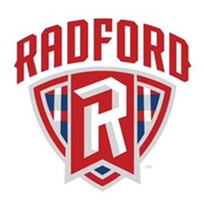
The Radford University Highlanders of Virginia may be one of the smaller schools that we’ve covered here on the website (even though they’re still Division 1 and members of the Big South Conference), but they’ve recently unveiled new identity for their athletic program that’s definitely worth talking about. That’s because the school has decided to go with an identity that we rarely see in sports, but is always popular when implemented correctly.
Ladies and gentlemen, check out the new-look Radford Highlanders and their new plaid look!
For reference’s sake, here’s the logo that is being replaced:

On the surface, it’s a pretty clear upgrade. Instead of having a generic logo set that could’ve been used for anything, this new set from Joe Bosack gives Radford a solid and clear identity. There’s even a logo that includes the Highlander mascot himself.
This new identity was a collaborative effort on the part of Bosack and figures from Radford university, as they explained in the press release:
“We are thrilled to be engaged with Radford on the development of its new athletics brand”, said Joe Bosack, Owner and Creative Director. “This new look is a distinctive representation of the proud history and traditions of Radford Athletics as well as the aspirations of today’s teams and student-athletes.”
The logo development process included focus groups consisting of the administration, coaches, current and former student-athletes and alumni, as well as community members of Radford. The logo reflects recommendations made by these groups for the direction of the new marks
I’m sure that students and alumni will be pleased with Radford’s new look, and fans of plaid in general have to appreciate the fact that someone out there in the sports world is embracing this look.


