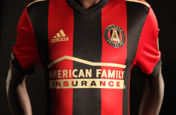
One of the two expansion clubs for the 2017 Major League Soccer season officially unveiled their kit for their inaugural season, as Atlanta United revealed their signature look to their supporters on Tuesday night.
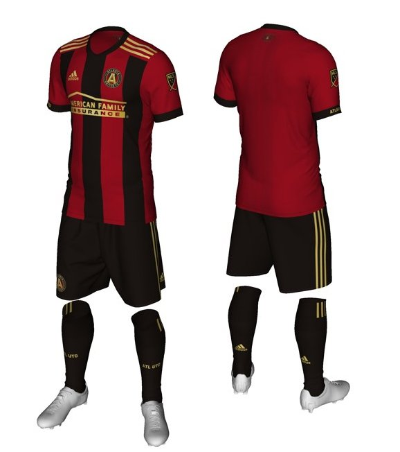
The design of the kit itself is pretty simple. The crest itself gave us all a hint of what was to come with the kits, and it’s consistent with what we all expected — a mostly red shirt with alternating black-and-red vertical stripes and black shorts, and gold trim all over.
As expected, you can’t just put stripes on a shirt without there being some sort of meaning behind it, right? So Atlanta United explained on their website that the five vertical stripes on the shirt stood for “the club’s five pillars of character – Unity, Excellence, Community, Determination, and Innovation.” So there you have it.
An interesting note is that the familiar three stripes that you see on Adidas shirts are back on the shoulders, instead of being relegated to the sides like they were on so many of the shirts that were released this season. They’re also extremely truncated as well — they stop at the shoulders and don’t even go onto the sleeves.
Another interesting sign is the club’s name is on one of the sleeve cuffs. That’s another unique element, and all of these elements could be an early signal of what to expect for other Adidas kits to be released for the 2017-18 soccer seasons across the world.
Again, there are no major shocks with this kit. Aside from the finer details, this is exactly what fans expected to see, so Adidas and Atlanta United absolutely delivered on that part. The fans should be pretty happy with the kit, and other fans should be interested in seeing what this means for new Adidas kits that have yet to be released. What do you all think? Where would you rank this among the kits in MLS?


