In simple terms, Juventus FC are the rulers of Italian soccer at this point. They’ve won Italy’s Serie A 32 times, including a current streak of five titles in a row and they’re currently in the hunt for a sixth title in a row. They’ve also had one of the better-looking crests in all of Europe — a look befitting a true blueblood of European soccer.

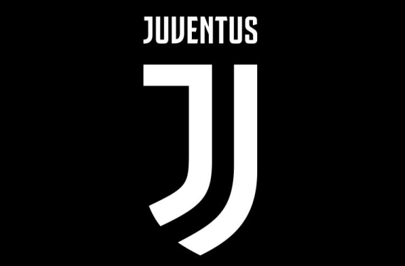
Although this crest is modern (it made its debut for the 2004-05 season), it seems like the type of logo that’s perfectly serviceable for a long period of time. However, Juventus didn’t think so, as they’ve decided to get rid of this crest in favor of a brand new crest. Here’s the new crest, and it’s a doozy.
Yep, it’s just a stylized “J” with “Juventus” on top of it. That’s it. Is it simple? Yes. Is it effective? Well, it depends on what your definition of “effective” is. It’s definitely effective at grabbing attention, but I can’t say that it’ll be effective at serving its purpose of being a decent soccer crest.
Juventus did give us an infographic for the new logo. Just like the logo, it’s simple and to the point.
Well, you can’t argue with the bold part! Other than that, this is a a pretty underwhelming look for a club like Juventus and it’s definitely a huge downgrade from their soon-to-be-defunct crest. What do you all think, though? Does anybody out there actually prefer the new look to the old look?


