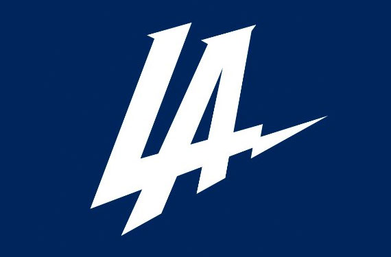
When the Los Angeles Chargers announced their move to the City of Angels, the news was accompanied with an interlocking LA logo that was nearly universally panned by fans, critics, and even other sports teams — most notably, the Tampa Bay Lightning.
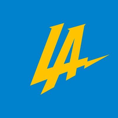
Ever since the unveiling, the logo was stuck in a whirlwind of rumors and changes. The team even tried to re-color it in the popular powder-blue-and-gold colors, but fan reaction to the logo remained the same.

Perhaps the biggest indictment of the logo came when they showed the logo at a Clippers/Lakers game and the crowd of potential new Chargers fans united to boo the logo. Let’s put this in perspective: Fans of the Clippers — who currently sport arguably the ugliest logo in all of North American sports — booed the Chargers logo. When Clippers fans are panning your logo, that’s how you know that you’ve got a bad logo on your hands.
The age of tumult for this logo has come to a head, as ESPN reporter Arash Markazi is reporting that the Chargers will no longer use this logo. It won’t be in their official set, nor will they use it for “social media purposes.” They have completely dropped it.
As a result, this logo will go down in history as one of the shortest-lived logos in sports. It brings back memories of infamous short-lived logos from the past — most notably, the disastrous attempt at a logo change that the San Francisco 49ers tried back in 1991.

That logo is one of the hidden gems of NFL lore, but in today’s age of social media, the story of the Chargers’ logo will live on in infamy for a very long time. So it’s time to bid farewell to this logo — it was too garish for this world.

Credit: USA Today for image


