It appears that the annual kit rollout for Major League Soccer is starting to really kick into gear, because a few more teams have unveiled new looks for the upcoming season. New York City has a new home kit (which you can look at here), and two teams also unveiled new looks yesterday.
First we’ll start with the Chicago Fire. Their new secondary shirt leaked late last week, and it turned out to be an accurate leak when the Fire unveiled their new look on Monday and made it official.
It’s an all-gray look for the Fire, and they will also be sporting navy blue names and numbers on the back. It’s not a spectacular-looking kit by any means, but it’s definitely not ugly so that means that this is a look that works for Chicago.
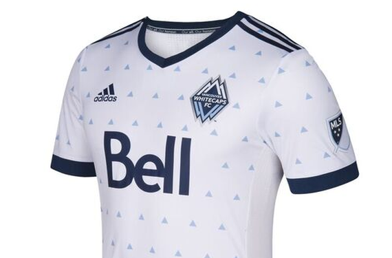
Meanwhile, one team who managed to avoid a leak was the Vancouver Whitecaps. They had their Season Launch event on Monday, and that included a new home kit for 2017. From afar, it’s very simple. However, when you get close to it, it’s as if they went back to the good ol’ days of 1990s soccer. While the Whitecaps’ “Rain” kit isn’t as crazy as those kits from that decade, it’s definitely reminiscent of those designs.
The Whitecaps are also one of those cool organizations that also release an infographic to go with their kit unveilings. They’ve been doing this for a few years now, and 2017 is no different.
While the design is definitely unique and a tiny bit funky, it’s not a bad thing at all. The Whitecaps always find a way to make sure that their all-white home kit isn’t boring or too simple, which is why they’re consistently one of the better looking teams in Major League Soccer, in my opinion. Rain drop, drop top–just another successful kit drop for the Whitecaps.
But what do you all think of these two new kits? Can you stand the rain from Vancouver? Do the Fire have a decent kit on their hands this season?


