When it comes to design in sports there’s a common theme which appears to have been lost over time.
I’m not necessarily speaking about logos and uniforms, although with logos it certainly applies. I’m focusing more on the complimentary pieces that make the in-game experience that much more complete: programs, pennants, yearbooks, ticket stubs.
Anyone who has browsed through the program covers of any sport from the late 1920s up through to the 1950s would instantly notice that things have changed; we’re talking about an era in which each series or homestand was quite literally a blank canvas for an artist to work with. These are the days before photographs took over as the preferred option on a cover.
That collage above was created just from a quick, random Google search for each of the four sports depicted during that time period, it’s the same across any team and sport during those decades. You just don’t see it that much anymore and it’s a shame.
Fortunately some teams have tried bringing this style back, the Columbus Blue Jackets released a series of custom artwork for each home game of the 2015-16 season, the designs called “gameday posters” were created by Anthony Zych, now with the New Jersey Devils, weren’t featured anywhere outside the website and social media accounts. The Toronto Maple Leafs released an absolutely beautiful season ticket package for the 2016-17 season, a welcome sight for old-school fans who can grow tired of leaving a game with a fairly drab PDF print-out as a poor substitute of a souvenir, frankly they’re not even worth keeping.
When the Toronto Blue Jays finally cracked through to the Postseason in 2015 I took advantage of the fact I was a partial season ticket holder and quickly scooped up a pair for every playoff game that fall. I eagerly awaited to receive the package in the mail, it was like I was a kid again who knew the next copy of Nintendo Power was due to be delivered any day now. Welp, guess what I got? An email showing me where to print out my barcode. Magical. Label me any way you wish but that killed me, it almost felt as if these weren’t really the playoffs that were about to happen anymore.
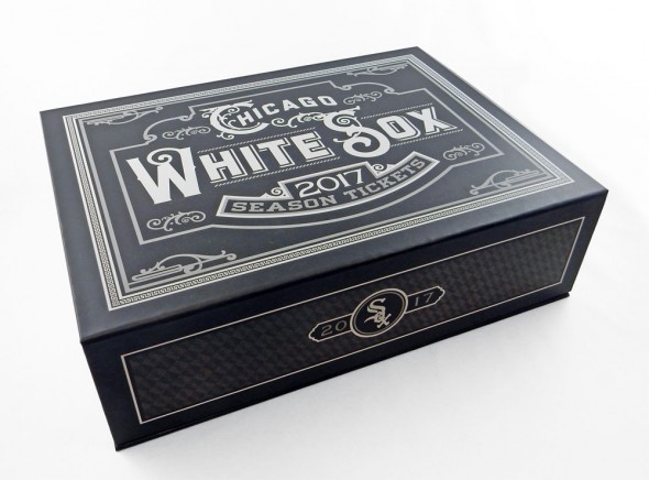
This brings me to the Chicago White Sox, who yesterday unveiled the design of their 2017 premium club and suite guests season ticket package. It’s remarkable. From the box art to each of the 81 individual ticket designs. This beats a lousy PDF or ticket card anyday:
“Every season we try to make our printed season tickets something beautiful and special that fans will want to keep,” Gareth Breunlin, the White Sox Director of Advertising & Design Services told us in an email. “At the end of last season I met with our team archivist, Jeff Szynal, and was going through our memorabilia with him and had the idea of using old programs, tickets and scorecards on our ticket stock. I wanted to showcase the amazing artwork from the different eras in White Sox history. Once I got this idea I knew I needed the right artist to bring my vision to life.”
That artist was Todd Radom, responsible for many of your favourite team, league, and event logos and recently branded the most “interesting man in the sports business world” by Forbes magazine. Radom found himself on Breunlin’s radar after attending a talk given by Radom at Major Level Creative Connect in Houston last Summer, an event for designers in the pro sports world to get together and talk shop.
“I reached out to Todd in late October and we got to work”, Breunlin recalled. “We wanted to make 81 unique ticket designs. I went through our archives and scanned and photographed as many programs, scorecards, pennants, ticket stubs and memorabilia as I could. We had a list of players that included our retired numbers, hall of fame players and fan favourites. About half of the tickets are reproductions of old programs and scorecards, the other 40 some designs use either photography or memorabilia, with Radom going in and giving each design its own look and feel.”
The look of each ticket goes beyond simply using a White Sox legend or a photo of an old World Series press pin, they’ve each been designed in the style of the era represented. A ticket stub featuring Eddie Collins for example, Collins played with the White Sox from 1915 through 1926 and while the Collins ticket may look like it was designed in the early 20th century, complete with the accurate White Sox logo used in that period, well… it wasn’t. Only off by about a hundred years, give or take. Same goes with the Minnie Minoso and Harold Baines designs shown below, all of which are modern designs created in the past five months by Mr. Radom.
“Todd was able to capture each era a player played in using distinct typefaces and colours. If you look at the Billy Pierce Card it has a 50s feel and the Tim Raines card has a 90s feel. Todd took my vision for these tickets to the next level with his designs. ”
“Part of the task was to keep these varied in sequence, with era depicted, colours, and specific kinds of art progressing through the season in a fun and engaging way”, Radom explained in an email. “With so many disparate-looking pieces of art in play, the only way to bundle them up in a cohesive way was to institute a fairly rigid grid system. They are all framed, in black and all of the individual game information is delivered cleanly and uniformly.”
Feedback thus far has been extremely positive the team says so much so that they’re going to try and make them available to fans who didn’t purchase these special tickets as keepsakes. That’s A+ move by the Pale Hose here.
“Our fans love the designs and we are finding innovative ways to get them to fans that didn’t purchase tickets. I would love to do something like this in the future,” Breunlin told us. “It’s going to be tough to top these designs, but we have such a rich history that we only scratched the surface of what we can use in the future. I would recommend to other creative directors in professional sports to take the time to look in their archives. They will be surprised at what they find. The artwork and designs back in the day really resonates with our fans and this was just one way to showcase it.”
I sincerely hope other clubs from around the “big four” take note at the overall positive reaction to meet the release of these designs. Yes, digital is convenient, I’ll ‘fess up to that, but there’s something special in taking home to keep a pocket-sized piece of artwork that both pays tribute to your favourite team and serves as a great memory of what was almost certainly a fantastic day. Whether it’s that time you were lucky enough to attend a no-hitter or when you took your child to their first ever ballgame to just some regular old “dog day” game in August long after your team has been knocked out of contention. You’ll remember, and you’ll keep it forever.
Let’s look to the White Sox, let’s keep this tradition alive.


