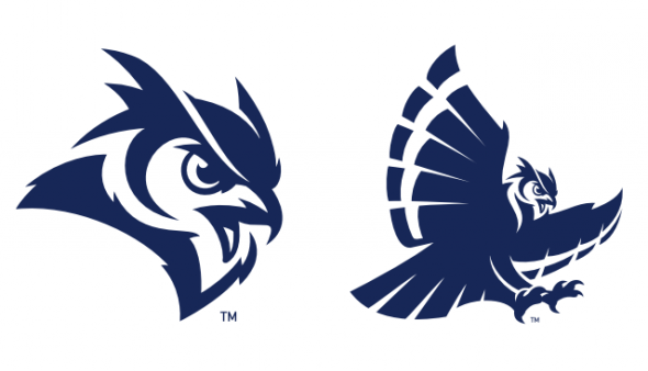
Rice’s athletic program will have a new look going forward, as the school has officially unveiled its new athletic identity for the Owls.
What’s interesting is that they’ve basically kept their primary logo fully intact. The Old English “R” logo remains as the primary logo, and that was done on purpose. The school’s webpage based on the official unveiling of the brand explained the reasoning behind keeping the “R” logo as the primary.
Our Branding team researched the history of the Rice Athletics marks, conducted over 50 interviews with various constituencies (alumni, donors, fans, university personnel including Public Affairs, coaches, student-athletes and students), and sent a survey to over 25,000 people – those currently engaged with Rice and local Houstonians who are not engaged with Rice.
The feedback we received on our marks demonstrates:
1. Strong affinity for the Old English R but a lack of broad recognition.
2. Mixed feelings for the Old English Script with a sense it is disconnected from the direction of Rice Athletics.
3. Fondness towards being an owl and all that it represents but a desire for an owl mark that is dynamic, sharp, aggressive and relevant.
4. Need for marks that are legible, usable, recognizable and consistent.
So, while the primary logo remains the same, a lot of things have changed. For starters, there are brand new wordmarks and fonts, and the Old English font that used to be prominent has now been relegated to being used for just baseball.
Meanwhile, here’s a look at the new secondary logos for the Owls. I’d say that these birds are an upgrade over the old birds.
Overall, I’d say that this is a solid identity refresh for the Owls. It was nice to see that they put their extensive research when it came to alumni and fans to good use when it came to coming up with an idea that would satisfy them. What do you all think? Is this a good upgrade for Rice?


