
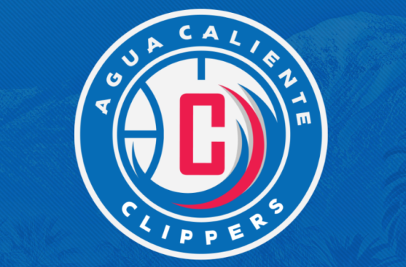
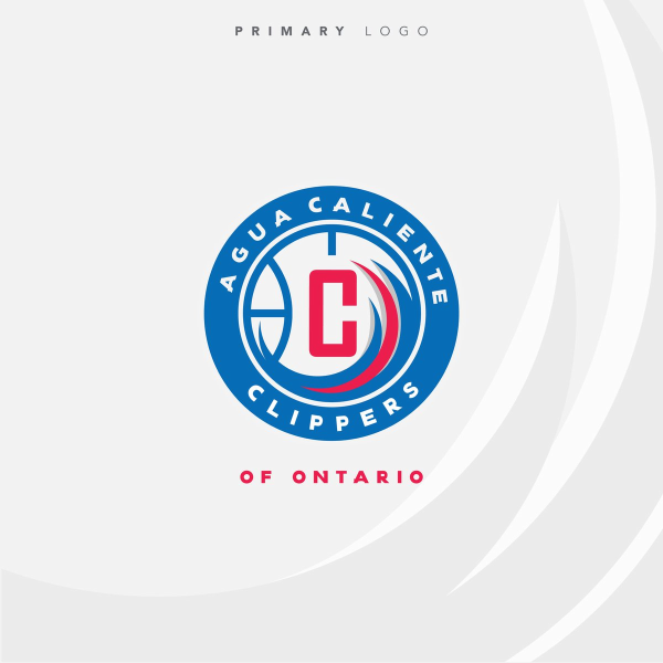
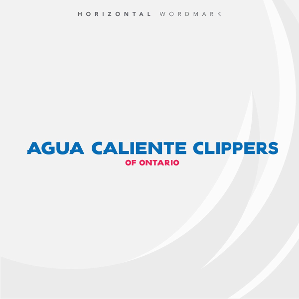
Let’s all take some time to congratulate the Agua Caliente Clippers of Ontario. Although their name is very unwieldy and reminiscent of what the Los Angeles Angels of Anaheim tried to accomplish with their name, their logo set is actually good. Take a look at what they came up with:
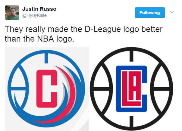
Two things come to mind here. The obvious thought is that this is easily better than what their parent club currently has proudly emblazoned on across their visual identity. I mean, it’s not perfect by any stretch of the imagination but it’s really sad that the D-League team will have much better-looking logos than the NBA team will. It’s good for the D-League squad but still shameful for the actual parent club.
Secondly, this makes you wonder why the LA Clippers didn’t go down this route when it came to their logo? This post from SB Nation blog Clips Nation does a good job of explaining things, and the basic gist of it is that you can blame the Miami Heat’s design staff for the general design and the Brooklyn Nets for the useless infusion of black into the color scheme.
Simply put, the Agua Caliente Clippers of Ontario are giving us a tease of what could have been for the Los Angeles Clippers had they put a little bit more patience and effort into their visual identity. Such a shame. Meanwhile, I think it’s clear that the two Los Angeles NBA teams may have the best looking D-League teams as well. You can put this look next to the South Bay Lakers‘ look and you have a pair of very good-looking D-League logos. Well done to those to teams.
So, what do you think? Do you agree with me when it comes to comparing the two Clippers logos? Let us know what you think!
Related stories:
 Colangelo (Possible) Twitter Account Takes Shot at Uniforms
  Bucks Announce Wisconsin Herd As Name of D-League Team
  Iowa Energy re-brands and becomes the Iowa Wolves
  As Rated By You: The Worst New Logos of 2015
  2015 Logo of the Year Awards: The Best New Sports Logos of the Year 2015 Logo of the Year Awards: The Best New Sports Logos of the Year
  Two D-League Teams Introduce Ad Laden Jerseys, Courts