In a minor league baseball landscape of increasingly outrageous logos and team names, the St. Louis Cardinals farm system is unusual. Three of the Cardinals’ six affiliates are named directly for their parent club, including Double-A Springfield, High-A Palm Beach, and Rookie League Johnson City. Two of the three Cardinal affiliates with unique names are the Low-A Peoria Chiefs and the Short-Season Class-A State College Spikes.
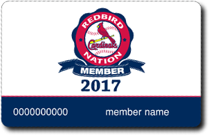 The third is the Triple-A Memphis Redbirds, who, of course, are indirectly named for their parent club. The nickname Redbirds has long been an unofficial moniker for the St. Louis Cardinals—in fact, the big league club sells a membership to a fan club called Redbird Nation, which has nothing to do with the minor league team in Memphis.
The Memphis Redbirds have been the Triple-A affiliate of the Cardinals since the franchise’s inception in 1998. But minor league baseball in the city dates back to 1877, featuring team names over the years of Reds, Grays, Browns, Giants, Fever Germs (!), Lambs, Egyptians, Turtles, Chickasaws, Blues, and Chicks.
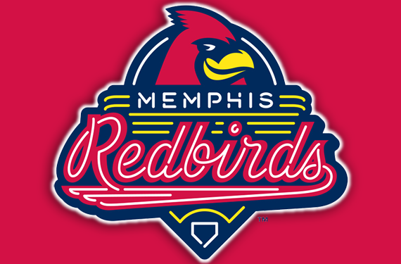
The Redbirds rebranded this offseason with a suite of logos designed by Dan Simon of Studio Simon. While the Redbirds were working on their new look, other teams were upping the ante on the already considerable stakes of minor league baseball’s wacky nicknames—teams like the New Orleans Baby Cakes, Binghamton Rumble Ponies, and Jacksonville Jumbo Shrimp, to name a few, would unveil new identities during the same offseason.
But the Redbirds were content to remove themselves from that discussion.
“We could have gone several different routes, and I always use the Memphis Mudbugs as an example,” said Peter Freund, the team’s owner since March of 2016. “You’ve got the Mississippi River, you’ve got the crawfish. We could have just done a total rebrand. That would be what has become more typical in minor league baseball.”
In staying with their traditional name and not adopting an overtly outrageous logo, the Redbirds were bucking a trend.
“I almost feel like we were the outlier,” Freund said. “We were the one that was unique as opposed to the other teams that were attempting to be unique.”
![]()
Prior to the rebrand, the Redbirds played two seasons with a primary mark that reflected their parent club, which at that time owned the Triple-A club. Peter Freund knows something about classic brands—he’s a minority owner of the New York Yankees, as well as several other minor league clubs. So when he purchased the Redbirds, switching away from a successful logo was not a decision made lightly.
“The birds on the bat is probably my favorite logo in sports. You’ve got to be careful taking that away,” Freund said. “In the end, that’s the Cardinals logo, it’s not ours. It doesn’t reflect the city of Memphis.”
That focus on the city of Memphis guided the thinking behind the new logos.
“We didn’t think of it in a context of minor league baseball, we thought of it in a context of Memphis,” Freund said. “What was intentional was that we created a unique brand for Memphis but remained loyal to the Cardinals identity.”
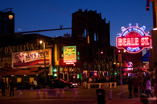
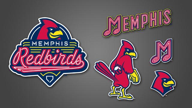
The new logos incorporate neon lights found on the city’s famous Beale Street; the team’s mascot, Rockey the Redbird; and a musical note that evokes Memphis’s considerable musical heritage.
![]() One mark in particular has been popular not just with baseball fans, but fans of the city’s music. During a recent music festival in Memphis, caps and shirts featuring a letter M made of neon musical notes was flying off the shelf at the team’s store. The mark achieves the team’s goal of being iconic and simple.
One mark in particular has been popular not just with baseball fans, but fans of the city’s music. During a recent music festival in Memphis, caps and shirts featuring a letter M made of neon musical notes was flying off the shelf at the team’s store. The mark achieves the team’s goal of being iconic and simple.
“Our music note M—which is basically just an M, but it’s got the neon tubing and it’s shaped like a music note—that M is identifiable with Memphis,” Freund said. “I think it’s fabulous, and I think that it’s timeless, and I think 20 years from, that music note M will always be associated with the Memphis minor league baseball team.”
While the new suite of logos focuses on the local community, the Redbirds wanted to be sure that they maintained a close tie to their parent club’s brand.
“I just think it’s something you want to celebrate,” Freund said. “We’re four hours away from St. Louis, we’re in Cardinals country. Why take away the power of the Cardinals brand, which is one of the great brands in all of sports anywhere in the world?”
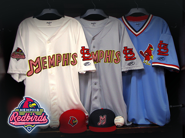
To that end, one of the most popular new looks this season has been the “dirty bird” logo on alternate powder blue jerseys, the idea for which Freund credits to Dan Simon. The Cardinals are among a handful of teams that wore powder blue in the 1970s, ’80s, and into the ’90s, and that retro look has become a sentimental favorite among baseball fans.
The Redbirds are walking a couple fine lines, and doing a fairly good job of it. The first fine line is between a classic look and the wackiness that defines the minors now. Their brand is simple and classic, but the cartoon dirty bird is a little more fun than the identities you’d find in the Majors (Baltimore’s cartoon Oriole notwithstanding). The second fine line is the one between adopting their parent club’s identity and creating something unique to their local home. The team name is an overt wink and a nod to the Cardinals, but the focus on neon and music in the branding is distinctly Memphis.
Related stories:
 More Cowbell: The Story Behind the Visalia Rawhide
  Star Spangled Baseball: The Story Behind the Frederick Keys
  The Ocean Blue? The Story Behind the Columbus Clippers
  That Nashville Sound: The Story Behind the Nickname
  It’s Corny, But it’s Good: The Story Behind the Cedar Rapids Kernels
  The Story Behind the Carolina Mudcats: It’s the Fish, Stupid
  Rancho Cucamonga Quakes are the Picture of Stability
  Nancy, Sluggo, and Slugger: The Story Behind the Portland Sea Dogs

