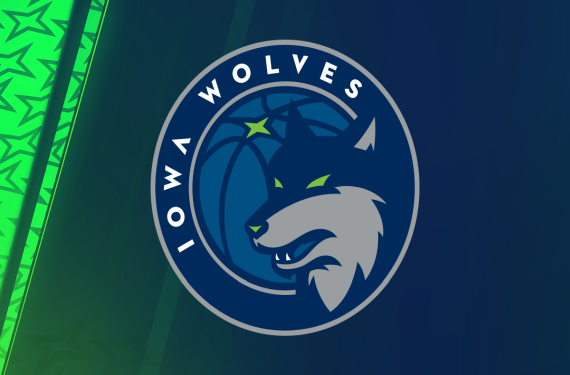
Another D-League team has become a little brother in identity to their parent club, and this time it’s the Iowa Energy. Earlier this month, the Minnesota Timberwolves bought the Energy after their affiliation with the Memphis Grizzlies ended. The T-Wolves wasted no time in putting their imprint on their new D-League team, as they decided to re-name the Iowa Energy as the Iowa Wolves.
The D-League squad’s new look is very similar to the sleek new look that the parent club will be sporting for the 2017-18 season. Here’s how the Wolves described the process behind coming up with the new logo:
The Iowa Wolves rebrand follows the Timberwolves own unveiling of a new logo this past April. The logos were created by the same designer, Rodney Richardson of RARE Designs, whose resume includes recent identity designs for the NBA’s Charlotte Hornets, New Orleans Pelicans, Atlanta Hawks and Sacramento Kings. The logo is meant to give a nod to the original Timberwolves logo while serving as a mark that aligns the two teams. More on the Iowa Wolves logo meaning and creation process is explained by Rodney Richardson in a video that can be viewed here.
And here’s how the Iowa Wolves logo looks when compared to the Minnesota Timberwolves logo:
The article states that the designer meant for the Iowa Wolves logo to serve as a callback of sorts to the logo that the team used during their days as an expansion team, and I’d say that they nailed it in that regard.
With that being said, this particular doesn’t have the type of unique flourishes that the South Bay Lakers and Agua Caliente Clippers of Ontario had with their logos. Instead, it just looks like something that was left on the cutting room floor that they decided to just give the D-League team. I’m not saying that that’s a bad thing, but it’s still kind of weird that the two logos are as similar as they are.
So, what do you think of the Iowa Wolves and their new look? Are you a fan, or should they have gone with something more unique?


