The Cleveland Cavaliers have introduced their new logos for the 2017-18 season today, just one day before Game 1 of their third-consecutive NBA Final appearance against the Golden State Warriors.
What’s new are two logos featuring a shield-like design, doubling down on their team name. The secondary mark with a “C”, in use since the day LeBron was drafted, is the certainly the centerpiece of the new look, playing a prominent role in all four of the team’s non-wordmark logos including these two new shields.
Black has been added to the colour scheme, returning to the Cavs colour palette as an official primary colour for the first time since the early 2000s. The inclusion of black is a nod to the black sleeved uniforms the team wore during the comeback from a 3-1 series deficit in the 2016 NBA Final.

“PRIMARY ICON” vs “GLOBAL LOGO”
The “C” with a sword is now classified as the “Primary Team Icon”, while the new black shield logo is the “Global Logo”. These terms for logos are new to the world of sports, the NBA basically giving each team two “primary” logos, one for use domestically, and the other for worldwide. The domestic logos tend to be much more simplified and resemble what we’d typically think of as a secondary or alternate logo, while the Global Logos always include the full team name and carry the appearance of a traditional primary brand.
Right now on this site we’ve decided to classify the “Global Logo” as “Primary”, and the “Primary Icons” as “Alternate” (you can see this already with our Minnesota Timberwolves section), however we may end up creating a new category for those logos as time goes on.
WELCOME TO NIKELAND
Nike, the manufacturer of NBA uniforms starting as soon as the Cavs or the Warriors win the title later next month, designed the new logos, created “to infuse the most popular existing features of the franchise’s brand identity with new designs that reflect the progress and success of the team and organization”, read the official release.
The new “global logo” is a black shield with the “C-Sword” logo at the bottom, above features an updated wordmark design. The shield represents “the Cavaliers commitment to Defend the Land” and is “a direct nod to the most faithful and passionate of Cavaliers fans” who “stand together in loyalty and support of the Cavaliers and are symbolic of the ‘All for One. One for All.’ mindset and spirit.”
This shield also appears in one of the new alternate marks with no black at all (good), a basketball design in the top half, and it split evenly vertically between wine and navy.
As mentioned earlier the “C-Sword” on its own is classified as the “Primary Team Icon”. The term may be new but the designation is not, the Cavs had this logo listed officially as a “secondary” logo on their stylesheet in 2016-17 but was noted as their “preferred logo”. Whatever, right? Let’s just talk about the logo… introduced first in 2003, the logo is being tweaked ever-so-slightly for 2017-18, that bit of white has been removed from the hilt of the sword. A comparison of the old and the new below:
The “C” logo without the sword (featured at center court in Cleveland) remains as an alternate logo.
Two new wordmarks were introduced, these new logos represent a “new aggressive look” and “the substantial progress of the franchise”. While the sharp edges of the typeface are inspired by “the motion of a sword”.
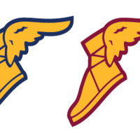
The Cleveland Cavaliers had previously announced they would be adding a Goodyear logo to their uniforms for the 2017-18 season, one of many who will take advantage of the NBA now allowing advertiser logos to appear on in-game uniforms.


