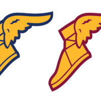
The rollout of new Nike uniforms continues, and while some teams have been going with slight tweaks, the Cleveland Cavaliers have fallen into the category of teams who underwent big changes. They have a new primary logo, a new script font, and they have new uniforms as well. The uniform actually leaked a while back and Conrad Burry did a great job of mocking up what the uniforms would look like. Now the team has officially revealed their new look for the 2017-18 season and beyond.


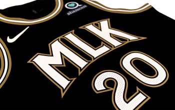
There is an interesting wrinkle here when it comes to the script design — there’s a bevel effect going on here. It’s not present on the numbers (which I believe is due to NBA rules. If it’s not, then feel free to correct me in the comments section, please) but it’s on the lettering.


Other than a few slight changes, Conrad’s mockup appears to be very close to what the real deal turned out to be. With that being said, judging by the reaction that the mockup receieved, it’s unlikely that these uniforms will receive a very positive reaction from uniform enthusiasts.


I’d say that this is very much a case of not knowing what you really had until it was gone. I wasn’t a huge fan of Cleveland’s previous uniform set, but it was functional and solid. They weren’t the best uniforms in the league, but they still got the job done and weren’t ugly by any means. These uniforms, on the other hand, are a downgrade in my view. However, when you have the league’s most marketable player in your employ, you’ve got to keep that uniform money rolling in somehow, and getting new uniforms is the best way to get it done.
But what do you guys think of these uniforms now that the final product has been released?


