The Single-A Delmarva Shorebirds play in Salisbury, Maryland, a town of roughly 30,000 residents that bills itself as the crossroads of the Delmarva Peninsula. This raises the important question, what in the world is the Delmarva Peninsula?
While most sports teams identify their geographic location by a city or state, the Delmarva Shorebirds represent a 170-mile stretch of land between the Chesapeake Bay and the Atlantic Ocean that comprises parts of three states, Delaware, Maryland, and Virginia. The peninsula (which is actually an island because it is separated from the mainland by the Chesapeake and Delaware Canal) is notable because its name, DEL-MAR-VA, comes from the three states it plays home to.
“You can’t just go into a geography class and say, hey, point at Delmarva,” said Shorebirds General Manager Chris Bitters. “We’re one team with a market in three states.”
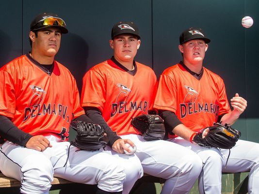
The team is so proud of its unique geographic locator that it made a significant change in its uniforms when it rebranded before the 2010 season.
“We have Delmarva now on our road uniforms, which I thought was important, and might cause some intrigue with people who might not know what Delmarva even is,” Bitters said. “It’s not a city, it’s not a state, it’s not a county.”
The nickname itself, which dates back to the team’s first season in 1996, is self-explanatory. The team plays on Maryland’s Eastern Shore, and there are lots of birds there.
“A shorebird is a large variety of bird that lives on shorelines,” Bitters said. That’s a general term for all kinds of different birds.”

Anyone familiar with a passing familiarity with ornithology will recognize the specific bird represented in the mark.
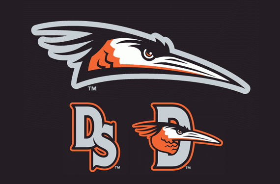
“Our logo, the original logo as well as our current design, basically replicates a blue heron,” Bitters said.
Of course, there’s nothing blue about the Shorebirds’ logo. You’d think that the reason for the orange is the team’s nearby parent club, the Baltimore Orioles, and you’d be right, but there is a twist to that tidbit.
“When the team first started, we were a Montreal Expos affiliate,” Bitters said. “It was pretty well known that that affiliation was only going to last the first year in 1996, and then after that year, we were teed up, I guess you could say, to become an Orioles affiliate.”
The team was so confident in their impending affiliation with the Orioles that it factored into the choice of their name.
“The Orioles are well known as the Birds when fans talk about them,” Bitters said. “The region as a whole is called Birdland.”
The Shorebirds updated their brand before the 2010 with the help of a firm then called Plan B Branding, better known today as Brandiose.
“What we were attempting to do with the new look was to take this bird that was basically a silhouette and not to completely change who we are, but to take this bird logo that was a silhouette and bring him to life,” Bitters said.
“What I call the D-bird logo became the one that the majority of fans gravitated toward,” Bitters continued. “It was really cool to see.”
The team kept one new logo in its back pocket after the 2010 rebrand. That logo was unveiled this season, and found its way into popular culture in a unique way.
“The Friday night logo, which I’ll call the full-body bird, we’ve had that logo design for years,” Bitters said. “We unveiled it this year after Kevin Durant used them as part of a mash-up with one of his shoe sets.”
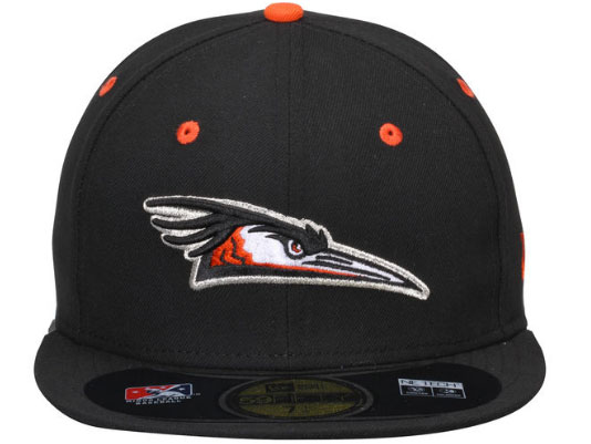
The team saw and liked what Durant had done with the logo and replicated it on one of their own caps.
“The big thing we did with it is we dropped the bird so he’s physically sitting on the bill,” Bitters said. “The bird is sitting on the bill to somewhat replicate a bird sitting on the water.”
There’s one detail of the logo that Bitters is specific to point out.
“The big thing that you can’t see on paper but that you can see in the stitching, the area where I’ll call it the cheek of the bird, there’s really, really detailed feathering in there,” he said. “If you actually look at the logo on a hat in the stitching, that’s the only place you can see it, it has some really cool detailed feathering in there.”
The Shorebirds accomplish a lot with a fairly simple look. They tie in effectively with their parent club (something Orioles affiliates, all but one of which play in Maryland, excel at). They have just four logos in their suite of marks, all of them consistent in style and tone, and just understated enough in this wackadoodle market to have a classic feeling about them. They’ve been around for two decades, but their updated look makes them feel current and appropriate.

