Vancouver, Canada, is a fascinating, beautiful city. More than half of its population claims something other than English as a first language. Vancouver’s population density is Canada’s highest and North America’s fourth highest, but it also has the 1.5-square-mile Stanley Park (not the continent’s second largest, as previously reported, but still very large; see the comments below). The city sits in an astonishing geographic location on the Burrard Peninsula, and is home to impressive architecture, remarkable ethnic diversity, and perhaps most importantly, one of the best all-you-can-eat sushi places I’ve ever been to.
So in 2014, when Brandiose partners Jason Klein and Casey White set about updating the brand of the Vancouver Canadians, the city’s baseball team, they looked forward to delving into some of what makes Vancouver unique.
“We’re always looking for something that has to do with the city,” Klein said. “We said, what sort of local things do we want to incorporate? And they were like, we want it to be a celebration of Canada.”

That’s a lot to put on the shoulders of a short-season Single-A baseball team, and Klein admits that the Brandiose partners struggled to get their head around the idea of representing an entire country in a minor league baseball team’s identity. So they put the question another way.
“Canada is so proud of the maple leaf, and so proud of, just, Canada, and everything Canada, Canada, Canada,” Klein said. “We were like, what about Vancouver? And they were like, no, no, no, it’s all about Canada.”
While it’s a lot to take on, it makes sense that the Canadians would want to represent all of Canada in their brand. The team is (of course) an affiliate of its in-country neighbors the Toronto Blue Jays (a short 40-hour, 4,400-kilometer drive to the east), and it is the only one of 160 affiliated minor league teams to play in Canada.

So with their marching orders in hand, Brandiose set about updating the team’s current brand and adding a mark that would walk the line between a serious brand and minor league frivolity.
“The owners and the management are very about classic, traditional, major league approach,” Klein said. “They’re not really into the minor league, tongue-in-cheek stuff. They wanted to keep it real buttoned up.”
To that end…
“Back in the ’80s and ’90s there was a Disney show called the Wuzzles. They’re like mash-up animals,” Klein said. “[Brandiose partner] Casey [White] had this idea of creating kind of like a Wuzzle character that was half moose, half orca, half beaver. Because we were trying to figure out how to bring a minor league, tongue-in-cheekness to the whole thing. It was dead on arrival. They were like, no way, this is not going to work.”
For real this time, Brandiose set about creating a brand that honored the team’s wish to avoid the outrageous minor league identity while also being fun.
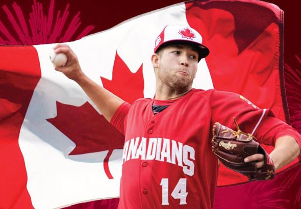
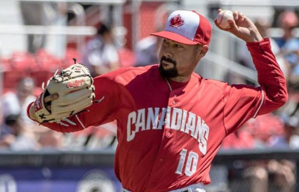
The first step was to update the primary logo, pictured above from the inception of the current franchise in 2000 through updates in 2005, 2008, and most recently in 2014. (Prior to the current short-season Single-A Vancouver Canadians, a Triple-A team of the same name played from 1978 to 1999 before relocating to California to become the Sacramento River Cats.)
The real strength of the new brand, as Klein sees it, is the custom typeface.
“It’s a very northwestern typeface that we created for them,” Klein said. “It looks like it could have been made out of wood. It’s got a craftsman feel about it.”
Of course, the most notable departure from anything the team had done previously is an alternate logo depicting a burly Mountie—a member of the Royal Canadian Mounted Police—running with not one but three baseball bats over his shoulder. The idea to use an image of the Mountie came from the team, in part as an homage to a Pacific Coast League team called the Vancouver Mounties that played in the 1950s and 60s, and in part because it’s basically the most Canadian Canada thing ever.
In keeping with the team’s wishes to have a Major League feeling while expressing minor league fun, the Brandiose partners used another team they have done some work for as a model.
“We really treated it like it was a Cincinnati Reds type brand,” Klein said. “That was part how we approached it to ownership and management. Hey, we’re going to look at the Reds as an example. They have like an old-timey character. We’ll do an old-timey character.”
Even with a cartoon Mountie in their suite of logos, the Canadians’ brand is downright sophisticated, especially compared to some of the other teams that play in the Northwest League—like the Hillsboro Hops, Everett Aquasox, and Tri-City Dust Devils. A strong use of color, a commitment to the meaning behind the brand, and just a sleeve patch’s worth of minor league fun make the Vancouver Canadians’ identity work.


