I had never been to Greenville, South Carolina, before last Thursday, when I rolled into town in a van with eight longtime friends to kick off a four-day minor league baseball road trip we call “Baseballpalooza.” Greenville pops up a lot on those annual lists of “Coolest Towns for Young People” or “Fastest Growing Cities” or “Best Places to Drink Beer and Eat Quinoa” that magazines and websites like to put out, but I had not given the town much thought before.
Indeed, Greenville’s downtown is great—lots of interesting restaurants and unique shops, great trails and green spaces along a river right in the heart of the city, and nestled among the not-too-tall buildings, a very nice minor league ballpark that plays host to the Single-A Greenville Drive.
One thing that you hear in Greenville is that the city has really taken off in the last 10 years or so, roughly corresponding with their minor league baseball team’s tenure in the city.
“We feel like the Drive name has become part of the community,” said Cameron White, the team’s media relations manager. “As Greenville has grown in the last decade, we feel we’ve done the same.”
 The Drive debuted in 2006 after the Capital City Bombers relocated to Greenville from Columbia, South Carolina. A name-the-team contest generated ideas like the Greenville Grits, the Greenville Fireflies, and the Greenville Joes. The latter, an homage to Shoeless Joe Jackson, who was born in Greenville, was vetoed by Major League Baseball because of Jackson’s role in the 1919 Black Sox scandal.
The team offers both a generic explanation and a more specific reason for the nickname that was ultimately selected. The generic one comes from a 2005 press release quoting team president Craig Brown (who is still with the team today):
“Greenville has an incredibly entrepreneurial, forward-looking spirit, and we wanted the name to reflect that enthusiasm,” said Brown. “Its remarkable success on so many fronts has been the result of individuals who had a vision and made it a reality through perseverance and hard work. It is that unique quality and experience we wanted to capture in the name of this community’s team.”

As the team wraps up its 12th season as the Drive this week, that explanation is still part of the team’s brand:
“Being in Greenville, you see a lot of drive, you see a lot of creativity, you see a lot of people who are passionate about what they do,” said White, who has been with the team for the last five years. “You see it every day here and it kind of fits.”
The more specific reason for the team’s name comes from the region’s association with the automotive industry. Greenville is home to Michelin’s North American headquarters and the International Center for Automotive Research, and BMW’s only US manufacturing plant is located in nearby Spartanburg.
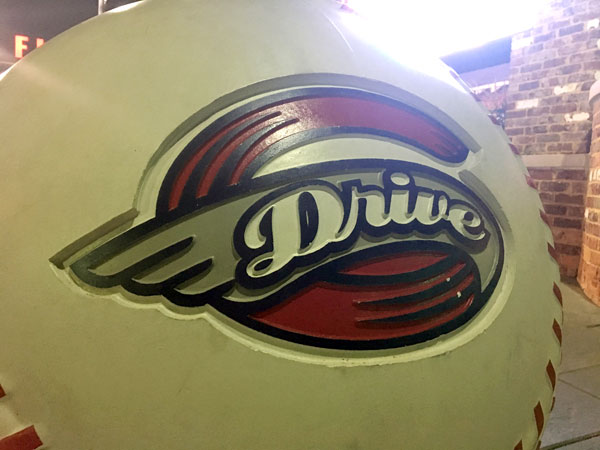
To that end, the team’s logo, created by the Greenville-based firm Erwin-Penland (which recently changed its name to EP+Co.), features an automotive theme. Again from that 2005 press release:
The Greenville Drive’s logo includes nostalgic elements that evoke the imagery of car hood ornaments from the 1940s and 1950s. The rounded, winged “G” embedded with the “Drive” name in flocked script is meant to connect the best of the past with the best of the future.
The connection to Michelin, in particular, has featured prominently in the team’s operations.
“We’ve done a ton of stuff, partnership-wise with them,” White said. “They actually sponsor our Reading All Stars Program that we do with kids in schools. Michelin and us, that partnership goes back a long way.”
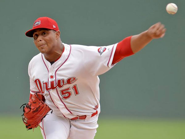
A big part of the Drive’s visual brand derives from the team’s affiliation with the Boston Red Sox—team colors reflect those of the parent club, and the gift shop is filled with Drive paraphernalia set in the Red Sox typeface. (I came really close to buying a green Drive T-shirt in the Red Sox vernacular, but I didn’t want to look like a Boston fan.) The team’s stadium, Fluor Field, even has a Green Monster, emulating Fenway Park—and yes, fans sing along with Neil Diamond’s Sweet Caroline at every game.
 The Drive’s brand is unassuming and fairly simple. While some teams have so many secondary and alternate marks that you can’t keep track of them, the Drive pretty much just have a primary logo that you see everywhere (including on the cap), a wordmark, and an alternate cap logo that features the letter G set in the Red Sox typeface. It’s a good look that has taken root in a town that you’ll probably see mentioned the next time you see a list of the Top 10 Cities for Whatever.


