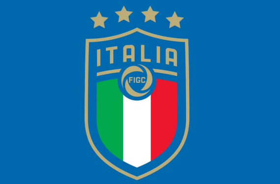
The four-time World Cup Champions will have an updated look on their shirts when they take to the pitch in Russia for next year’s edition of the World Cup. The Italian National Team has updated their crest and have gone to a bit of a more rounded look instead of the angular look that their previous crest had.
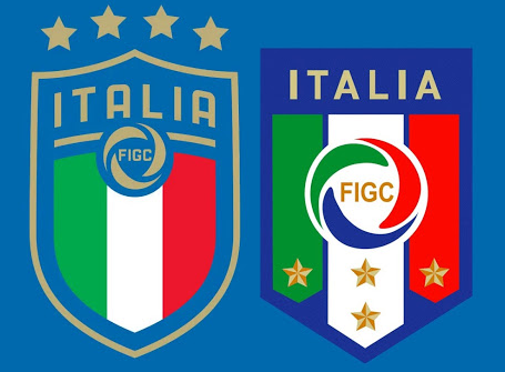
The biggest change between the new crest and the old has to be the star placement. Instead of being placed within the stripes of the Italian flag in the crest, the stars have now been placed on top of the crest. Anybody who follows soccer would probably argue that this is the proper place for championship stars to be placed, and now Italy is following proper protocol in that regard.
Here’s a quick side-by-side comparison of the new and old crests:

Italy’s official twitter account even posted a gif that showed the old crest transforming into its new and current look.
Additionally, one of our many friends of this site is tweeting that Italy will unveil the kits to go with the new look in about two weeks. So, fans of soccer kits should have that to look forward to in the near-future.
Now that you’ve seen their new crest, what do you all think? Do you consider this to be an upgrade over what they had before?


