Notice that sudden chill in the air? Ah, it feels like playoff baseball out there.
The start of Major League Baseball’s Postseason is neck-and-neck with Opening Day as the best day of the year, of course that all depends what ballclub you cheer for. For me, it’s the first time since 2014 that my boys will be staying at home which means I can just relax and root for “good baseball”, and that’s fine, I’m not sure my nerves could handle a third-straight October.
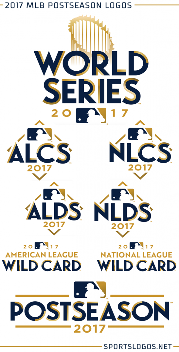
For 2017, MLB’s Postseason logos follow a blue and gold theme… yes gold, a clear emphasis on the prize awaiting the victors at the end of this 162 game + Spring Training + Playoffs marathon. The Commissioner’s Trophy *and* it’s gold the centrepiece around the branding of the Postseason for, believe it or not, the first time ever.
“In this year one of the things we did was we included the trophy, which is not something we’ve done every year”, Anne Occi, MLB’s Vice President of Design Services told SportsLogos.Net. “The trophy itself is becoming much more recognizable, a lot of the trophy ceremonies I think are well touted. When you see any of the conclusions of the games and how someone treats the trophy has now become something – it doesn’t matter what sport we’re talking about – it’s become iconic.”
Indeed it has, and when you look around the playoff logo landscape Major League Baseball had been the only big league sport to omit their championship trophy from the logo annually (note: the NBA *just* removed the trophy from their NBA Finals logo for 2018).
The same theme and colour scheme has been applied across each round of the Postseason, as has been the case over the last several years.
The trophy reserved for the Fall Classic itself, as it should be.
One challenge in designing the Postseason and World Series logos each year is just coming up with a a whole new design for the same event. Unlike the All-Star Game the Postseason has no host team or city to design around.
“What we do is take a hard look at what’s happening in design, what colours are being used”, Occi added. “We can kind of tailor the master logo around something that is going to be seen and be popular.”
Occi also noted that a look back through World Series logo history works well as a trip back to see different various design trends from era-to-era, this is most evident when the league started going with a unique design each year (beginning in 2000):
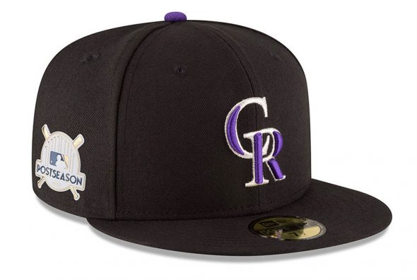
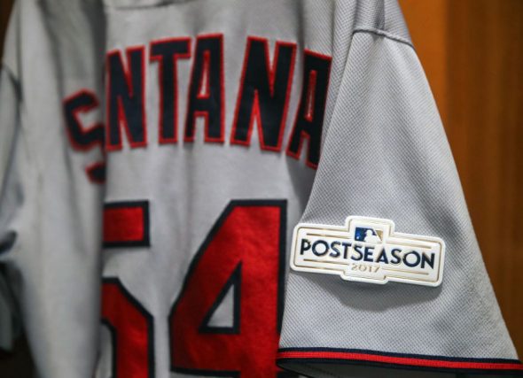
Each club to play in the Postseason will wear the 2017 Postseason logo as a patch on their jersey, a special version of that logo also to be worn as a cap patch. A look at both of those:
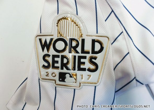
The World Series will see it’s own patch, the logo with the trophy:
The 2017 Major League Baseball Postseason gets underway tomorrow night with the Minnesota Twins visiting Yankee Stadium to take on the New York Yankees in the American League Wildcard Game, the Colorado Rockies and Arizona Diamondbacks keep it going in the National League on Wednesday. The first of three rounds leading up to the World Series later this month.

