
The Triple-A baseball club in Rochester, New York, has a remarkable history. Founded in 1899, it lays claim to being North America’s longest continuously operating non-Major League franchise. It also lays claim to being part of the longest baseball game in professional history—a 33-inning affair against the Pawtucket Red Sox over 8 hours and 25 minutes in April 1981.
The team has been called the Red Wings since 1928, when a certain hockey team in Detroit was going by the name Cougars. (It would be another three years before the world was introduced to the Detroit Red Wings.)
When it debuted, the Rochester Red Wings nickname was a wink and a nod to the team’s new parent club, as well as an aspect of western New York’s heritage: “The team came to be called the Red Wings in 1928, when their affiliation with the St. Louis Cardinals began,” says an article on the Red Wings’ website. “The name was intended to reference not only a link to their parent club, but also the region’s rich Native American history.”
That affiliation with the Cardinals would last more than three decades until 1960. And while the Red Wings’ nickname was inspired by the team’s association with St. Louis, Rochester maintained it well after that affiliation ended, through more than 40 years as an Orioles affiliate and another 15 in their current tenure as a Twins farm club.
Prior to adopting the Red Wings name, Rochester’s club went by the names Tribe (1922–1927), Colts (1921), Hustlers (1908–1920), and Bronchos (1899–1907). Red Wings is not the oldest team name in the minors, but it may be the name with the longest uninterrupted use. Teams like the Buffalo Bisons, Birmingham Barons, and Durham Bulls, among others, date back to the late 1800s and early 1900s, but their franchises have had gaps and changes along the way. Rochester, on the other hand, has played every season since 1928 as the Red Wings.
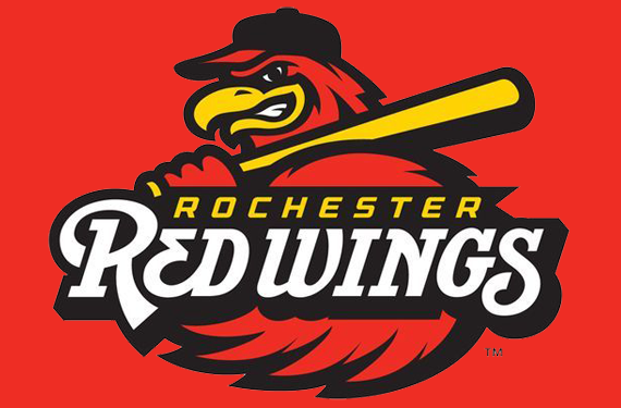
When the team rebranded before the 2014 season, there was a responsibility to pay homage to the club’s considerable history. There would be no wacky new nickname or outrageous cartoon for a logo. The team turned to Dan Simon of Studio Simon to refresh a look that was starting to show its age.
Simon spoke with Red Wings team president Naomi Silver at the 2012 winter meetings in Nashville about the team’s then-current logo.
“I said, it’s been around for a while,” Simon recalled. “It’s getting a little long in the tooth.”
Naomi Silver, it’s worth noting, is the daughter of Morrie Silver, who in the 1950s coordinated the stock drive to raise funds to purchase the team from the St. Louis Cardinals, who were making noises about moving the franchise. The purchase kept the Red Wings in town, and to this day the team (which can be found at One Morrie Silver Way on the map) is owned by community stockholders.
In discussing the redesign, Naomi Silver wanted to maintain the visual approach the team had used in its recent history.
“Their mascot is very popular in the community there,” Simon said. “She wanted to make sure that the updated identity reflected that mascot.”
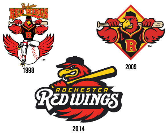
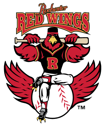
So for the third iteration of the Red Wings logo since 1998, Spikes the bird is front and center. While the 1998 version looks like it may have been dipping into the HGH and andro, Simon’s current version appears to have adjusted to baseball’s ban on performance-enhancing substances.
“That was an intentional change,” Simon said. “They don’t need to be looking like they’re on steroids to be tough. It could still be tough. It could still be a big, strong, baseball-playing bird without Charles Atlas- or Arnold Schwarzenegger-defined muscles. That was something we wanted to do on our end, was not make this so overboard with regards to that.”
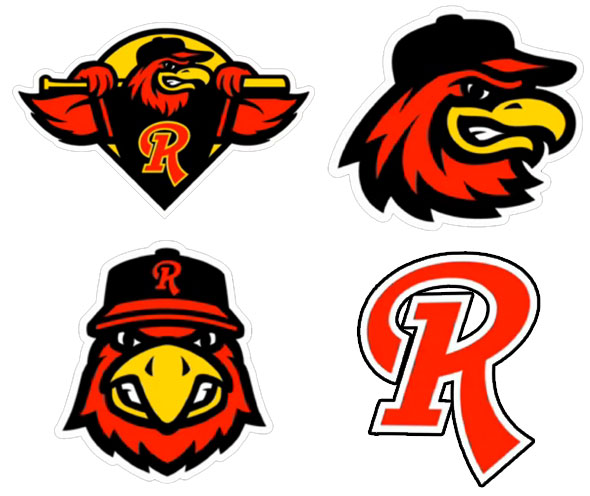
In developing the new look, Simon recognized that minor league baseball is about family entertainment and should be fun, but at the Triple-A level, these professional players are just a breath away from the Majors, so there’s a reason to be serious as well.
“What we try to develop are characters that are approachable to a certain degree,” Simon said, “but are also rendered in a bolder, more graphic logo fashion, as opposed to a Disney or Warner Brothers cartoon character fashion.”
In a baseball market with a storied history, the Red Wings’ identity strikes the balance between fun and serious effectively. Owned by stockholders in the community and older than the vast majority of its residents, Rochester’s Red Wings are as much a part of their hometown as any club in sports.
Related stories:
 MiLB announces record sales, top 25 teams in merchandise
  Rochester Red Wings to wear hockey-themed jerseys
  Rochester Red Wings to wear sign language jerseys on Deaf Culture Day
 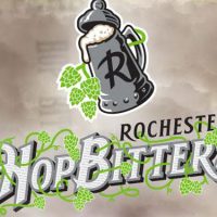 Rochester Red Wings throw back to 1879 as Hop Bitters
  Rochester Red Wings pay tribute to Garbage Plates
  USA! USA! Baseball Team Wears Miracle on Ice Jerseys
  Rochester Red Wings Reveal New Uniforms For 2014 Season
  Rochester Red Wings Introduce Updated Logos