Ask most people what the most-visited national park in the United States is and their minds will almost certainly go first to one of the iconic sites out west. But the answer to that question is not the Grand Canyon or Yosemite or Yellowstone, but Great Smoky Mountain National Park, which sits on the border between Tennessee and North Carolina. In fact, Great Smoky Mountain National Park drew 11 million visitors last year, more than the next two parks on the list, Grand Canyon and Yosemite, combined.
The Great Smoky Mountains—the Smokies, for short—get their name from the mist that often shrouds the mountain range. The mist, which from afar looks like plumes of smoke, is caused by the dense vegetation in the area’s almost 200,000 acres of old-growth forest.
The Great Smoky Mountains have another claim to fame that those other parks out west don’t have—they have a minor league baseball team named for them. The Tennessee Smokies, double-A affiliate of the Chicago Cubs, play in Kodak, Tennessee, near Knoxville, a city whose minor league baseball credentials date back to 1897.
Over the years, teams with names like the Knoxville Sox (1972–1979), Knoxville Appalachians (1909–1911), Knoxville Pioneers (1921–1924), and my favorite, the Knoxville Baseball Club (1904) have graced the city’s fields. Among those teams, two iterations of the Knoxville Smokies (1925–1967 and 1993–1999) bore the nickname of the current club, which has been playing as the Tennessee Smokies since 2000.
Aside from the mountain range, another association many people bring to the word “Smoky” (or “Smokey,” in this case) is the moniker of one Smokey Bear, the anti-forest fire mascot of the U.S. Forest Service and later the National Park Service. (Author’s pet peeve side note: There is no “THE” in Smokey Bear’s name!) (Also, while I’m at it with the pet peeves, there is no “S” on the end of “Cracker Jack” in Take Me Out to the Ballgame!)
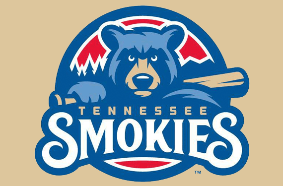
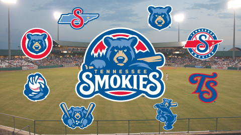
Before the 2015 season, when the team worked with Dan Simon of Studio Simon to update its logos, there were several givens to what the new visual identity would include: The colors would be determined by the team’s parent club, the wordmark would remain roughly the same, and there would be a bear.
“We knew there was going to be a bear in the logo,” Simon said. “It was a team called the Tennessee Smokies. It already had a bear…. We knew that it was going to be a bear-centric identity.”
A Cubs affiliate since 2007, the Smokies wanted to reinforce their connection to their parent club with the new brand. The existence of a bear in the logo was a start, but a bear in a blue and red logo cemented the deal.
The direction Simon received from the club was this: “We really want to play up our connection to the Cubs,” Simon was told. “That’s something we haven’t had with our previous identity.”
It’s not just the colors and the animal that tie the Smokies’ identity to that of their parent club, but the form of the design itself.
“If you at the Chicago Cubs logo, you will notice that their logo has a blue circle on the outside, then it’s got white, and then it’s got red,” Simon said. “If you look at the Smokies’ primary logo, it’s got a blue circle on the outside, a white in-line inside of that, and then red in that. So that circular shape that encompasses the primary logo is directly based on what the Cubs do.”
One of Simon’s favorite alternates in the suite of logos is one that was fraught with peril early on—the fear that trotting out a tired trope would look too familiar to sports fans.
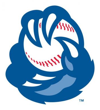 “They wanted a bear claw logo,” Simon said. “One of the things I said to them was, there are so many bear claw logos out there.”
Simon fretted over how to create a logo that would not look derivative of others out there in the sports world already. Aware that there are countless logos, not just of bear claws, but any number of animals clutching baseballs, Simon turned to fellow designer and friend Joe Bosack to discuss the issue.
Bosack’s suggestion, according to Simon, was this: “Instead of clutching the baseball like a paw would, why don’t you have him clutch it like a baseball pitcher would? So we’ve got him doing a four-seam fastball grip there, what it did was put a different spin on an otherwise familiar theme.” [Author’s note: SO TO SPEAK!]
The Smokies have generations of tradition behind their brand. With a nickname that derives from a misty mountain range and a set of logos that ties to both America’s most famous bear and the team’s parent club, the Tennessee Smokies’ new suite of logos builds on that tradition rather than replacing it.

