As far as uniforms go, this year’s World Series is a battle between consistency and anything but.
From the National League you’ve got the Los Angeles Dodgers, whose only drastic uniform change in the past 70 season was due to the relocation of the team battling the American League’s Houston Astros, a club which has changed their colour scheme, logo, uniform, and even what league they play in all within the past five years.
Heck, the Dodgers are pretty much wearing the same uniform now as they were when the Astros (then the Colt .45s) were an expansion team.
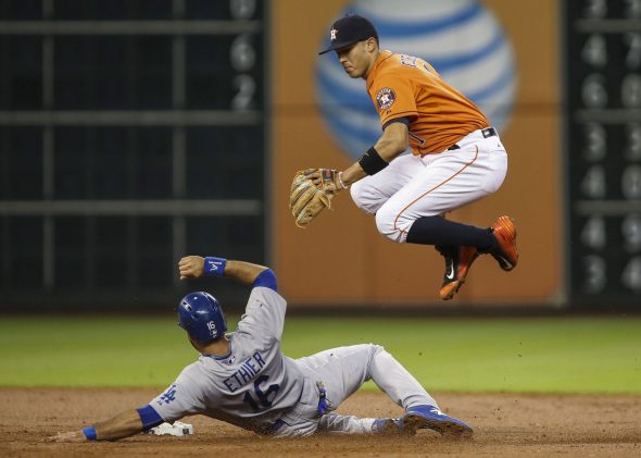
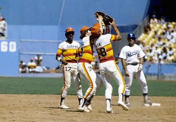
The Dodgers, like other traditional clubs such as the Detroit Tigers and New York Yankees, only have a white and grey uniform option. In 2017 when wearing their home whites the Dodgers were 53-22, on the road they have two grey jerseys – one “Dodgers”, the other “Los Angeles”, the “Dodgers” option worn far more often performed better at 31-21 while “Los Angeles” barely cracked .500 at 12-11.
Houston has four regular uniform options, home white and road grey as well as two alternates – an orange and a blue – the orange alternate already making an appearance a handful of times in this postseason. During the regular season at Minute Maid Park the Astros went 27-20 wearing their home whites, 9-5 in orange, and 6-4 in the blues. On the road they went 37-19 in their road greys and 10-6 wearing orange.
None of the win-loss records mentioned above include and of the special holiday uniforms or one-game-only “turn back the clock” uniforms, just the standard home/road/alt uniforms set by each club prior to the season. These totals also do not include any postseason games.
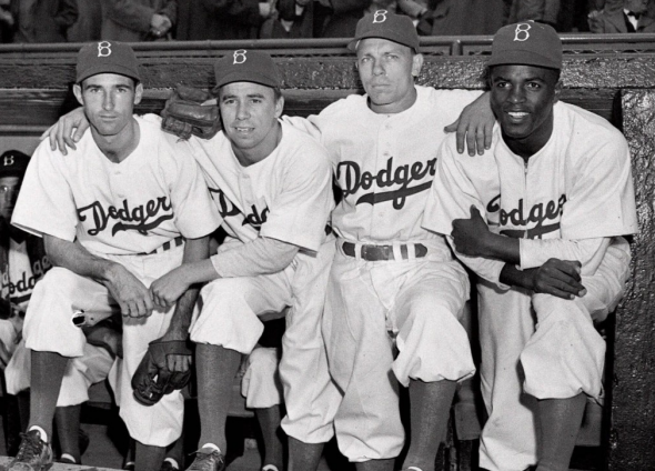
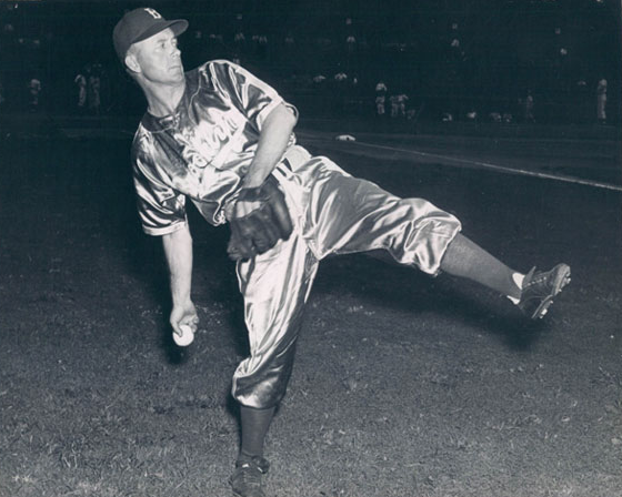
Before finally finding “their look” in 1938, the Dodgers tried a variety of different ideas when it came to their uniform and even their name. Blue and white has been the dominating colour scheme since 1902 aside from a one-year experiment with green (believe it or not) in 1937, every now and then they’d darken or lighten the shade of blue even using a powder blue as their main colour on a few difference occasions in the 20s and 30s. In 1916 the Dodgers (then known as the Brooklyn Robins) wore plaid, yes plaid, where you’d expect a team to wear pinstripes. It only lasted the one year at home but remained on their road outfit again in 1917. The 1938 season was the first wearing their iconic “Dodgers” wordmark with a tail across the chest and in 1952 they added the red numbers below it, both remain in 2017.
Houston is another story altogether. They began life in the National League as the Houston Colt .45s in 1962 wearing a uniform featuring a smoking gun across the chest. A trademark dispute with Colt Firearms two years later resulted in the team changing their name to the Astros, a nod to the space industry which was all the fashion in 1960s Houston. The switch to Astros gave the team its familiar orange star with white “H” cap logo, a version of which being was brought back by the club in 2013 and continues to be worn today, while the blue and orange colour scheme then as it is now and remained in use until 1993, also returned with that retro re-brand in 2013.

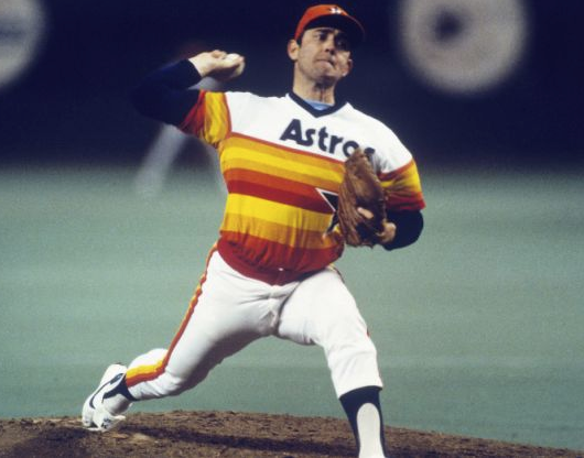
The Astros went a little “out-there” with their uniforms in the early 1970s, redesigning their uniforms to feature a jersey consisting of various red, orange, and yellow horizontal stripes which started at the waist and ran up to the chest and looping around the back, quite possibly the most infamous uniforms in Major League Baseball history. They were so unique the Astros didn’t even bother designing a road set to accompany them, there was absolutely no risk they’d be confused for their opponents. Houston used this “tequila sunrise” until 1986 when they moved their big stripes to the shoulders resulting in a much more “clean” look.
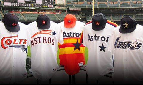
A major rebranding took place in 1994, the Astros kept the navy blue but swapped the reds and oranges for gold. The familiar “H-star” cap logo became a thin gold star with an open end creating the impression it was in motion. When the team relocated to what was then Enron Field in 2000 they flirted briefly with a name change, Houston Diesel was the most rumoured change at the time as the club looked at an overall old-timey train theme for the club. In the end only the name survived as the new look of the club named for modern space travel branded entirely around 19th century railroads – blue was eliminated for the first time in club history, the team was now wearing black with a “brick red” star on the cap trimmed in beige, the look they took with them to their first and (until this week) last World Series appearance in 2005. All of this was corrected with the retro re-brand in 2013 as the club returned to their original blue and orange colour scheme and a modernized H-star cap logo to coincide with their shift from the National to the American League.
The 2017 World Series matchup is a whole slew of firsts in Major League history. It is the first time two teams which had previously shared a league (NL, 1962-2012) are playing each other in the World Series, first time from the same division too (NL West, 1969-93). The Dodgers-Astros World Series is the first time what had previously been a LDS or LCS is now a World Series, the two teams met in the 1981 NLDS with the Dodgers prevailing in five games before eventually moving on to win the World Series later that month. It’s also by-far the matchup with the most games played between the two teams heading into the World Series… I don’t have the numbers but c’mon, multiple times every season for 51 years, no other inter-league matchup could even come close to that.
A battle between two 100+ win clubs, doesn’t get much better than that. Let’s sit back and watch some good baseball, I can’t wait.

