
The Cleveland Browns will be facing off against the Minnesota Vikings in the final London game of the 2017 NFL season, and the Browns are having a little fun with it on social media at least.
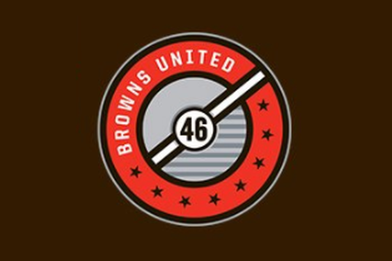
While the NFL is doing its best to create inroads outside of the United States, they at least have to concede that soccer is still very much king of sports in England. As such, someone involved with the Browns’ social media caught onto this and came up with a logo that is clearly inspired by what you’d see in a typical soccer logo.
Naturally, in this glimpse at an alternate universe where the Cleveland Browns are a soccer team, the team is known as “Browns United,” with eight stars in the roundel crest representing their 4 AAFC Championships and 4 NFL Championships. Additionally, the “46” in the logo is short for “1946,” the team’s inaugural season, and the rest just seems to incorporate design elements that are already present in Cleveland’s visual identity.
If you keep a close eye on soccer aesthetics, you’d probably agree with me when I say that this type of roundel logo would be more likely to appear in Germany’s Bundesliga rather than the Premier League, which is where you’d likely see something more resembling a crest of a shield. Also, it’s very similar to what Ohio’s Major League Soccer team looks like, as the Columbus Crew have a similar-looking logo. Either way, this logo would still look proper in any soccer league.
What do you all think about the logo? Would this work for the Browns if they were a soccer team?
Related stories:
 Cleveland Browns To Wear Alternate Uniform In 2021 For 75th Anniversary
  Cleveland Browns may overhaul their uniforms in 2020
  Cleveland Browns and Cincinnati Bengals give us orange overload in Week 7 Cleveland Browns complete identity revamp with uniform unveiling
  Old Navy Fails at NFL History with New T-Shirt Line
  Logo Links Mar 12, 2012: Colts Firearm Returns; New Minor League Logo Logo Links Mar 7, 2012: New NCAA Unis, Regina Lingerie Team Logo Links Mar 6, 2012: MLB Forbids Throwback, NBA Jersey Sponsors?