“Subjective opinion is the rule of the day. ‘I don’t like it therefore it must not be good’. The public is not invited to sit in the lab. Design [has become] about communication with a public that’s unaware of motivations behind a design” – 99% Invisible, podcast
It’s all too predictable. When a new logo or brand identity is unveiled, all the assets are released at once, as a surprise to it’s audience and often accompanied with some non-sense, disconnected copywriting about how the logo “stands tall” or “points to the future while representing the past”.
To Brian Gundell and I (Brandon Moore), the common public reaction to such a release is also predictable.
They hate it.
At least, the vocal “they” of the internet. No matter how good a design might be, or how much thought went into creating it, there is so often a void between design and audience, and this digital voice can influence big changes. The University of California, The Gap, Juventus and loads of other major brands have gone through an entire design process only to scrap their new material because of the initial public resistance— the brands cave to pressures of uninformed snark and drive-by critique. Ultimately, the brands waste their time and money because they trusted a reactionary, anonymous voice over the experts who created it, and themselves who approved it.

And the thing about that is, most people are risk averse and wary of change. Even when this change is needed, it also needs time to settle in. New things in design are not easily understood because they don’t really represent anything other than change. . . .yet.
But what could be done to prevent any of this push back against needed change, or new ideas? What can brands (and design teams) do to ease the public into a new idea?
We believe there are 3 factors that attribute to a poor launch of a brand identity, and as any design team must convince their client of their ideas, the client (brand) should convince their audience.
The issues are 1.) It comes as a surprise. 2.) There is poor communication about what honestly went into the work. 3.) The public only sees the final piece and never the process or thought that created it.
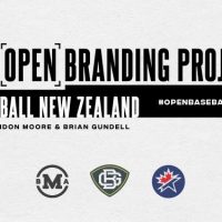
The Open Branding Project
That’s why Brian and I want to do what we do best all in the open. We’d like to go through an entire design project and put all that we do on a virtual wall for all to see, in hope of solving the mentioned issues. We went looking for a client-partner that would be brave enough to allow us to show everything to the public as it happens. Ironically, that idea which began as experimental and crazy started making a lot of sense when we thought about why anyone should be interested in it.
First, we hope to create more value by using the project itself as a marketing campaign for the client. We’ll count on our built-in audience on social media and Sportslogos.net to help us spread the message about our chosen client. You can count on SportsLogos.Net to be our home base!
Secondly, It will certainly be a teaching tool. I believe both of us can teach a thing or two to a person or two and hopefully in the end, make the design industry a little better for it. On this note, it’s mostly about teaching design to an audience that doesn’t know anything about it. But, we also realize we don’t know everything and are willing to take the risks of making a mistake or missing the mark on something. I’m sure this process will have a lot to teach us as well.
Branding & Baseball
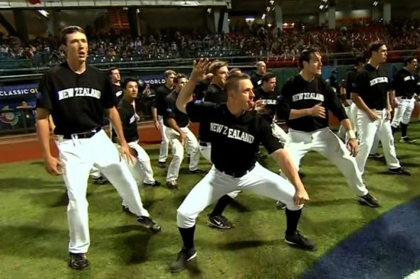
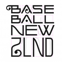
When Brian and I tweeted we were interested in this “open project” idea, we were quickly introduced to Baseball New Zealand by Gareth Hooton (@garethhooton) and we could not have found a better client-partner for it! Not only have they come a long way in pursuing some lofty goals, but stand for the participation and growth of one of the world’s greatest sports.
And, they’re looking for a brand identity that aligns with that.

Baseball New Zealand (I’ll refer to as Baseball NZ here on out) is one of over 130 member affiliates of the International Baseball Federation (IBAF) and comprises more than 4,000 individual members, who play, coach, officiate and support baseball in New Zealand within 3 Associations and 8 Clubs.
“Baseball NZ’s purpose is to be the dynamic and innovative leader of Baseball in New Zealand. To engage, support and inform all baseball stakeholders. To raise the profile and standing of and participation in baseball, and to support and deliver quality, competitive, and recreational baseball opportunities locally, nationally, and internationally.
Our vision is to be the world’s number one baseball nation, providing exciting competitive and recreational opportunities to a rapidly expanding and diverse membership and to communities throughout New Zealand. Baseball NZ provides numerous services, programs and activities to our members and the wider Baseball community.” – baseballnewzealand.com
You can read more about Baseball NZ and their history here
Baseball NZ needs more than an identity though. They are seeking to drive interest and participation in baseball within New Zealand, want to be taken seriously on the international stage, and wish to drive exposure worldwide, particularly in the United States.
So, it didn’t take long for us all to kick around this open project idea with Baseball NZ and at least speaking from the Designer’s side, get very excited about working with this organization. I was in Denver at the time, and when we thought this might be a possibility, I couldn’t contain that excitement and grabbed the hotel room’s notepad and started sketching out ideas immediately.
The Creamer Connection
After those initial twitter convos, Chris Creamer quickly expressed his interest in the project, which is why you’re reading this here. Brian and I will make weekly progress reports on SportsLogos.Net and every 3 weeks, we’ll hold a Q&A that addresses questions, comments, and concerns.
In these reports, we will put everything out on the table involving the process of creation. We want to share the things the general public never gets to see: the sketches, the discussion, the research, and all the decision making involved. You might even be able to sit in with us live as we’re doing the work.
In the coming articles, we’ll be getting deeper into the execution plans of this project, as well as our first big step; making this whole thing official and a recap of those initial client talks. We had to get creative from the very start and create a payment method that works for all sides. This model is something neither Brian or I have done before, but it was one of the major reasons we were able to go forward with the project. There should be a lot to learn from there as well.
***
Find the designers and Baseball New Zealand on twitter and instagram, and follow SportsLogos.Net for updates:
Baseball NZ @BaseballNZ / Facebook
Brian Gundell @BGundell / Dribbble
Brandon Moore @BrandMooreArt / Dribbble
SportsLogos.Net @sportslogosnet / Facebook
***
** If you want your question to be answered for the Q&A posts, please leave them in the comments section below **

