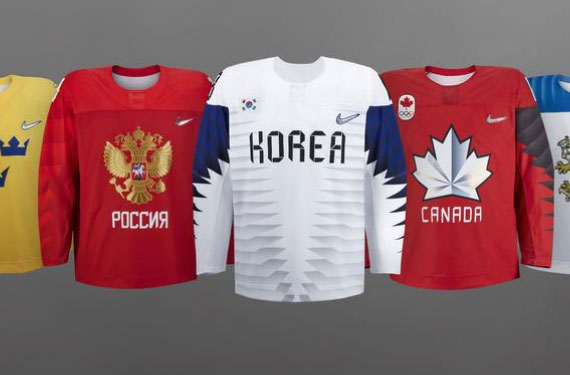
Nike today unveiled the jersey designs for all thirteen of the countries participating in the 2018 Winter Olympic and Paralympic hockey tournaments.
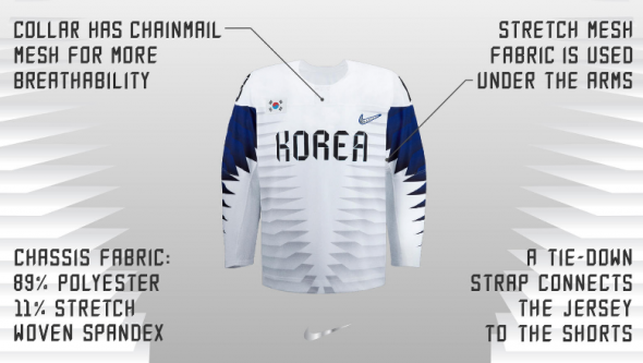
The uniforms were all designed to be as lightweight as possible, in fact they’re calling them Nike’s lightest hockey jerseys ever. To do this there has been a reduction in size of the team crests (“which reduced weight, resulting in better articulation for the athlete”) and numbers now being limited to one layer and being applied using heat rather than stitching (for “increased breathability and articulation”).
Collars have no design, no laces, not even the faux-laces we saw from Nike in 2014, now they’re “chainmail mesh” (the Golden Knights upset they missed out on this one, I’m sure) – the mesh meant to increase breathability, there’s an additional mesh, a “stretch mesh fabric” under each arm.
Twelve of the thirteen teams follow the same similar design we saw on the sleeves of the United States and Canada uniforms revealed yesterday, Sweden (being awesome) is typically the only hockey country who consistently seems to enforce their uniforms are designed the way they should be. The Swedish jersey has traditional arm striping, but nothing around the waist.
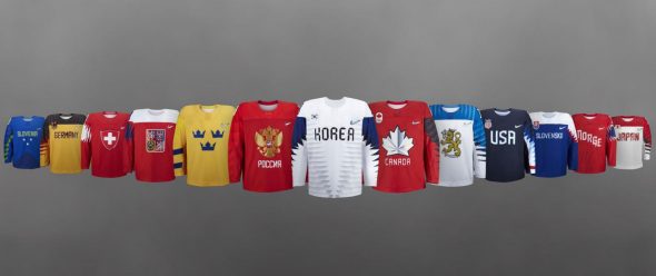
Nike explained the various designs employed in this set as a cascading gradient designed to amplify each nation’s colours, adding additional colours to expand the palette, a new Nike swoosh logo to mimic the blade of an ice skate, chrome trim which will sparkle under arena lights, and injected silicone molds to make the trims “pop”.
I mean, that all sounds great, but all I want are some waist stripes… can you invent a way to inject some of those in there?
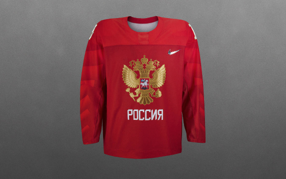
The Nike press release did a dive into four of the teams, one of which was Russia which is just a red jersey, with those “colour-amplifying gradients” and a crest on it. They said it’s meant to evoke memories of the “Big Red Machine”, the dominant Soviet teams of the later half of the 20th Century. Fitting, those Soviet/Russian teams didn’t have to compete against the best Canadian and American players out there, and (on the men’s side) neither will this one. Excellent throwback.
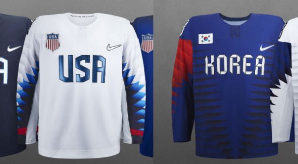
The host South Korea jerseys include a font inspired by origami and the sleeves are “a distinctive graphic pattern” based on Korea’s unique architecture. The United States meanwhile said their sleeve pattern was inspired by a bald eagle, the national bird of the U.S.A.:
Yes very distinct.
The 2018 Winter Olympic hockey tournament gets underway in Pyeongchang, South Korea on February 10, 2018 with the women kicking things off, the men’s tournament starts on the 14th. These uniforms will also be worn during the sledge hockey tournament at the 2018 Winter Paralympic games beginning on March 9th.

