This is part 4 of a multi-part series chronicling the real-time development and design of a new logo for Baseball New Zealand. Check out our past “The Open Branding Project” posts here.
***
Hey everyone, Brian here with another update on the Open Branding Project for Baseball New Zealand. We missed an article last week, and frankly there wasn’t a ton of developments, so I’ll incorporate what happened over the past couple of weeks in this article. We want to thank everyone for their week three questions, it definitely has spurred some good conversations with everyone involved.
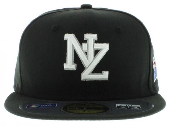
Last Thursday, we spoke with Ryan Flynn (CEO of Baseball NZ) and started talking about actual directions for the logo and branding. Ryan mentioned that, as he’s worked with MLB franchises like the Yankees, Mariners, and Padres, he’s a bit of a classicist with the looks, and that was the genesis of the NZ cap logo the “Diamondblacks” wore during the 2013 World Baseball Classic.
The problem with the NZ lockup is that it is currently trademarked by another owner in New Zealand, and the organization has lost the rights to use that mark. That’s where we were brought in. So now the challenge for us is to create an entirely new NZ lockup or something totally different. We asked Ryan his feelings about balancing a classic baseball look with something contemporary, and his response to us was that he “wants new ideas.” Essentially, he gave us carte blanche to create whatever we wanted.
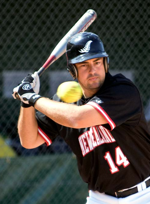
We also discussed the silver fern with him. He explained that his hesitancy to use the silver fern in the Baseball NZ brand were two-fold. First, it’s really and truly owned by the All Blacks (national rugby union team) and that there are a lot of imitators. Secondly, and more importantly, the silver fern is used prominently by Softball New Zealand, which is baseball’s chief competitor and currently the more successful summer sport in the country.
With that in mind, Ryan gave his blessing for us to explore every avenue possible, including the silver fern, to make the most successful design we can.
Now for the more recent stuff, where it really starts to get interesting.
Ryan put us in touch with Dave Bishop, who is a Maori tattoo artist and designer currently living in Australia. We ended up chatting with Dave for about an hour or so on Skype, talking about some of our ideas and learning about Maori traditions and some of the more significant symbols in the country and culture.
One of the early ideas Brandon and I have had for the brand is to move away from a typographic monogram for the cap logo and do instead an animal representation, using Maori patterns to fill in a silhouette and really creating something interesting and unique. With Dave’s input, we bounced around a number of creatures that might have worked. We discussed kiwi birds, the New Zealand Hawk, Tuatara (an indigenous lizard), stingrays, and sharks. Dave mentioned to us the significance and importance of sharks, particularly Mako and Hammerheads, to Maori people, and that got us really excited.
We also talked to Dave about making sure the Maori patterns we used were authentic and meaningful, and Dave offered to draw some patterns and explain those for us. Here are the sketches he sent:
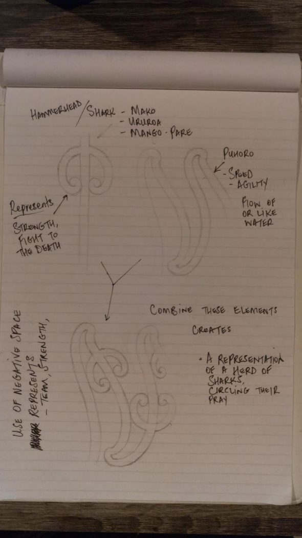
Dave’s explanations: “The first pic (above) is a mockup of how elements are used in Maori art and this case the shark or hammerhead shark and the traditional pattern called Puhoro which was tattooed on the legs of my ancestors who were warriors. Represents speed, agility and stealth.
The second pic (below) is a close up on a drawing I did which shows a close up of a carved pattern called Rauponga.
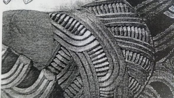
It is common in most tribes and it symbolizes genealogical or Whakapapa in Maori. The long lines are called Haehae and the cross section patterns are called Pakati. Where the Haehae lines curve, this tells the story of how many generations back we are representing the Whakapapa e.g. Parents, grandparents, great grandparents which this pattern shows.
The 3rd pic (below) is a more detailed version of how our patterns work together in the positive (drawn) and negative space. This piece is called Kaitiaki or Guardian. You will see the Puhoro pattern used and at the centre bottom is a Kaitiaki face. These forms are used a lot in modern Maori art.”
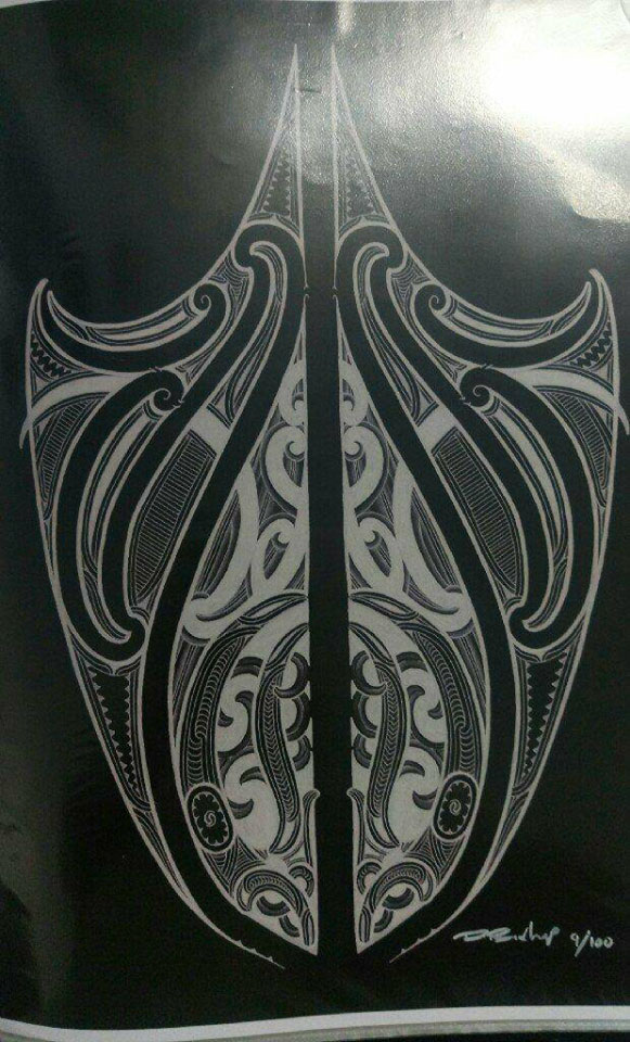
Needless to say, this is great information, and Dave is a fantastic resource. He has offered to continue to provide information and feedback to us as we go along, so you can expect to hear his name a lot more throughout this process. For those curious, see Dave’s art on his facebook page https://www.facebook.com/matatoadesign/ and Instagram https://www.instagram.com/matatoadesign/
Brandon and I had a follow up conversation where we went over everything mentioned above, and we’re really excited about the direction of using a shark as the symbol for the brand. Fraser Davidson suggested the Taniwha on Twitter as well, and we will look into this further. Our initial concerns about using an animal is we don’t want it to look like the team is the “New Zealand Sharks,” so part of the challenge is getting that to represent “Baseball NZ.”
We started doing some loose sketches, shown below, where we explore some shark shapes and have started to play with some of the Maori patterns as fills within the type. We’re thinking these can maybe be translated to a sublimated twill on the jersey and potentially a 3D embroidery effect if it goes on the cap.
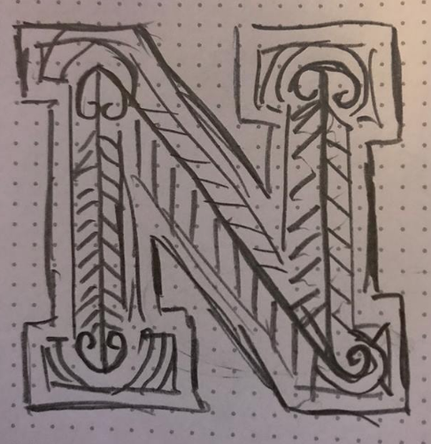
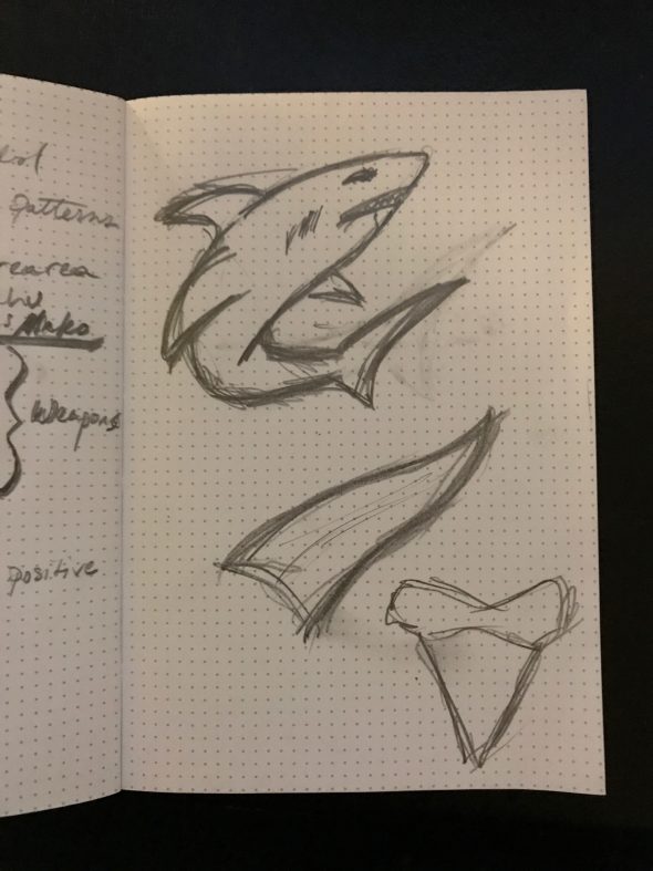
With Thanksgiving in the United States this week, and me going out of town the week after next, we’re going to try to squeeze in as much sketching as we can so hopefully we have more to show. Be sure to follow our hashtag on Twitter, #OpenBaseballNZ, and be sure to submit your questions to us via Twitter, the comments section on this article, or to Chris directly for our Q&A session next week. That’s all for now, folks!
This is part 4 of a multi-part series chronicling the real-time development and design of a new logo for Baseball New Zealand. Check out our past “The Open Branding Project” posts here.

