This is part 7 of a multi-part series chronicling the real-time development and design of a new logo for Baseball New Zealand. Check out our past “The Open Branding Project” posts here.
***
Brian here again everybody with an update on the Open Branding Project. We didn’t have an article last week, what with Chris being on vacation and all, plus it was a slow week for us (I had been on vacation the week prior). However, since then Brandon and I have picked up the pace and turned on the turbo jets on this project. Those of you following on Twitter may have seen some of Brandon’s sketches that led to us having a conversation about the NZ monogram. Here are some of those from earlier:
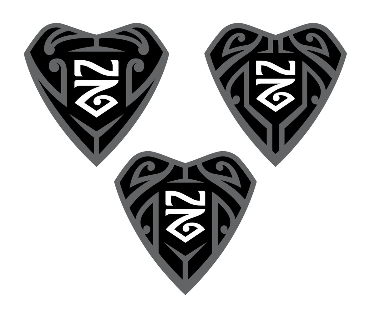
One of the main things Brandon and I knew we wanted to do was to use the Shark Tooth design as a primary mark, containing the cap logo within it. We thought maybe having the monogram be held in the negative space of a home plate shape could help connect the logo with baseball a little bit more, so I started exploring how to fit the NZ into a home plate shape.
Up until this point, we had largely focused on having a small N follow along the curves of the Z, which just wasn’t working in the home plate configuration. That’s when inspiration hit however, and we thought to stack the NZ and have the Z create the contour of the plate itself.
When we added the koru curl to the tail of the Z, we knew we were cooking with gas, and we were off to the races. We then began exploring variations of that design. Early in the process, they were very heavy, with me trying to keep a Silver Fern shape in the arm of the Z, and Brandon exploring monoline options.
We eventually settled on having the N and Z separated, and thinning out the overall weight of the characters, and simplifying the curves so that it was a quicker read for the eye. When we did this, as @2Shayzz pointed out, that we also managed to get an abstract baseball field look in the design. Since that time, we’ve been tweaking and refining this mark until where we’ve arrived today. We’ve put our mark next to MLB cap logos to compare size, stroke weight, and simplicity, as shown here. It’s worth noting the the strokes of our ‘N’ match that of the San Diego Padres’ cap logo, so we feel like we’ve got the right balance on stroke weight.
Meanwhile, we haven’t forgotten about our tooth idea, so we got back in touch with Maori tattoo artist and designer, Dave Bishop. Dave drew up some mangopare patterns for us to use inside the tooth shape for our home plate idea, seen here. I then took Dave’s design and put my own, more simplified spin on it, seen here as well.
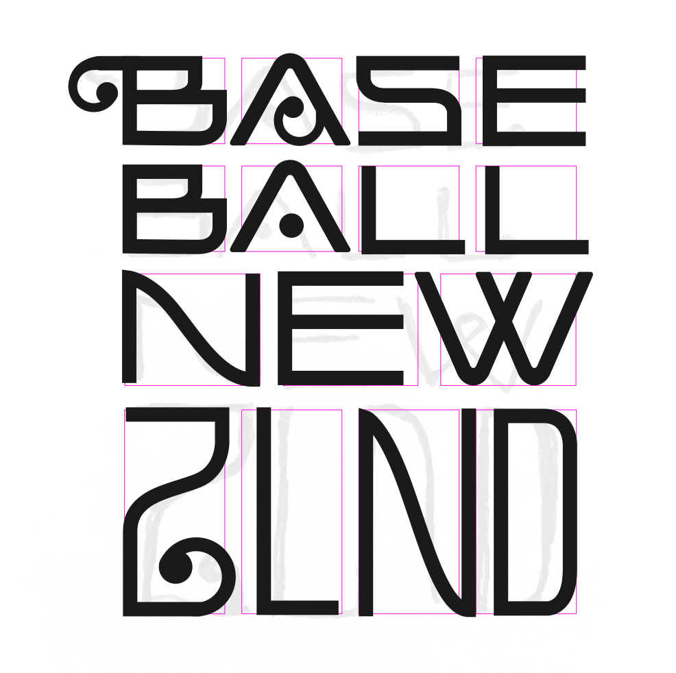
To round out our idea for the primary mark, we’re taking another look at a design Brandon had done earlier, where he typeset the words “Baseball New Zealand” in a tabula rasa format. The idea clicked for me as being able to be paired up with the tooth mark, as well as being able to stand out on its own. That’s our next big design challenge — refining and stylizing the text to go in this layout and then be extended to all the other applications and font. Stay tuned for that.
So there you have it — a big update here and we’ve got a lot of momentum. We’ve gotten a really positive response from social media and from Baseball New Zealand on the homeplate NZ monogram, and we’re really excited about how that’s coming along. As always, add your thoughts and comments to the article here, and be sure to keep up with us by following #OpenBaseballNZ on Twitter. Until next time!
***
This was part 7 of a multi-part series chronicling the real-time development and design of a new logo for Baseball New Zealand. Check out our past “The Open Branding Project” posts here.


