Nike and the National Basketball Association today unveiled the final set of new NBA uniforms for the 2017-18 season. Known as the “City Edition” it’s one of the four new uniform sets for each team which replaced the standard home, away, alternate uniform designations – in their place are Icon, Association, Statement, and now City.
The unveiling follows a myriad of leaks over the past few weeks thanks to some hard work by Conrad Burry, today’s released images confirm those leaks but give us a much better look – as well as an explanation for most of those designs. All but four of the teams were unveiled by Nike today – Houston, Miami, New York, and Toronto were being withheld for a later date but those leaks already showed those designs; we’ll be including them in this post.
The theme of these designs, as described by Nike are to honour the fans of each team, to “represent insights and emotion from the court to the upper deck to the cities’ streets” while also “respecting the past and present of the clubs while also positioning them for the future”.
Let’s roll through these one at a time:
ATLANTA HAWKS
A mixture of past and future, the asymmetrical lines and “volt” accents are based off the Hawks uniforms of the 1970s, and the jersey font is inspired by Atlanta’s “cutting-edge” music scene.
BOSTON CELTICS
Grey with the Celtics iconic parquet floor serving as a textured pattern on the base of the jersey. Red Auerbach’s signature is added to the bottom of the jersey, on the belt is the banner celebrating the Celtics 2008 NBA title, their most recent.
BROOKLYN NETS
Patterned off of the Brooklyn Bridge, the steel cables patterned into the base of the jersey.
CHARLOTTE HORNETS
Black with “BUZZ CITY” across the front, the pattern on the sides are based off a hive while the colours are meant to resemble the wings of a hornet.
CHICAGO BULLS
Inspired by the city flag of Chicago, the colours as well as the stars are all from the local flag while using the classic Bulls road jersey script from the 1980s.
CLEVELAND CAVALIERS
Grey with “THE LAND” across the front (short for Cleveland?), the design is inspired by the Guardians of Transportation sculptures on the Hope Memorial Bridge.
DALLAS MAVERICKS
Neon accents are a reference to the nighttime skyline of the City of Dallas
DENVER NUGGETS
Mountain represents the Mile High City, pickaxes for the name of the team, and (oh yes) “metallic gold accents to symbolize refinement in the club’s journey to new heights”… not because they’re named after nuggets of gold.
DETROIT PISTONS
Design is based off of classic automobile designs, the city’s “MOTOR CITY” nickname across the front
GOLDEN STATE WARRIORS
A tribute to the Chinese culture in the Bay Area
HOUSTON ROCKETS
See: Warriors, Golden State
INDIANA PACERS
A nod to the State of Indiana’s association with auto racing, a checkered flag in the stripe and the player number in a circle like a racecar
LOS ANGELES CLIPPERS
Modern LA Clippers design in original San Diego Clippers colours, in recognition of the franchise’s relocation to California in the 1970s.
LOS ANGELES LAKERS
Instead of doing a city design, the Lakers are doing player designs despite the name. The “Black Mamba” design this year is in honour of Kobe Bryant.
MEMPHIS GRIZZLIES
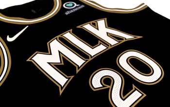
A simple black-and-white design, the uniform is inspired by the 1968 Memphis Sanitation Workers Strike ‘I Am A Man’ slogans as well as the the 50th Anniversary of the assassination of Dr. Martin Luther King Jr.
MIAMI HEAT
A design and colour scheme which just screams “Miami in the 1980s”, think Miami Vice.
MILWAUKEE BUCKS
Buck head front and centre, the cream base is a nod to the cream coloured bricks in Milwaukee, the “Cream City”
MINNESOTA TIMBERWOLVES
The design is based off of the tonal grey colour of the winter coat of a wolf
NEW ORLEANS PELICANS
All about Mardi Gras and Carnival
NEW YORK KNICKS
The shield featured on the front is a tribute to the badge worn by the Fire Department of New York
OKLAHOMA CITY THUNDER
Like their logo this generic uniform design could really apply to any team nickname the team could have come up with, the lines represent “fast, bold, dynamic” while also representing the forces of nature which exist “on and off the court”
ORLANDO MAGIC
Shows space, the edges of our universe to inspire us to do more and be greater.
PHILADELPHIA 76ERS
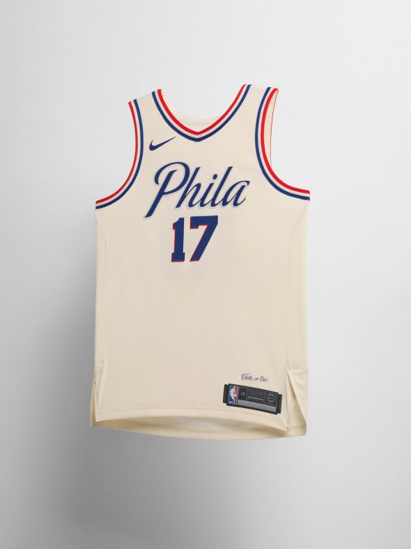
The declaration of independence, signed in Philadelphia in 1776 (hence the team name!) inspires the beige colour of this uniform as well as the scripted font used for the “Phila” wordmark.
PHOENIX SUNS
A tribute to the local hispanic community, the rear of the jersey (not shown) shows a design detail inspired by the Phoenix constellation.
PORTLAND TRAIL BLAZERS
Black with a plaid pattern in tribute to the unique wardrobe of former Blazers head coach Jack Ramsay as well as the design trends of the Pacific Northwest.
SACRAMENTO KINGS
The modern lion head alternate logo is featured, recoloured to the original 1980s Kings team colours of blue and red.
SAN ANTONIO SPURS
A tribute to the U.S. Armed Forces
TORONTO RAPTORS
Taking pride in representing the North of North America, the Raptors design features a chevron pointing north with simply “NORTH” written within it.
UTAH JAZZ
The sunset/rainbow style design here represents Utah’s “famous red rock formations, stunning arches, and breathtaking canyon lands”
WASHINGTON WIZARDS
Reading “District of Columbia”, the uniform has a marble pattern up each side as well as a bevelling effect on the numbers – all of which are a nod to the architecture found throughout the U.S. capital.
Some of these uniforms are making their on-court debut’s TONIGHT, some aren’t even officially unveiled yet (such as Toronto, Miami, and New York), while others won’t be worn for several weeks still. None of the officially unveiled jerseys are available for sale yet at the official NBA Shop.


