Welcome to the 2018 Creamer Awards, our seventh annual celebration of the best new sports logos to debut throughout the year.
Over these past twelve months, we saw a plethora of new logos across the sports world. In addition to the usual crop of fresh designs, we were treated to the advent of temporary re-brands taking over the minor leagues presenting us with an entirely new set of team names, logos, and uniforms for several dozen teams. In recognition of this, we’ve added a new category for 2018, the Best New Promo Logo of the Year. Our three usual categories are back – the Best New League/Event Logo, the Best Alternate Logo, and the top prize – the Best New Primary Logo.
Winners were selected by a panel of fourteen judges: four are writers from here at SportsLogos.Net, nine others are sports writers at various other websites, and, of course, the fifteenth ballot cast by you, our readers. I’d like to personally thank Brodie Brazil, Maury Brown, Paul Caputo, Kevin Clark, Tyler Kepner, Paul Lukas, Tim Newcomb, Rob Neyer, Jay Onrait, Clark Rasmussen, Ray Ratto, Jesse Spector, and Greg Wyshynski as well as all of you for once again taking time out to help determine the best in sports logos this year.
This year ballots were fully ranked from one to ten, this is new as in previous years judges were asked only to rank their top three per category. We’re using the same points system to determine the final rankings that Major League Baseball uses for their MVP ballots, first place on each ballot gets 14 points, second gets nine, third eight, fourth seven, and so on down to one point for the 10th place team. A reminder that only logos to be used in a game for the first time in 2018 are eligible, any new logos released in the last few weeks set to be used in 2019 will be judged next year.
Our first category is…
2018 BEST NEW PRIMARY LOGO
The nominees:
![]()
Clockwise from top
Newfoundland Growlers, ECHL
Tampa Tarpons, FSL
Torpedo Nizhny Novgorod, KHL
Stetson Hatters, NCAA
Gwinnett Stripers, IL
Los Angeles FC, MLS
Pittsburgh Riverhounds SC, USL
Jacksonville Dolphins, NCAA
William & Mary Tribe, NCAA
Augusta Greenjackets, SAL
And the Creamer goes to…
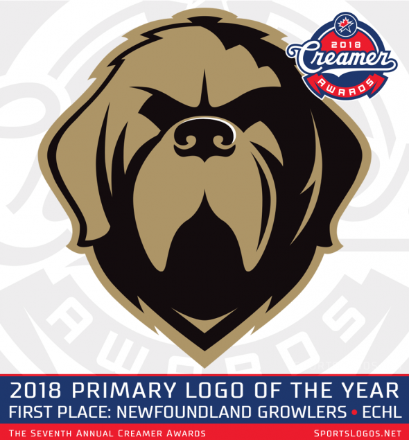
The Newfoundland Growlers of the ECHL
The Growlers joined hockey’s “Double-A league” as an expansion team for the 2018-19 season bringing hockey back to the rock following the departure of the AHL’s St. John’s IceCaps in 2017. The logo was designed by Idea Factory, a St. John’s marketing company and prominently features the face of a Newfoundland dog in gold and black.
A Newfoundland dog is “a large working dog who is known for their size, strength, intelligence and loyalty”, read the official press release at the time the logo was first released. “The dog in the logo is fierce and stoic to represent the pride and resilience of our province and our reputation of never backing down from a challenge.”

The colour scheme of gold and black draws its inspiration from a locally iconic photo showing Sable Chief, a Newfoundland dog adopted by the Royal Newfoundland Regiment as their mascot during the First World War.
“The vintage tones compliment the dog’s dark hues, creating a strong combination with a classic, universal appeal”, explained the release. “Paired with a forged-style font, the hard edges and strong weight give it a stone-chiseled feel which lends itself well to the vintage style of the logo.”
Congratulations to the Newfoundland Growlers and the Idea Factory on winning the 2018 Creamer Award for Best New Primary Logo! The Growlers become the first ECHL team to ever win a Creamer Award.
From the judges…
“This logo is just a masterpiece. The Growlers managed to create a logo that somehow looks gruff and cuddly like this pooch is going to guard the house at all costs unless you distract it with delightful ear scratches.” – Greg Wyshynski
“The Growlers logo is the only one that I even remembered seeing and loving over the course of the year” – Jesse Spector
“The name is great, the logo is self-contained. No words needed. It’s so on every kid’s next T-shirt.” – Ray Ratto
Following up in second place is

The Stetson Hatters, NCAA
A logo that plays with the negative space in a fun way, the Hatters logo designed by Joe Bosack & Co. features an “S” in green with a cowboy hat in white in the top half of the letter. The design took two years of research and development involving all sectors of the Stetson community – students, faculty, alumni, trustees, as well as former athletes and coaches.
The Hatters name is from John B. Stetson, the inventor of the cowboy hat, and a donor to the school who named themselves after Stetson in appreciation in 1900.
“The new Stetson logos and branding give the entire Stetson University community a set of icons to be proud of,” Ricky Hazel, Associate Director of Athletics, said. “The logos honour the long history of Hatters Athletics while at the same time reflecting a clean, modern feel that will carry well into the future.”
Rounding out the top three is

The Augusta Greenjackets, South Atlantic League
Designed by Brandiose, the Greenjackets new look features their mascot Auggie, now shown flexing instead of wearing the green jacket so closely associated with The Masters golf major held in town. With the new look, the GreenJackets are the first team in minor league baseball to feature a plaid pattern in their logo, as seen in Auggie’s cap—perfect for a team whose brand is tied to golf. The unveiling of the new logo coincided with the team’s move to a new ballpark located just across the river in North Augusta, South Carolina.
“I love the Augusta-related elements included in the new GreenJackets logo. The golf ball eye and the tam o’shanter are nice elements. Additionally, including the wing as the cross on the A in Jackets is a unique touch” – Clark Rasmussen
Congratulations to all our finalists and especially our top three finishers in 2018!
Here’s how the ten nominees ended up finishing:

Our next category is…
2018 BEST NEW ALTERNATE LOGO
The nominees:
![]()
Clockwise from top
Greeneville Reds, Appy League
Carolina Hurricanes, NHL
Gwinnett Stripers, IL
William & Mary Tribe, NCAA
Denver Nuggets, NBA
Hudson Valley Renegades, NYPL
Capital City Go-Go, NBA G-League
Los Angeles FC, MLS
Tampa Tarpons, FSL
Jacksonville Dolphins, NCAA
And the Creamer goes to…

The Denver Nuggets of the NBA
Denver’s modernized take on an old classic placed first on several of the judges and on the fan ballot giving them the title of Best New Alternate Logo of the Year.
The Nuggets unveiled their new logo set in June calling it “Nuggets Evolved”, hence the “evolved” version of their old logo from the 1980s here but it’s not a retread, merely the shape and concept of the logo is the same, a colourful skyline inside a semi-circle, all the elements have been updated in a significant way.
![]()
The new colour scheme included a new shade of red which the team refers to as “Flatiron Red”, said to have been “derived from the red sandstone soil” from the Denver area, the same stone which inspired the name of the Colorado River. The other colours are “Midnight Blue”, “Sunshine Yellow”, and “Skyline Blue” the same shade used by the team in the 1970s.
“I will forever regard the Nuggets’ rainbow as their best iteration, and while I’m glad for their City Edition uniforms bringing back the vibe, this alternate logo does a great job of blending past and present. It’s really sharp, and unmistakably the Nuggets without a second look.” – Jesse Spector
Congratulations to the Denver Nuggets on winning the Creamer Award for Best New Alternate Logo of 2018.
In second place:

The Greeneville Reds of the Appalachian League
A coonskin cap on Mr. Redlegs? It works just as well as you’d think it would, enough to nearly take home top spot in this category. The Greeneville Reds joined the Appy League as an expansion franchise for 2018 following the Houston Astros disbanding the old Greeneville Astros prior to the season. Coming in second, the Reds alternate logo won first place votes from two of our judges this year.
“What if a Brooklyn craft cocktail bartender was coming off a bender and cosplayed as Davy Crockett? Thank you, Greeneville Reds, for now, I know the answer to this query.” – Greg Wyshynski
“The Davy Crockett version of Mr. Redlegs just makes me giggle.” – Jesse Spector
And in third place…

The Tampa Tarpons, Florida State League
The former Tampa Yankees, the Advanced-A club decided to go their own way in 2018 picking up a historical baseball name used by a previous Tampa-based Florida State League club for over thirty years. The winning logo features a tarpon, which is a large fish, holding a baseball bat coloured silver and black with blue trim – the logo here is featured on the Tarpons home ballcaps.
In regards to moving away from the Yankees, “we’re talking about one of the most, if not the most iconic brands in all of sports,” said Dan Simon of Studio Simon, who created and designed the Tarpons logos. “When you make a decision to make a change like this, that’s not something that’s taken lightly. This was not your typical rebranding.”
Congratulations to all our finalists and to the Nuggets, Reds, and Tarpons on their top three finishes.
Our next category is…
2018 BEST NEW PROMO LOGO
A new category this year, and depending on how this trend carries on into 2019 it’s possible it’s the only year we get to run it, but it’s certainly fun while it’s here, just check out these nominees…
![]()
Clockwise from top
Pawtucket Red Sox (Pawtucket Hot Weiners)
Buffalo Bisons (Buffalo Wings)
Charleston RiverDogs (Charleston Boiled Peanuts)
Staten Island Yankees (Staten Island Pizza Rats)
Eugene Emeralds (Monarcas de Eugene)
Hickory Crawdads (Hickory Crawmoms)
Bowie BaySox (Chesapeake Cangrejos Fantasmas)
San Antonio Missions (Flying Chanclas de San Antonio)
Vermont Lake Monsters (Vermont Maple Kings)
Albuquerque Isotopes (Mariachis de Nuevo México)
And the Creamer goes to…

The Albuquerque Isotopes – Mariachis de Nuevo México, Pacific Coast League
Designed by Ryan Foose at Minor League Baseball with an assist from Kara Hayes and Alvin Garcia with the Isotopes. The Mariachis are the Isotopes alternate identity from Minor League Baseball’s Copa de la Diversión series launched this year and adopted by over thirty different Minor League clubs. The name celebrates a traditional Mexican musical style and the logo features Catrin, the male version of Catrina, who was born as a protest symbol of social inequality in Mexico and who has come to represent the Day of the Dead.
Albuquerque’s win in this category comes just a week after the team won the inaugural Copa for, among other things but most relevant here, creating and embracing culturally-relevant on-field personas that authentically connect the team with its local U.S. Hispanic/Latinx community.

¡Felicidades Mariachis!
“I like dogs on fire, local icons like pizza rats and syrup jugs running without feet as much as the next guy, but Dios De Los Muertos renderings always has a great chance of scaring the weak at heart, and who doesn’t think that’s a good idea?” – Ray Ratto
“The ‘Copa de la Diversión’ imitative in the Minors was one of the best things in years. The Day of the Dead design that the Isotopes used was one of my favourites.” – Maury Brown
In second…

The Staten Island Yankees – Staten Island Pizza Rats, New York-Penn League
From the team at Brandiose, the Staten Island Pizza Rats were once a proposed new name for the team before they backed off and kept the Yankees name back in 2016; named after a viral video showing a rat dragging a slice of pizza on an NYC subway track.
“As we sat down on the days we were there and people told us about what made Staten Island tick, it is an underdog,” said Jason Klein, co-founder of Brandiose in a Studio Stories post we did about the Pizza Rats design. “As a borough, it doesn’t get a whole lot of attention … You want a name that can’t be ignored, these teams don’t have millions of dollars for an advertising budget. You have to find ways to get attention without spending a lot of money.”
“I remember the pizza rats stunt when it happened because we dressed our dog up as ‘Pizza Rat’ for Halloween… in 2015. That said, it’s a delightfully New York logo: ‘Ya got ya pizza, you got ya rat, what else do ya friggin’ want?'” – Greg Wyshynski
“The Staten Island Pizza Rats take the top honour in my mind not just for the fun logo, but for capturing the spirit of a city defined by a video of vermin dragging junk food down a subway stairwell.” – Paul Caputo
And in third…

The Pawtucket Red Sox – Pawtucket Hot Wieners, International League
Wieners—which Rhode Islanders differentiate from hot dogs because you can identify the meat in them; they’re made of beef, pork, veal, and spices—are a local specialty, dating back to Greek immigrants in the early 1900s. Just as Philadelphians will argue over where to get the best cheesesteak and New Yorkers can list the best three pizza joints like they’re the names of their children, so too do those in Pawtucket have a favourite wiener.
The Pawtucket Red Sox played just one game with the simultaneously adorable and terrifying logo (that dachshund, while cute, is both on fire and about to be served for lunch) on August 16th but based on the love for it I bet we’ll see it a few more times in 2019. My wiener dog Howard will get to celebrate this bronze medal for his breed tonight with a special treat.
And, finally…
2018 BEST NEW LEAGUE OR EVENT LOGO
The nominees:
![]()
Clockwise from top
MLB All-Star Game – Washington, DC
CFL Grey Cup – Edmonton, AB
KHL All-Star Game – Astana, KAZ
NHL All-Star Game – Tampa, FL
NCAA Women’s Final Four – Columbus, OH
NHL Stadium Series – Annapolis, MD
NHL Winter Classic – New York, NY
AHL Outdoor Classic – Hershey, PA
ECHL All-Star Classic – Indianapolis, IN
NCAA Men’s Final Four – San Antonio, TX
And the Creamer goes to…

2018 MLB ALL-STAR GAME – WASHINGTON DC
This award-winning logo featured the freshly polished U.S. Capitol Dome as its centrepiece flanked by a set of six stars above, two stars below, and red and white stripes waving behind; the two stars at the bottom representing the two competing leagues while the three on each side of the dome for the three divisions per league. It’s a whole lot of U.S. patriotism on display, appropriately of course, for a game that was played in its capital city.
“We worked with the Nationals just short of a year,” Anne Occi, Vice President, Design Services for Major League Baseball told SportsLogos.Net at the time. “We got involved with the club right at the conclusion of the 2016 All-Star Game, we start to move on a questionnaire, specifically to hone in on the reasons why the club is hosting the game, what do they want to get out of hosting the game, and the legacy they hope to come from it.”

From the judges…
“The MLB ASG logo is refreshing for its restrained colour scheme and thinner line weights. Also: Will we ever again see an All-Star logo for any sport or league that uses a hyphen, rather a than a star, in between the words ‘All’ and ‘Star’?” – Paul Lukas
“I ranked the MLB All-Star Game in Washington as #1 but it’s more a matter of almost all of the rest of the field being basically the same logo. Event Name slapped on some semi-random shape, with a defining element from the host city or venue. Maybe include a piece of equipment from the sport in question. At least the Washington All-Star logo stands out from those.” – Clark Rasmussen
“It’s hard to capture a sense of place and all of the all of the additional information you find in an event logo, but MLB’s 2018 All-Star Game logo does an excellent job of doing so without feeling cluttered.” – Paul Caputo
In second place

2018 KHL ALL-STAR GAME – ASTANA, KAZAKHSTAN
Featuring a beautiful colour scheme of two-tone blue and yellow, the KHL’s 2018 All-Star Game logo incorporates the skyline of the host city of Astana, Kazakhstan within a shield. Yes, it’s just another skyline with a wordmark but when you can make the focal point of your skyline look like a trophy for a sporting event it’ll work well in your favour.
“The KHL All-Star Game had the good fortune of having the game in Astana, home to the Baiterek Tower, which is the centrepiece of the logo. Sure, it makes the whole thing look like it might be for a basketball tournament, but the colour scheme is lovely.”- Greg Wyshynski
And in third

2018 NHL ALL-STAR GAME – TAMPA FL
It’s the Tampa Bay region, not the Tampa Bay Lightning that was featured as the main focus in the 2018 NHL All-Star logo, our bronze medal winner in the League/Event category this year. Designed as a collaboration between the NHL Creative Services department and Fanbrandz, the logo includes the usual elements you’d expect for a game hosted in the Sunshine State palm trees and waves, a sunset and of course a hockey puck… the only lightning bolt on the bottom left corner of the star. Along the bottom of the circle is a pattern which was in reference to Tampa’s annual Gasparilla Pirate Festival which took place concurrent to the All-Star festivities.
Congratulations to all of our winners and nominees in all categories, just remember that these logos are the top ten in the entire sports world for 2018. So, if you cracked the top ten but didn’t place or win, that’s still pretty darned great I’d think, a pat on the back, well done!
Before we wrap things up, let’s once again acknowledge our judges, they’re all good people, I recommend you follow each and every one of them on Twitter and then subscribe to whatever publication or media outlet they happen to be presently contributing to and/or purchase their books because they’re probably great.
Brodie Brazil – Is the host of both the Oakland Athletics and San Jose Sharks Pregame & Postgame Live shows on NBC Sports California. Twitter: @BrodieNBCS
Maury Brown is a sportswriter who focuses on the business side of baseball for Forbes. He’s also the owner of BizBall LLC and has a weekly guest spot on Fox Sports Radio in Portland, Oregon. Twitter: @BizBallMaury
Paul Caputo a regular contributor at SportsLogos.Net and is the man behind “The Story Behind” series here, which looks at the origin stories behind Minor League baseball names and logos, he has a new book out focusing on these stories with the same name available on Amazon here. Twitter: @Count2Baseball
Kevin Clark is the public address announcer for the New Jersey Devils and an avid fan of sports logos, uniforms, and design. Also, a shareholder with the CFL’s Saskatchewan Roughriders. Twitter: @Bronc53
Chris Creamer is the founder and editor of SportsLogos.Net and named these awards after himself because he wanted to. He’s also the author of this post, so in addition to continuing to check out the work on this site here, you can also follow him (yes, me) on Twitter: @sportslogosnet
Tyler Kepner is the national baseball writer for the New York Times who had previously covered the New York Yankees and the Mets. Has also spent time covering the Seattle Mariners for the Seattle Post-Intelligencer, and Anaheim Angels for the Riverside Press-Enterprise. Watch out for his new book K: A History of Baseball in Ten Pitches due out this coming spring. Twitter: @tylerkepner
Paul Lukas should require no introduction to this audience, a longtime contributor to ESPN as well as having written a pair of books and, of course, is the main man behind the legendary Uni Watch blog. Twitter: @UniWatch
Tim Newcomb is the writer of the Studio Series posts on SportsLogos.Net and has contributed to many major publications over recent years including Sports Illustrated and Forbes. Also writes for How Design and Popular Mechanics among many others. Twitter: @tdnewcomb
Rob Neyer has been a sportswriter for over twenty years who has previously written for ESPN, SB Nation, and Fox Sports. Now the commissioner of baseball’s West Coast League, his latest book Power Ball is out now. Twitter @robneyer
Jay Onrait is one of two anchors in on TSN’s SportsCentre with Jay and Dan, previously seen in the U.S. on Fox Sports 1. Beloved all across Canada, he’s been the author of two books, “Anchorboy” and “Number Two”, and once called SportsLogos.Net “awesome” on national television. Twitter: @jayonrait
Clark Rasmussen is a longtime contributor right here at SportsLogos.Net. Red Wings history fans should check out his very comprehensive site at DetroitHockey.Net as well as FantasyHockeySim.com. Twitter: @detroithockey96
Ray Ratto has spent five impressive decades as a sportswriter in the San Francisco Bay Area, including time with the San Francisco Examiner and San Francisco Chronicle. Since 2010 has been a senior insider for NBC Sports Bay Area. Twitter: @RattoNBCS
Jesse Spector is currently a contributor to many including the New Jersey Devils, theScore, Deal Breaker, and Colorado Rockies Magazine as well as hosting two podcasts: “Locked on Yankees” and “Jesse Spector Is…”. Twitter: @jessespector
Greg Wyshynski is the Senior NHL Writer at ESPN and host of the hockey podcast Puck Soup. Can be found @wyshynski on Twitter.
***
That’s it for 2018 here at SportsLogos.Net. I’d like to thank each and every one of you for your support and readership over these years, hope it was a great year for you and those you care about and that the holiday season treats you well.
If you’re feeling like you need more awards, well then you can just take a look through our past five Creamer Awards posts as well: 2012, 2013, 2014, 2015, 2016, and 2017.
Have a very safe and happy holiday season, I look forward to you joining us back here again in 2019.
Related stories:
 2018 Creamer Awards: Finalists Announced for Best New Sports Logos of the Year
  U.S. Presidents: Sports, Logos, and Uniforms
  2015 Logo of the Year Awards: The Best New Sports Logos of the Year 2015 Logo of the Year Awards: The Best New Sports Logos of the Year
  Best, Worst New Logos of 2014: SportsLogos.Net Readers’ Choice Awards
  2012 St. Patrick’s Day Uniforms Logo Links Mar 15, 2012: Nike NFL Peek, Green Shoes, Mets Patches Logo Links Mar 9, 2012: Nike NFL Uniforms, York Revolution Rebrand