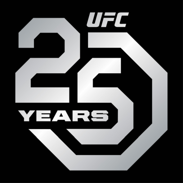
A lot of people and organizations can say that they’re excited about the calendar turning from 2017 to 2018, but one organization that is definitely looking forward to what this year has to offer is the Ultimate Fighting Championship. This year will mark the 25th anniversary of the UFC and the world’s premier MMA promotion will celebrate all year with a special logo.

The new logo was unveiled a a few days ago and the UFC’s official website explained the meaning behind the logo.
The logo, designed in conjunction with Droga5, ‘Cannes Lions Independent Agency of the Year’, combines the silver anniversary with UFC’s world-famous Octagon®, the organization’s iconic symbol that debuted at UFC® 1: THE BEGINNING, which took place on Friday, November 12, 1993 in Denver, Colorado.
The 25th anniversary commemorative logos, along with additional creative designs, will be integrated into UFC broadcasts, across social and digital platforms, in-Octagon branding, UFC Fight Night collection, event posters, fan activations and limited-edition merchandise throughout 2018.
There’s also a secondary logo that’s being used as well, which you can take a look at below.

The first time that we’ll see this logo on the mat will be for the UFC Fight Night event on January 14th. As such, we got a look at what the logo will look like when it’s time for the fights to go down.

Overall, the logo isn’t too bad but it does give me vibes of the OCP logo from the original series of RoboCop movies. With that being said, there’s nothing really egregious about this design and I’m sure that UFC fans will probably be fine with seeing this logo all over the place for the next 365 days.
What do you all think of this logo? Could the UFC have done better for their silver anniversary? Are you a-ok with this? Let us know what you think!


