Weren’t we just complaining that we haven’t seen much from Major League Baseball yet this off-season? Well here we go, a leak!
Posted to Twitter by @kendrick_67 (who says he got it from a friend), we’re getting our first look at the 2018 MLB Postseason logo. This logo has been confirmed to be accurate to me by a source.
Legitimate 2018 MLB postseason logo or not?@sportslogosnet @PhilHecken @ColorWerx @UniWatch pic.twitter.com/JBVSA6Hz54
— Ed Kendrick (@kendrick_67) January 9, 2018
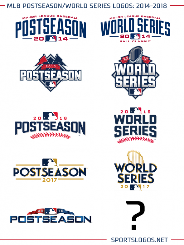
The design of the logo is a departure from the trend I had hoped we were continuing with last year, the use of gold with emphasis on the design of the championship trophy. It’s back to red/white/blue, presumably to match the colours of the MLB “batterman” logo. The logo uses metallic/bevel style blue lettering using what looks to be a slightly adjusted Bank Gothic font. Two pennants fly from either side of the logo, one red and one blue, these colours in the past have represented the two leagues – red for the American League and blue for the National.
So far it’s just the 2018 Postseason logo to come from this leak, it still gives us a pretty good idea of what to expect for the World Series and Wildcard/LDS/LCS rounds, a comparison of the Postseason logo with the accompanying World Series logo over the last five designs shows what I’m talking about:
What I’m saying is it’s almost a certainty that the 2018 World Series logo will be red/white/blue with a metallic Bank Gothic font; what we don’t know is if it’ll use the WS Trophy or not as that seems to vary from year to year.


