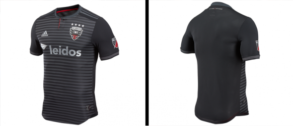
The MLS offseason hit a major milestone on the calendar after this past week’s SuperDraft and two of the league’s charter clubs also unveiled new kits for 2018 as well. For starters, DC United unveiled their new home shirt. It’s pretty interesting up close with the subtle horizontal pinstripes, but from afar it’ll look mostly black/slate gray for the most part. It’s a good look for their first season in their badly-needed new stadium.
Meanwhile, the LA Galaxy also decided not to stray too far from their regular look with their latest home shirt. The Galaxy have been wearing a diagonal sash on their home shirt every season since bringing it back in the 2012 campaign and the next two seasons will be no different.
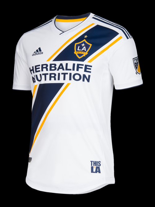
The Galaxy launched this kit with the social hashtag of #Since96, and it’s clear that this particular sash had a focus on the past. Here’s the explanation from the Galaxy themselves:
The iconic LA Galaxy sash is back, with a bold navy sash enclosed by a thin, gold sash on each side. The signature “This Is LA” jock tag returns, as does “Galaxy” just below the back neckline, complete with a quasar. Over the heart, the golden star at the top of the crest represents LA Galaxy’s five MLS Cup wins, the only club in MLS to rep such a feature.
If you won’t take their word for it, then here’s visual evidence of exactly where the inspiration for the 2018 shirt came from: The 2006-07 home kit.

Overall, it’s a nice way to pay tribute to the club’s history and also a good way to keep things consistent as far as their visual identity is concerned. It’s nothing too crazy, but the Galaxy don’t need to get crazy. All they need is a white kit with a shirt that has a sash on it and they’ll do well. So in my opinion, this definitely works for LA.
So, what do you think of the latest kits that have been unveiled in MLS?


