Despite the fact that Leeds United are a historical sleeping giant in English soccer, you could make the argument that they haven’t really had an iconic crest at any point in their history. A quick look at their crest history seems to indicate that they’ve floated to and from differing crests throughout their time as a football club, with the only constant being the colors of white, blue and yellow.
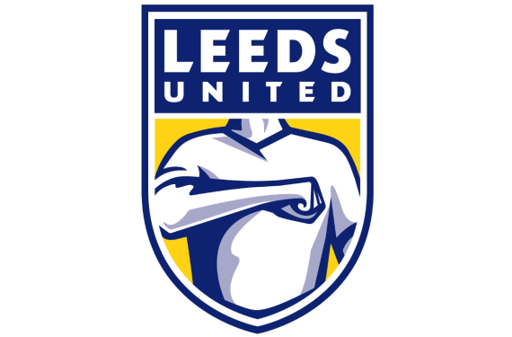
As such, it’s apparently time for another shift in crest design and Leeds decided to take the process straight to the fans. After consulting the fans, the designers were apparently impressed with the Leeds Salute — so much so that they decided that the main part of the new crest itself would be the Leeds Salute.

Here’s the official explanation behind the change from Leeds United:
The new crest depicts the ‘Leeds Salute’, which over the decades has been an expression of the passion that connects Leeds United’s fans and players on and off the pitch and all over the world.
It is used extensively, and notably on match days when with right hand on heart fans sing the Club’s famous song ‘Marching on Together’. Leeds United owes everything to the supporters who have stood by the club through thick and thin. We are delighted and proud to reveal a new crest that reflects the passion and loyalty that runs deep through the Club, and celebrates the fans at the heart of our identity.
While I definitely appreciate the fact that Leeds were willing to incorporate this part of their club’s culture into their visual identity and I also like that they took so much input from the fans themselves, I’m going to be honest, y’all: That’s a pretty bad-looking crest. Their current crest really isn’t much to write home about, but it’s much better than what could be their crest going forward.
I’m not the only one who thinks that this is bad. The fanbase has reacted by starting up a petition against the new crest and the players themselves aren’t fans either. Even star player Pontus Jansson had to revert to his native language of Swedish to describe how he felt about the new crest.
It appears that Leeds United are taking the reaction to heart and have decided to reconsider the design due to the negative reaction from everybody involved with the club.
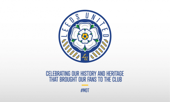
If they do indeed decide to scrap the “Salute” crest, then designer Marcus Dilley has a suggestion for them, which we’ll share below:

Leeds United have the potential to be one of the better-looking clubs in English football but for now, it appears that they’re willing to keep on stumbling around in the wilderness until they get there. With that being said, do any of you actually have anything nice to say about this crest? We’d love to hear it!


