This is part 8 of a multi-part series chronicling the real-time development and design of a new logo for Baseball New Zealand. Check out our past “The Open Branding Project” posts here.
***
Hello readers, we’re just getting back into the swing of things after the holiday break. Our main focus has been the wordmark and a repeating pattern design.
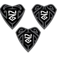
Our goal right now is finishing the wordmark, shark tooth logo, pattern, and pairing with the NZ monogram. Once we feel good about those, we’ll shoot them to our Maori culture experts to get their thoughts.
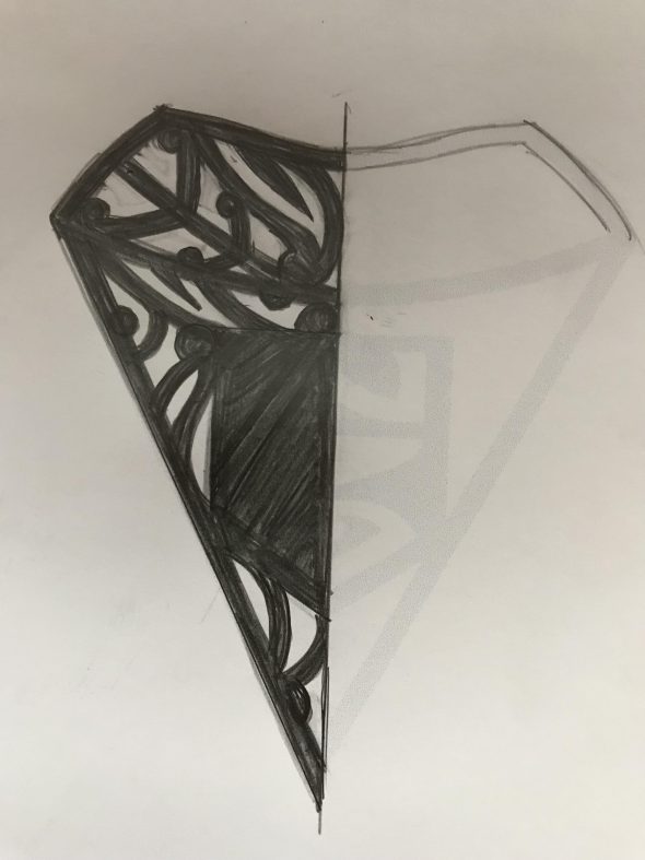
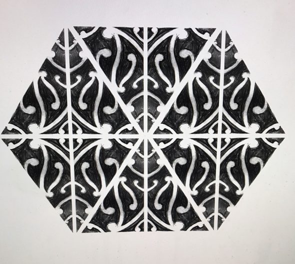
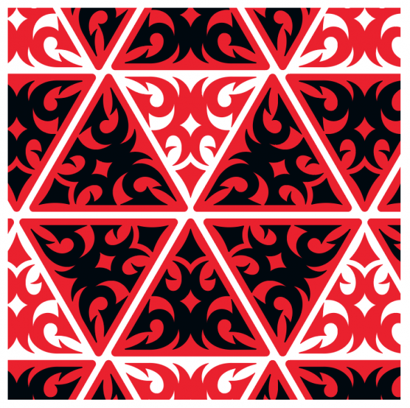
We’re probably furthest ahead on the repeating pattern, with just a few details to iron out before building out in vector form. We’ve studied Dave Bishop’s Maori sketches as well as some patterns built into Adobe Illustrator by Von Glitschka to help guide us in fitting these puzzle pieces together. Maori art is built on the relationship of positive and negative space, so making sure the shapes in the patterns we use flow together is vital.
Building the wordmark has been the most challenging part for me, thus far. I felt good about the sketches I’ve done, but when building in Illustrator, it loses something. I just haven’t been able to get it right in vector form, either because the letter’s weight wasn’t right or the proportions were off. That’s where Brian came in and did the latest sketch which I think is going to be the answer.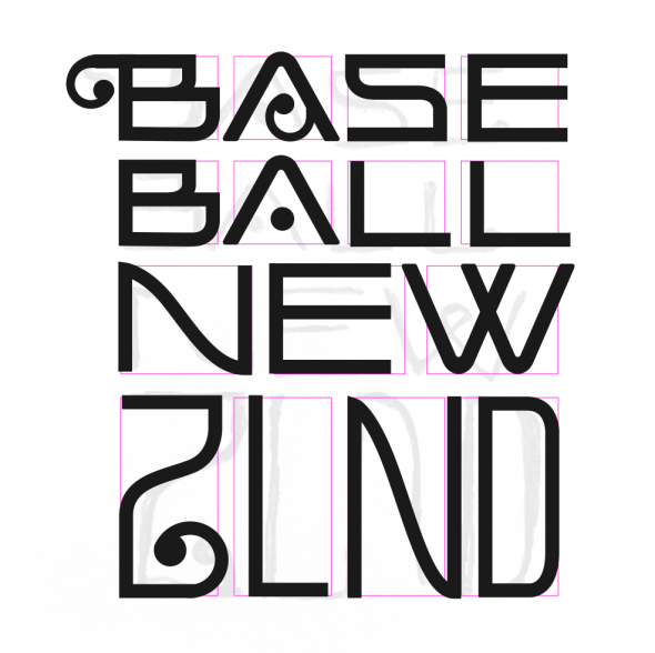 Once these elements are built out, Brian and I will use them in various mockups and assemble into a presentation so Ian and Ryan can present before the board of directors.
Much bigger post coming next week folks, big progress coming! Be sure to check back then for part 9.
***
This is part 8 of a multi-part series chronicling the real-time development and design of a new logo for Baseball New Zealand. Check out our past “The Open Branding Project” posts here.

