It’s Super Bowl weekend, finally. Maybe it’s just me but every year those two weeks off seem to feel longer and longer.
This Sunday it’s the Philadelphia Eagles and New England Patriots, the Eagles looking for their first Super Bowl title and I presume the Patriots are too since I can’t recall them ever making it this far before. So good luck to both teams.
We’re obsessed with the graphics surrounding the game around these parts so naturally I have no idea who most of the players are or any of their stats, there’s a good chance the MVP will be someone I’ve never heard of (who’s Tim Brady?). So my week has been more about: What uniforms are the teams wearing? (Eagles green, Patriots white); How about that Super Bowl logo? (Feels familiar); or What will the field and end zone designs look like?
This is a common debate in this community, what should be on a Super Bowl field. The NFL has experimented with many different templates when it comes to their field design for the championship game, templates which typically span over the course of several games in a row.
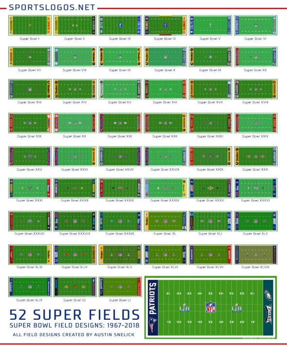
With great thanks to Austin Snelick who for the past four years has been chronicling the history of Super Bowl field designs in a thread on our forums, has graciously allowed us to add his fantastic collection to our Super Bowl logo section, we can take a look back at those different templates and how long they were used and then think about which template we liked best. Fun stuff! Personally I think Super Bowl IV might be my favourite, although I could do without the blue box around the trophy.
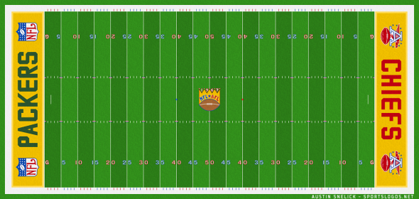
Like most things which are new, the Super Bowl (as it wasn’t even known at the time) started with no fixed style for their on-field designs, the first Super Bowl featured a gold crown on top of a football at mid-field, “NFL” “AFL” and 1967 all written above the ball; end zones featured the team name with the NFL or AFL logo on either side. This was the only year this style was used. The first five Super Bowls all used slightly different designs, helmets were on the field in II and IV, the Vince Lombardi trophy at mid-field (in different styles) for III-IV-V.
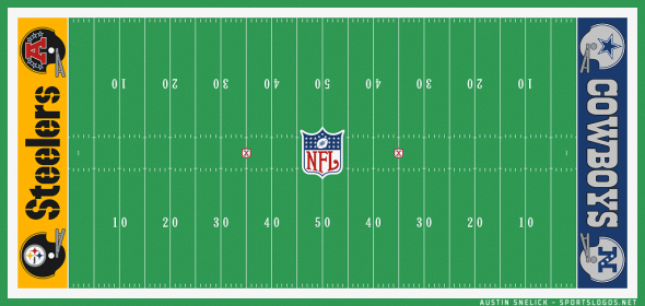
The first year-to-year field template began with Super Bowl VI, the NFL shield was added to the 50-yard-line and stayed there for every Super Bowl through XXX with the exception of one-offs for XXV and the NFL’s 75th anniversary at XXIX. Meanwhile things around the mid-field logo ran through their own templated cycles; a logo for the game itself was added on either side of the NFL shield for Super Bowl X (a simple small “X” in a shield), this logo gradually increased in size as the years went on before replacing the NFL logo itself for a single year at Super Bowl XXV.
In the end zones a template was set which placed the team wordmark in the center with their usual helmet with team logo on one side and their usual helmet but with the AFC or NFC conference in place of the team logo. This style was used for every Super Bowl from VIII to XXX, a run of 23 straight years.
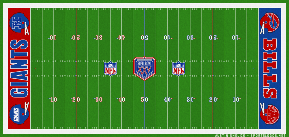
For Super Bowl XXXI the league played with their field layout a bit, the Super Bowl logo was moved to midfield and now flanked by the two team helmets facing each other and placed on the 30-yard lines; the end zones were changed to Conference Logo/Team Wordmark/NFL Shield. The league used this style for seven years, the last for the all-pirate Super Bowl XXXVII, this was also the last time anything other than the NFL logo was featured on the 50 and anything other than the Super Bowl logo was at the 25s.
Helmets returned to the end zone every so briefly for Super Bowl XXXVIII and XXXIX before things got a little different for the 40th edition of the game in which a stripe was added to each end zone around the AFC/NFC logo for each team; this design style was attempted again for XLI but with a banner shape used instead of the simple stripe. After XLI the stripes were never used again.
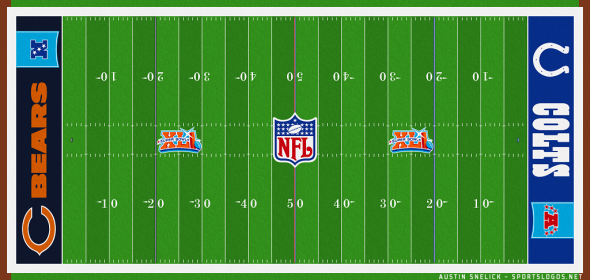
From XLII through XLIX everything remained the same, NFL logo at midfield, Super Bowl logos at the 25s, and end zones following a Team logo/Wordmark/Conference logo format. Super Bowl XLIX was the last time we saw the AFC or NFC logos on a Super Bowl field, for Super Bowl 50 the end zones were changed to just the team logo and a massive wordmark now able to fill the space previously reserved for the conference logo; this style was continued for LI and will be used again Sunday for Super Bowl LII (with the Eagles wordmark with a poor aspect ratio for such a placement).
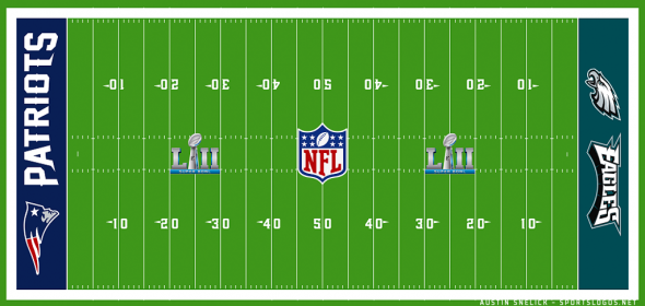
Here’s a look at every Super Bowl field design ever used (again with thanks to Austin Snelick!), you can see high res versions of each of these designs on our Super Bowl logo history section.
