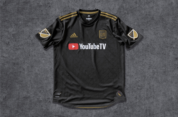
We are one week away from the 2018 Major League Soccer season getting underway and we’ve finally reached a point where all 23 teams who will be playing this season have unveiled their new looks for the year. Earlier this week, Orlando City revealed their new clash kit, while expansion club Los Angeles Football Club decided to reveal their inaugural season kits at 7 AM local time on social media. I guess they do things a little bit differently on the West Coast, huh.
Let’s start with Orlando City. The Lions have had a white clash kit since entering the league for the 2015 season and things will be no different for the next two seasons. This time, they’ve gone back to a mostly all-white look as they’ve dropped the purple sleeves that their previous white shirt had.
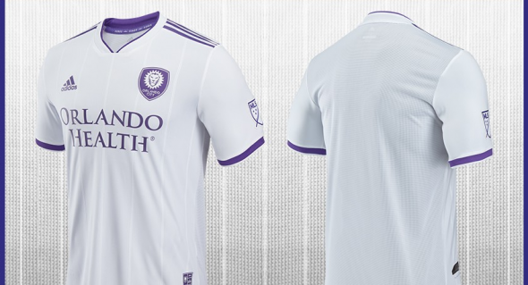
The main design element here is the lack of gold. Instead, the only colors that are present on this shirt are white and purple. Even the seven stripes on the body of the shirt are sublimated and white.
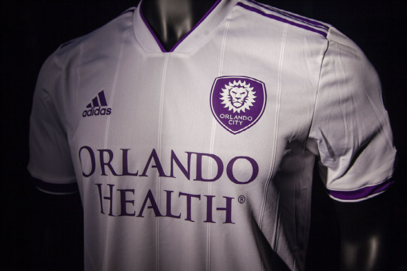
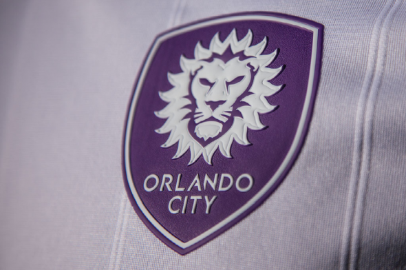
Even if it is the 485793th white clash kit in MLS this season, it’s still a very solid shirt for Orlando City. Meanwhile, LAFC finally got the chance to reveal their set of kits for their inaugural season and this includes the 485794th white kit in MLS this season.
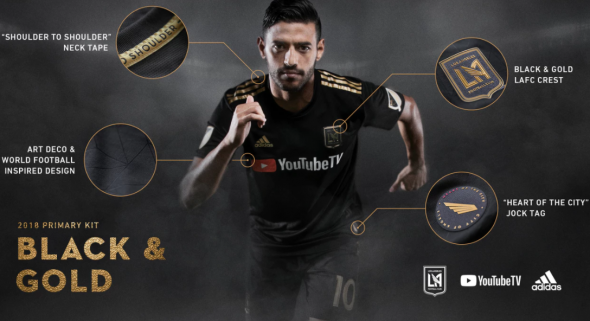
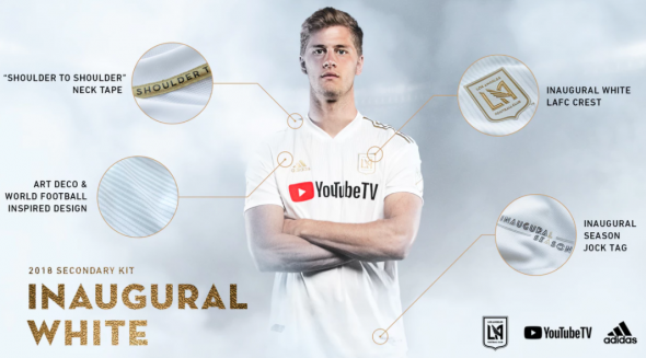
While the overall design of the kit lines up with what we expected, the most interesting design element comes in the form of the sponsorship logo. Youtube TV will be the main kit sponsor for LAFC and unfortunately that includes the red Play button logo on the left side. It’s unfortunate because it seems like they missed an opportunity to go with a gold Play button logo. Youtube actually gives out a gold-plated Play button to content creators who reach 1 million subscribers, so it’s not like they absolutely had to go with the red version of the Play button.
So instead of seamlessly integrating the sponsorship logo into the team’s visual identity, the sponsorship logo commits the cardinal sin of sticking out like a sore thumb. Granted, that might be good for Youtube since it will bring more attention to their logo, but it’s bad for the rest of the kit and it nearly ruins what could have easily been one of the top kits in MLS.
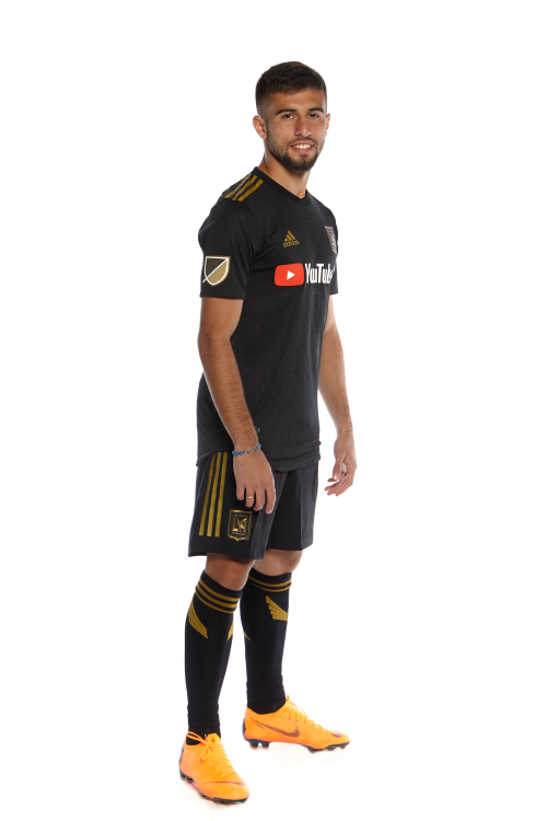
That’s not to say that LAFC will look bad. This is still a very solid look if you can get past the sponsorship logo and I am a huge fan of the Single Wing logo on the socks. Still, it definitely could have been better.
Anyways, what do you all think? Am I making too big of a deal about the Youtube TV logo? Am I downplaying Orlando City’s kits too much? Let us know what you think.


