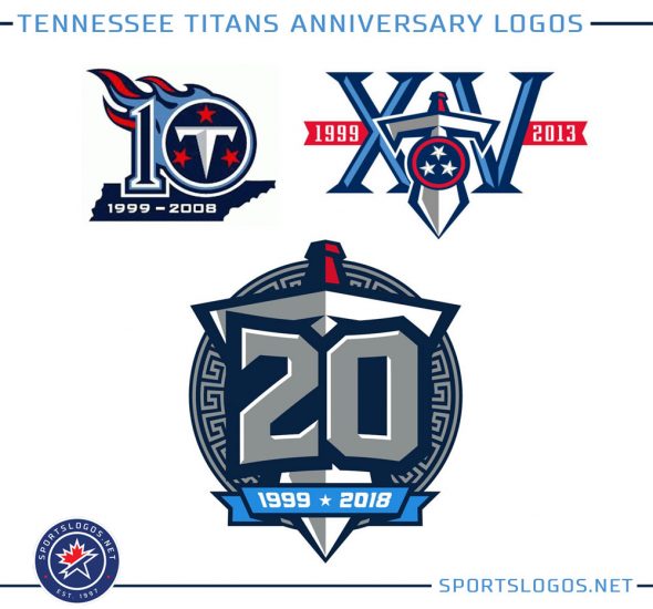
Just one day after announcing they’ll be getting new uniforms, the Tennessee Titans continued updating their look for 2018 by unveiling a special logo commemorating their 20th season.
The logo marks the 20 seasons of using the Titans name, their first season doing so was in 1999; the team moved from Houston to Tennessee in 1997 and played two seasons as the Tennessee Oilers in 1997 and 1998; the ’97 season was played in Memphis before the club shifted across the state, keeping the Oilers name for just one more season in ’98.
Greek mythology plays a role in this logo as that is the origin of the word “Titan”, the shield behind the entire logo based upon Greek artifacts that came from that era. A large silver “20” is front-and-centre with the sword from the Titans alternate logo behind it. At the bottom a light blue banner with the years 1999 * 2018 in white.
According to a post on the official Titans website the logo will not be worn as a jersey patch, instead it will be used only as a decal on the back of their helmets, as well as on merchandise and in signage around the stadium.
If the design of this logo is any indication of the direction the team will be going with their new uniforms we’d still looking a navy blue heavy set with much more silver than we’re used to on this team; powder blue and red used as trim.
The Titans have previously had anniversary logos celebrating their 10th and 15th seasons using the Titans name.
The Titans have had just one logo acknowledging their time as the Oilers – for the 50th anniversary of their franchise (including the Houston years) in 2009.


