This is part 10 of a multi-part series chronicling the real-time development and design of a new logo for Baseball New Zealand. Check out our past “The Open Branding Project” posts here.
***
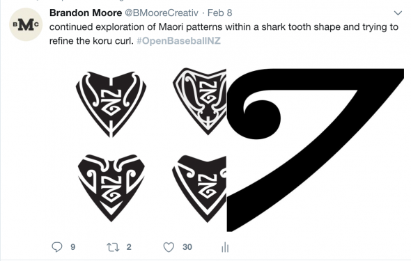
This is one of those articles where a lot of work has happened since the previous, but the progress may only seem minor. Still, those details are everything; we’ve put a ton of thought and effort into getting the Maori patterns in the shark tooth logo right and making sure they not only look authentic, but flow well through the containing shape.
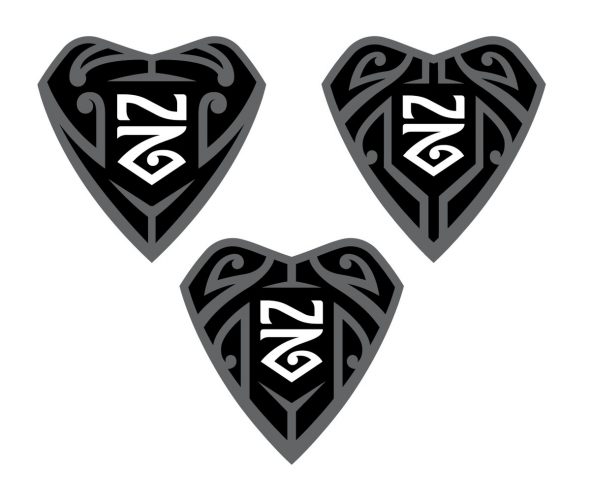
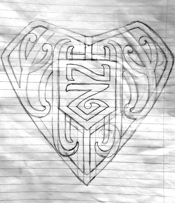
Our goal for last week was to put together our best attempts at the the tooth concept to show Dave Bishop, our hero and savior on this project, and Maori tattoo artist / former baseball player. If Dave likes it, we like it. Here’s what we presented.
Dave was happy overall with the direction we were going and with a better sense of what we were trying to accomplish, he took an attempt at the shark tooth too which both Brian and I were extremely happy with, so this week we are going to fine tune that into the primary shark tooth mark.
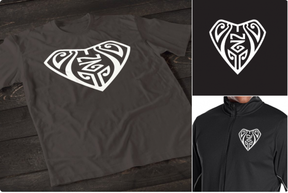
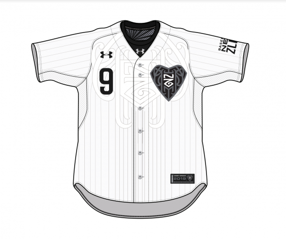
Dave also took Brian’s idea of using pinstripes to form a Maori pattern on the chest of a jersey and applied his version to it. That’s an idea that will certainly be pitched to Baseball New Zealand, but we’d like to push that a little further. Instead of just pulling the pattern from the tooth, we want to do a tattoo chest piece on the front of the jersey just as a Maori artist would on someones body. This can also be applied to the sleeves, back, legs, and ankles but we’re not certain how many different places we want to do. We also want the additional elements (logos, numbers, name-on-back) to work with the patterns instead of being slapped on top.
The other ideas for the tooth are not yet dead though. We are going to pitch the Baseball NZ board 1 tooth idea for now, but our plan is to come back with additional marks that can be used for different purposes based on their meaning. Because Maori patterns are very specific in their meaning, we can build a logo system with 4 different patterns representing speed, strength, team, and home. Dave’s version would likely be the “home” mark. A rough idea of this might look like the below picture
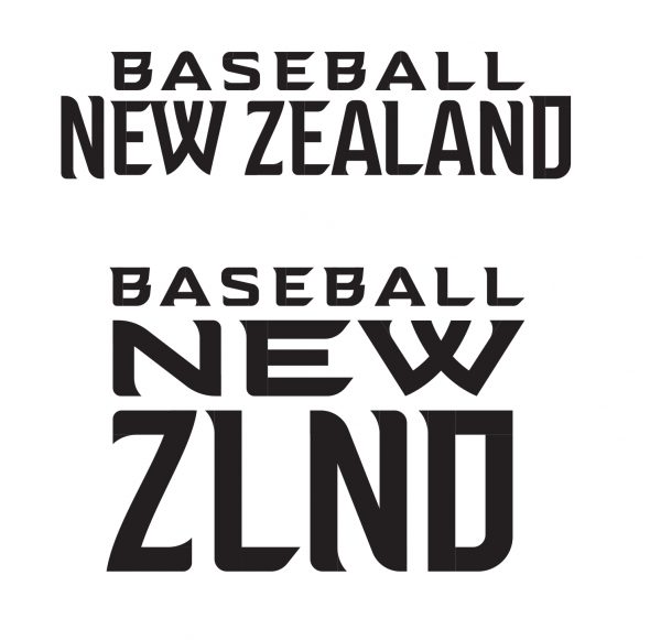
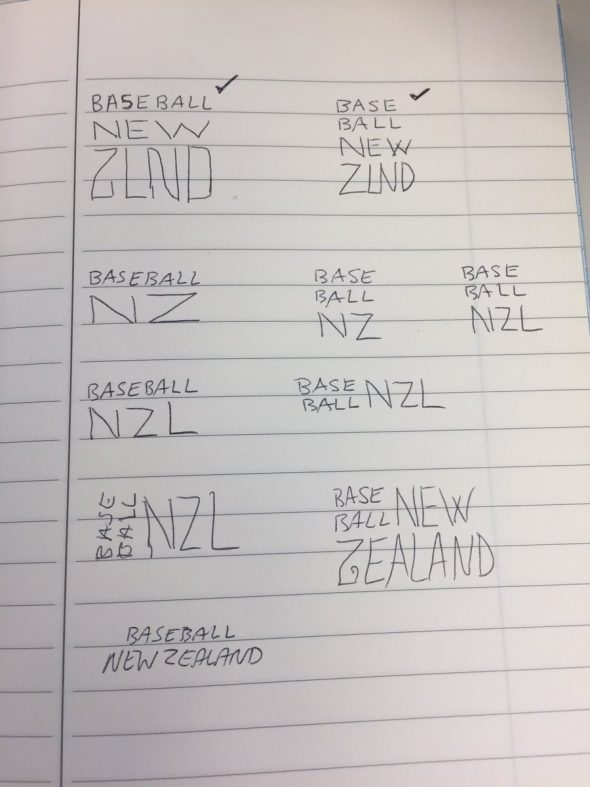
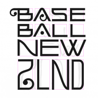
Dave also liked the wordmarks and supported the “ZLND” idea as a means to abbreviate the long name, which we wrote about before. We did go back to the start and ttry stacking the words in various ways, but feel pretty good about the decision making on this one.
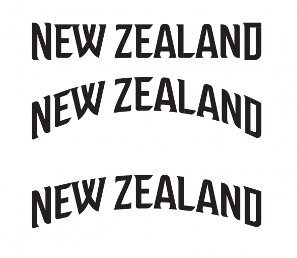
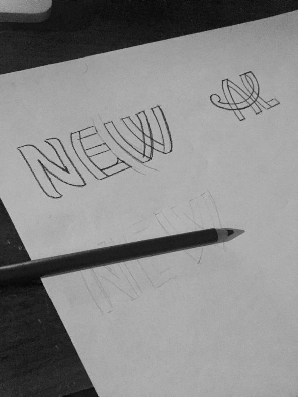
Another focus for the coming week is the wordmark and fine tuning of the letters. Im hoping to find a way to make the mark more of a logo with connected letters, a pattern, or some type of nice ligature that will reflect Maori art and prevent the wordmark from just being a typed-out stack of letters; it should be custom.
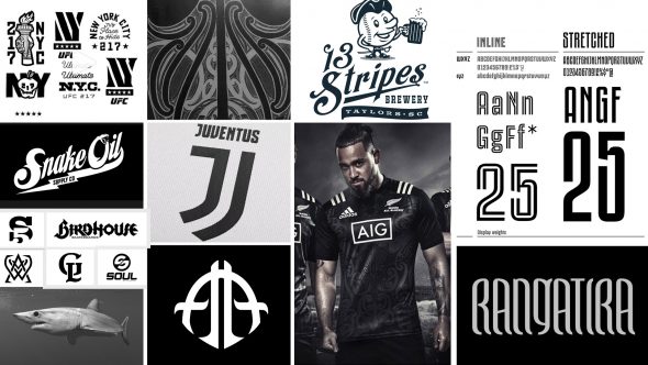
Finally, I put together a moodboard for the project, which usually is done at the very beginning. I felt like Brian, myself, and the Baseball NZ guys were all on the same page with the project from the start and this tool wasn’t needed, but i believe it will be a useful slide to kickoff the presentation when it is made to the board of directors, and also to let everyone outside of the project see what we’re going for.
What’s important to know about Baseball NZ is its almost a blank slate. This isn’t a traditional approach to baseball; the game is coming to NZ but everything outside of home runs and strikes doesn’t exist. For the most part, New Zealanders aren’t aware of many of the American traditions tied to the game, they may not even care to adopt them; this isn’t a team that will sing “take me out to the ballgame”, these guys come out and do a Haka! The aggressiveness and ambition this organization has shown over the last eight years to make the sport grow is why we chose the shark as their totem. Everything they are at their core has more in common with Steve Jobs era Apple than the NY Yankees. To quote Ryan from Baseball NZ “eight years ago, everyone thought we were crazy and people are just now starting to jump on the wagon”.
See ya next time.
***
This is part 10 of a multi-part series chronicling the real-time development and design of a new logo for Baseball New Zealand. Check out our past “The Open Branding Project” posts here.

