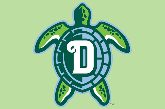
The Daytona Tortugas, who already lay claim to one of the best brands in minor league baseball, introduced a sweet new alternate logo for the 2018 season. The announcement came by way of social media this morning.
BREAKING: Tortugas announce a NEW alternate logo!
Be the first to wear the new logo around! Team store: https://t.co/3iQCPrCNi4 pic.twitter.com/PyyZGDIHZQ
— Daytona Tortugas (@daytonatortugas) March 6, 2018
The new logo, which like the rest of the team’s logos was designed by Dan Simon of Studio Simon, will be worn on new light green batting practice caps. The BP cap logo features a stylized top view of the turtle in the team’s soothing, tropical color palette, with a white D on its back.
“The goal of the team’s strategic marketing plan entering the fourth year of the Tortugas era was to continue to stay fresh, so the club decided that the time was ripe to introduce this new logo,” Simon said. “When the new Daytona Tortugas name was announced in 2015, the logos that were unveiled centered around the turtle character that was the focal point of the identity; born out of those marks, this new artwork represents a more graphic handling of the turtle, yet rendered in a similar manner that allows it to slide right in and join the existing elements of the identity as part of a cohesive brand package.”
The Tortugas’ brand has been met with fan approval since their debut in 2015, when they won both Minor League Baseball’s Clash of the Caps contest and Ballpark Digest’s best rebrand.
The name Tortugas derives from the Spanish word for turtles, but it also references the Gulf of Mexico’s Dry Tortuga Islands, which were explored by Ponce de Leon, the first Spanish explorer to set foot in Florida. (Ponce de Leon Inlet is 12 miles from Daytona.) The Tortugas, high-A affiliate of the Cincinnati Reds in the Florida State League, are named for start play in the 2018 season April 5 against the Florida Fire Frogs.

