
![]()
Y’know, when a team recruits a member of our forum to redesign their logo, things always turn out alright.
Tonight, National Premier Soccer League club Duluth FC unveiled their new logo at Hoops Brewing in Duluth, Minnesota; the mark was designed by Kevin Joseph of kjbranded, a decade-plus member of our CCSLC community forums. Joseph had previously done the logo for former NASL soccer team Minnesota Stars FC.
While I may have some bias towards a logo designed by one of our own, I feel safe in saying you won’t find a single person (of sound mind) who wouldn’t agree that the new Duluth FC logo is an incredible upgrade. Almost laughably so. Seriously, check out the comparison of old versus new:
![]()
Right?
The new logo features the typical Minnesota landscape – a row of evergreens, with Duluth’s Aerial Lift Bridge spanning behind it; the logo also includes a fleur-de-lis, which like the club’s colour scheme, is from the city flag.
Duluth also Tweeted out the six finalists for their new uniform design, we’ve assembled them below in one image for easy viewing:
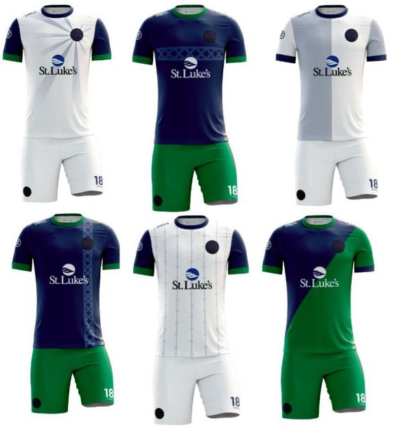
Some solid options there, if I had to pick a favourite it’d be either of the two blue options with the Aerial Lift Bridge pattern featured. Share your choices and thoughts of this upgrade in the comments.
Here’s the launch video from YouTube: