The Houston Astros “rainbow guts”; the Philadelphia Phillies all-maroon Saturday Night Specials, and oh yes, Turn Ahead the Clock Day. All of these were hideously ugly but still shall be remembered and because of the ugliness, loved by many for all-time.
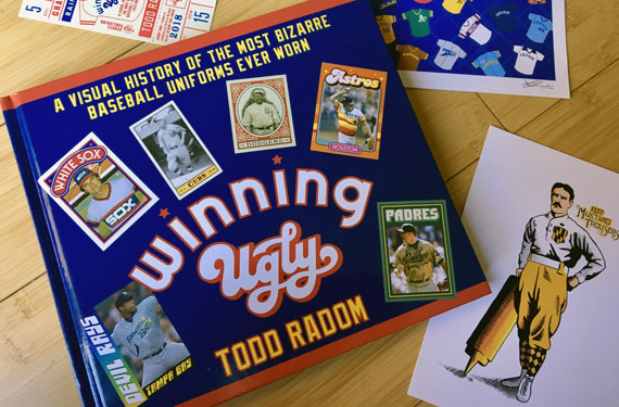
Todd Radom is a big league sports designer, brand consultant, visual historian, longtime friend of the site, and now the author of a new book: Winning Ugly: A Visual History of the Most Bizarre Baseball Uniforms Ever Worn, set to hit shelves at bookstores everywhere worthwhile next month but is also available now through Mr. Radom’s personal website.
It’s a visual delight of the more untraditional looks to appear on a Major League ballfield over the years, with original illustrations sketched by Radom himself, as well as a wealth of historical photos and newspaper clippings to help tell the story. There are Major League Baseball uniforms in this book that I honestly had no idea ever existed before reading… and guess what? They’re ugly.
In between the stunning visuals you have the stories of each of these garish getups, how they came to be, their reception by players and media of the day. It’s quite amusing to see sportswriters, even a century ago, complaining about a uniform design, and as Radom quips in an early chapter “strip away the florid language and it’s not unlike many of today’s comments online”… My language is florid, isn’t it?
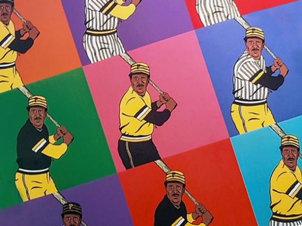
Pittsburgh’s mix-and-match pillbox set of the 1970s is one uniform which gets plenty of attention in the book, and it’s no surprise as that particular uniform caught the eye of the young, soon-to-be designer.
“When I was a kid I collected yearbooks. I sent away to the teams for them, and I still have them all to this day.”, Radom recalled to us. “The 1977 Pirates yearbook arrived before the season started, and there’s a page in there that displays the Bucs’ future look, the one that would carry them to the World Series two years later. While the pillbox caps were carried over from 1976, the rest of the package just blew me away. It’s hard to imagine a world where stuff like this was bottled up and not shared widely, but to say that the new look was a surprising thing would be an understatement.”
Fast forward a couple of decades and the Pirates stepped back into the ugly again with the unveiling of their red vests in 2007. Remember those red vests? They weren’t from that long ago (and naturally they’re featured in this book) but that set is a good example that yes, it is actually possible to make a uniform so ugly that it’s isn’t loved or missed by anyone.
Radom’s “Winning Ugly…” doesn’t just focus on baseball’s relatively modern eras of pullovers and elasticized waistbands. Going back over 150 years to look at how the Cincinnati Red Stockings high socks of the 1860s were considered “immoral and indecent” by many of the “high-toned members of the club”; the unusual then and unusual now Greek-keyed collars and belts of the 1876 St. Louis Brown Stockings; and the “rainbow hue” of uniforms that was the result of the National League’s brief experiment with each player of a team wearing a different colour based on their position in 1882.
Baseball in Montreal tonight, oui? Know that there is an ENTIRE chapter devoted to the Expos logo & uniforms in my new book, dropping a month hence: https://t.co/1npipwj7Nx pic.twitter.com/VAD0cbb3GD
— Todd Radom (@ToddRadom) March 26, 2018
Each significant design era throughout the history of Major League Baseball is well-represented, from those aforementioned uniforms which pre-date the World Series through Charlie O’s green-and-gold Kansas City A’s and Montreal Expos pinwheel caps of the 1960s and eventually right up to the recent incorporation of camouflage by a handful of teams in the 2010s… and folks, there’s even a chapter on the infamous Turn Ahead the Clock promotion from 1998-99.
Bottom line, if baseball uniforms are your thing, you’re going to want this book.
Reading the book left me wondering… Todd, what do you consider to be the ugliest baseball uniform of all time?
“I really believe that it’s gotta be something that none of us have ever seen, but that’s described in the book. The 1872 Baltimore ‘Mustard Trousers'”, Radom answers, a sketch of which appears in the book showing their black-and-mustard checkerboard socks and front pocket along with equally mustardy trousers. “An air of mystery and the sharp scent of dijon.”
—
Todd Radom’s Winning Ugly: A Visual History of the Most Bizarre Baseball Uniforms Ever Worn is available now online at ToddRadom.com or if you insist, you can needlessly wait until May 15th to see it for yourself in your local bookstore or to order through Amazon.
Related stories:
 Arizona D-backs-s-s-s-s Unveil New City Connect ‘Serpientes’ Uniforms
  Studio Stories: Detroit Tigers 2018 Season Tickets
  Back to Brown! (Among Others) San Diego Padres Unveil New Uniforms
  Kansas City Royals Logo and Uniform History
  Bryant, Bumgarner Most Popular MLB Jerseys in 2015
  Twins Pitcher Has Jersey Typo

