
Say, what would it look like if teams just weren’t allowed to change their logo? A scary idea, I know… especially for a fella like me.
What we’d see is an interesting mix of design eras scattered across the board; styles and colours considered to be “in” in any particular decade are locked in here as long as the team continues to exist residing alongside other unique styles over the years with subsequent waves of expansion.
Here I’ve created two different sets of graphics for each of the big four North American leagues:
Graphic one locks a logo in to a single franchise — you’re stuck with this logo even if you relocate or change your name. When the team played their first game in their expansion season, that’s the look they wear going forward no matter what.
Graphic two allows a logo change for a relocation or a significant change to the name of the team (Nordiques -> Avalanche? Yes! … Devil Rays -> Rays? No! … Bullets -> Wizards? Yes!)
So let’s start with Major League Baseball, what if the current 30 teams had to use the same logos they’ve used since their expansion season?
MAJOR LEAGUE BASEBALL
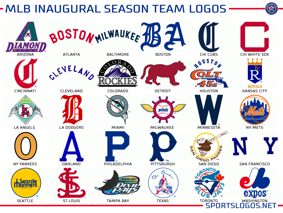
So the most obvious, thanks to relocation, is we’ve got a few blatant city mismatches: Atlanta (Boston Beaneaters) and Baltimore (Milwaukee Brewers) right off the bat stuck wearing the full names of the home towns they began with — the Dodgers (Brooklyn), Twins (Washington), and Giants (New York) too but at least they’re just the initials. Old nicknames carry over to mess with the new names adopted after a relocation for the Yankees (Orioles), Rangers (Senators), and Nationals (Expos). The logo of the Astros/Colt. 45s appear to be literally hunting the Detroit Tigers logo in this graphic.
The most modern design in this scenario is from 1998, the Arizona Diamondbacks and Tampa Bay Devil Rays. The oldest would be the 1883 Boston Beaneaters (Atlanta); a span of 115 years.
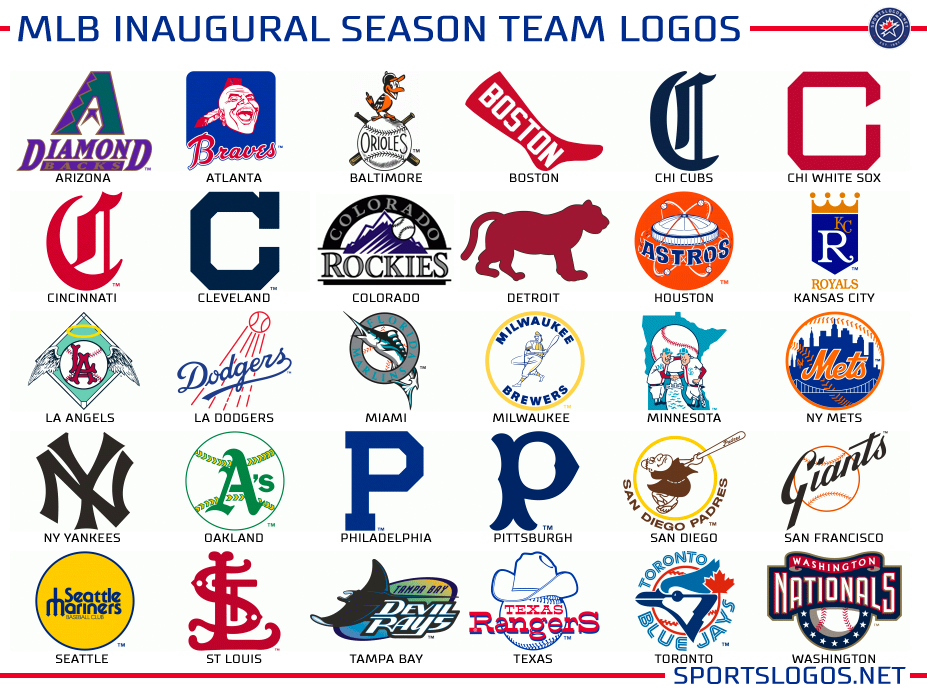
Now obviously this isn’t a very realistic situation, to have the Baltimore Orioles wearing a uniform with Milwaukee across the front among others, so what if we allowed a logo change only for a relocation or significant name change?
Much better!
Here we’ve allowed teams to update as their names change, what we have is a retro rainbow with designs ranging from the 1890 Cincinnati Red Stockings right up to the 2005 Washington Nationals. Major League Baseball, if you’re reading (and I know you do sometimes), do something like this for your 150th anniversary next year, imagine a week or two with every team wearing their inaugural season uniforms?
Moving on to the NHL…
NATIONAL HOCKEY LEAGUE
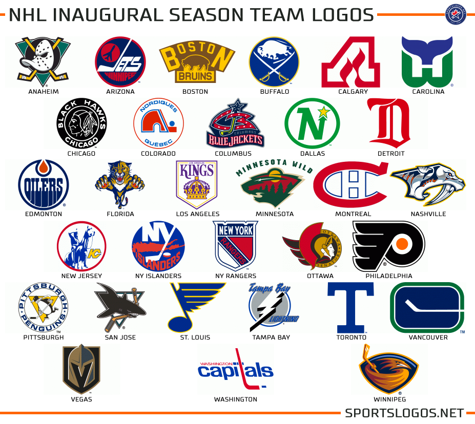
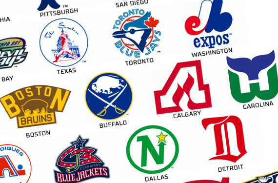
I’m breaking a few hearts with this graphic, I’m sure. The National Hockey League almost always sees a team change their name and identity upon relocation, so you see a lot of mismatches here: Arizona (Winnipeg), Calgary (Atlanta I), Carolina (Hartford… the “H” is for “Hurricanes”), Colorado (Quebec), New Jersey (Kansas City), and Winnipeg (Atlanta II). So again, not a very realistic looking league in 2017-18. Most recent logo design here is from this season and the expansion Vegas Golden Knights with the oldest belonging to the 1917-18 Montreal Canadiens and Toronto Hockey Club.
Let’s allow a change for relocation and name change:
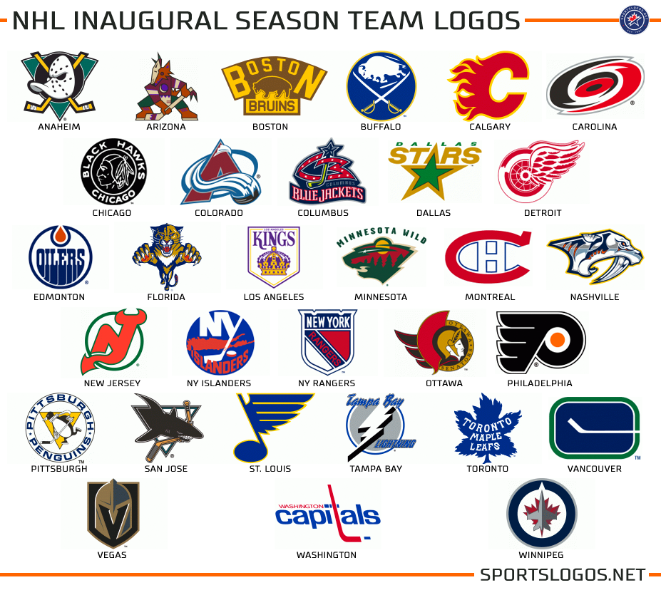
To some people this is their ideal National Hockey League, and to echo my suggestion to Major League Baseball — seeing something like this in terms of throwback uniforms would have been amazing during the NHL’s 100th anniversary season celebrations, alas we saw nothing of the sort. Here some logos could stand to be swapped with a design that came later — Boston, Chicago, and Pittsburgh jump out at me, but the rest could stay as they are and most of the world would be happy.
To the NBA…
NATIONAL BASKETBALL ASSOCIATION
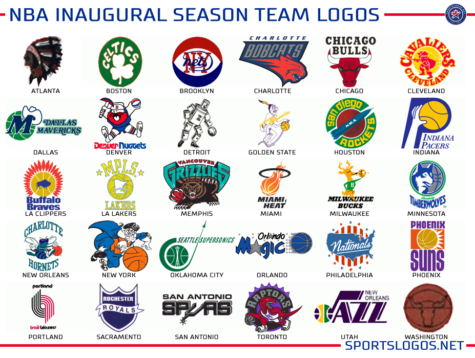
Yeah, stop already with the Hornets/Bobcats/Pelicans argument, I know the official timeline has been retroactively changed by the league. I’m dismissing that for this graphic, move on.
Here we see the shortest span between oldest and newest designs, the oldest going back to 1946 and the most recent being the 2004 Charlotte Bobcats.
The LA Clippers have no match at all with their original identity as the Buffalo Braves, the Washington Wizards and Chicago Packers just as much… but the Philadelphia 76ers work surprisingly well paired with the Syracuse Nationals. Oklahoma City incorporating the Seattle Space Needle is just rubbing it in.
To the adjusted graphic allowing for relocation/name changes:
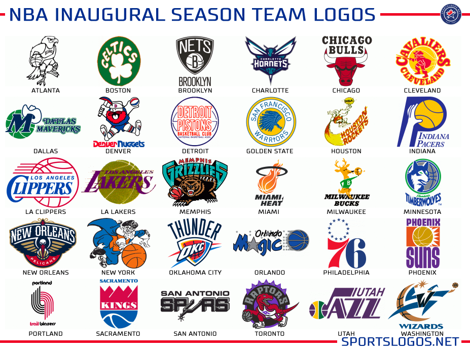
Again, retro gold. What might we swap here? While Atlanta’s “Pac-hawk” logo is more iconic, there’s nothing wrong with their logo here, Boston I think we could swap with their 70s logo and see an improvement… the rest aren’t too bad considering our available options (I’m not sure I ever noticed how similar in construction the original Bucks and Heat logos were). The most logo design here is the re-born Charlotte Hornets from 2014.
Finishing it up with the NFL…
NATIONAL FOOTBALL LEAGUE
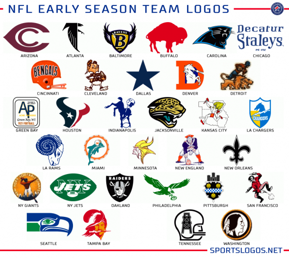
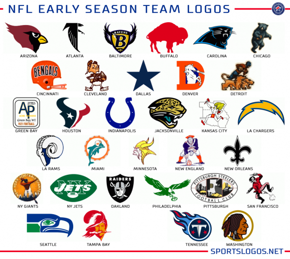
So for the NFL I’m less confident with my research on their logo histories so I’m not calling these “inaugural season logos” but instead going with “early season logos”; I picked what I could find as the oldest logo for each franchise, there may be some errors here… feeding time for the commenters. Speaking of commenters… these are original logos for their *first season in the NFL* — this affects teams like the Chiefs and Jets who played under different names in the AFL… and don’t even start with the Ravens/Browns thing. I picked what I picked.
The NFL rarely sees a team change their name when relocating which helps here with teams like the Colts, Chargers, Rams, and Raiders… not so much with the Titans.
Let’s look at this with allowances for relocations/name changes:
Looks good, except for the Packers. The LA Rams re-adopt their logo from their original first season as the Los Angeles Rams which matches with their “new” colour scheme. The NFL’s 100th anniversary is coming up soon, so, you know… this.
That’s all. What league looks the best here? Share your thoughts in the comments. The “Well actually,…” people can sit a few plays out.
Related stories:
 U.S. Presidents: Sports, Logos, and Uniforms
  A Chat About Professional Sports Trademark Disputes
  2015 Logo of the Year Awards: The Best New Sports Logos of the Year 2015 Logo of the Year Awards: The Best New Sports Logos of the Year
  Zombie Teams: Identities Brought Back from the Dead
  Logo Links Mar 15, 2012: Nike NFL Peek, Green Shoes, Mets Patches Maple Leaf Logos – Can we Stop This? Logo Links: Bills Unis, NHL Alignment, ECHL, NBA