The ECHL’s newest franchise officially unveiled their name, logo, and colour scheme via a video shared to their social media channels this morning.
Confirming reports over the past few weeks the Newfoundland Growlers was announced as the name of the St. John’s based expansion team; the Growlers, who are the first team from Atlantic Canada to play in the ECHL, will hit the ice for the first time this fall for the 2018-19 season.
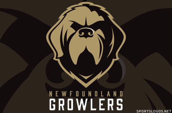
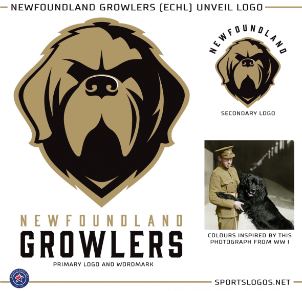
The logo was designed by Idea Factory, a St. John’s marketing company and prominently features the face of a Newfoundland dog in gold and black.
A Newfoundland dog is “a large working dog who is known for their size, strength, intelligence and loyalty”, read the official press release. “The dog in the logo is fierce and stoic to represent the pride and resilience of our province, and our reputation of never backing down from a challenge.”
Last week we discussed that Growlers was a good name to play up the double meaning of polar bears (or dogs, whichever) and an iceberg, which are frequently seen floating past the coast of Newfoundland but it appears that the iceberg angle was ignored completely in this identity.
As for the colour scheme, which is gold and black, it draws its inspiration from a locally iconic photo showing Sable Chief, a Newfoundland dog adopted by the Royal Newfoundland Regiment as their mascot during the First World War.
“The vintage tones compliment the dog’s dark hues, creating a strong combination with a classic, universal appeal”, explained the release. “Paired with a forged-style font, the hard edges and strong weight give it a stone-chiseled feel which lends itself well to the vintage style of the logo.”
A second logo was introduced which shows the Newfoundland dog head logo from the primary with “NEWFOUNDLAND” arched above in black.
Newfoundland Growlers logos on SportsLogos.Net

