
![]()
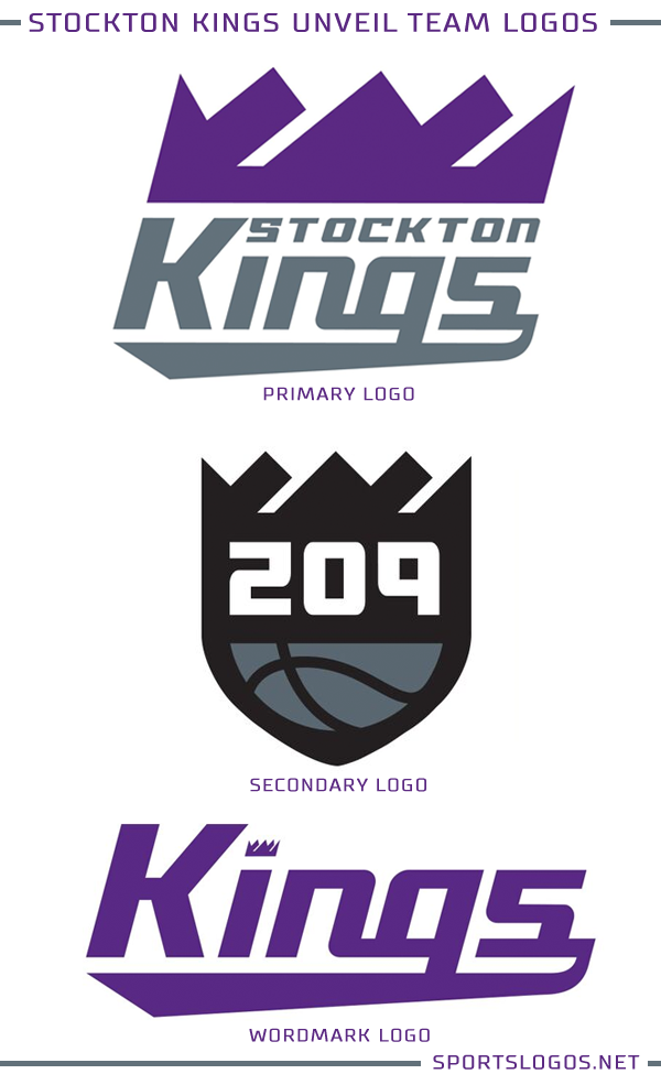
The Sacramento Kings this afternoon unveiled the logo of their NBA Gatorade League affiliate, the Stockton Kings. The Stockton Kings are the relocated Reno Bighorns who had played in the G and D-Leagues from 2008-09 up until the recently completed 2017-18 season.
Relying heavily on the imagery of their NBA parent club, the logo for the Stockton Kings is purple and silver and features a crown above a Stockton Kings wordmark. The entire logo is slanted for the “resurgence of Stockton” as well as the general concept of the G-League as a place for players to grow… sideways at a 45 degree angle.
A full explanation here:
![]()
The logo was designed by the creative team with the Sacramento Kings led by Ryan Brijs.
“This new brand not only starts a new chapter for the Kings franchise, but also for the city of Stockton,” Sacramento Kings Owner Vivek Ranadivé said in the media release. “Through sport, we aspire to positively impact the community and we look forward to partnering with civic leaders, businesses, school, and non-profits to continue to reinvent Stockton.”
In addition to the primary mark you see two-times two-times above the club also unveiled an alternate logo which dives even further back into the history of the Sacramento Kings franchise.
“For the secondary logo, we harkened back to some of the Rochester Royals roots with the shield, while also bringing in the ball from the Kings primary logo and introducing the ‘209’ Stockton area code,” Brijs told StocktonKings.com. “The basic idea was that it connected different elements from our past and tied it into the roots of Stockton.”
Here’s the new alternate along with the already covered primary and new wordmark logo:
The Stockton Kings will tip-off this fall at the Stockton Arena.
Related stories:
 Basketball Team Celebrates MGK with Pink Uniforms
  G-League Suns Become Rodeo Clowns For a Night
  Colangelo (Possible) Twitter Account Takes Shot at Uniforms
  Bucks Announce Wisconsin Herd As Name of D-League Team