The Indianapolis 500 will be getting a new look next year and all years going forward as they’ve announced they’re introducing a standardized element into the logo of “the greatest spectacle in racing”.
While the immediate thought is “oh no, here’s another Super Bowl“, it doesn’t appear to be quite that extreme; more like another NCAA Final Four in which the same idea is used from year to year with new elements incorporated to keep things fresh.
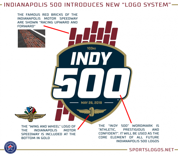
“The hallmark of the new logo system … is the type lock-up. This wordmark is athletic, prestigious and confident and includes a rich navy blue that contrasts with gold, the colour of the iconic Wing and Wheel logo of the Indianapolis Motor Speedway”, reads the official press release. “This lock-up will serve as the foundation of the new system and the core of future Indianapolis 500 logos, creating a strong, consistent annual brand appearance for the event.”
The logo introduced today begins with the race to be held next year on May 26, 2019. The event for the Indy 500 race this weekend will be the last pre-logo system and therefore have a considerably different design.
“This new logo system is an exciting step forward for the identity of the Indianapolis 500,” Indianapolis Motor Speedway President J. Douglas Boles said in the release. “The 103rd Indianapolis 500 logo, created within this system, salutes the traditions and legacy of the race while looking ahead to its bright future.”
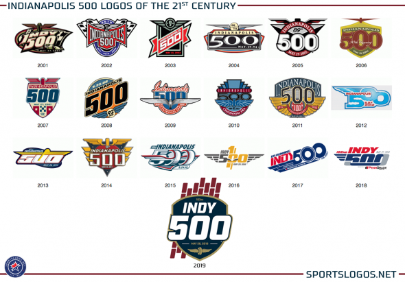
A look back at some of the previous/current Indy 500 logos up against the new “system” beginning in 2019:


