The Miami Marlins have a new ownership group in place and with it comes a sudden fondness for their original teal and black uniforms.
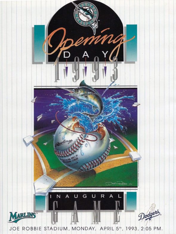
Yes, the Marlins will reach back into their past, all the way back to 1993, when they trot out onto the Marlins Park field starting tonight and throughout this weekend to take on the San Diego Padres, wearing their original white uniforms with teal pinstripes from their expansion season. The throwback is being held in celebration of the Florida/Miami Marlins 25th anniversary.
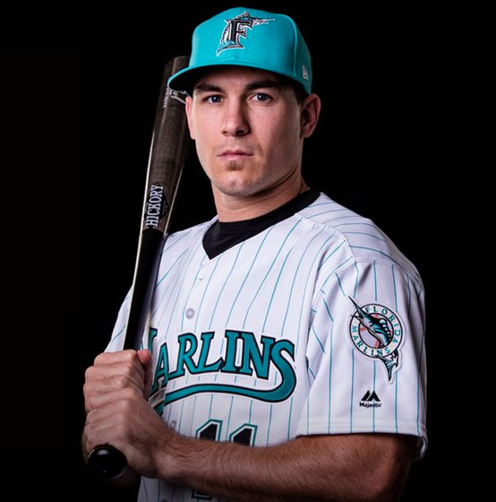
This marks the first time the Marlins have thrown it back to their pre-Miami days, an era the previous ownership group led by Jeffrey Loria seemed to want to avoid, even throwing an old Marlins cap to the ground at the unveiling ceremony for the new look in November 2011.
It’s really incredible to me how many teams are afraid to embrace what made them unique. Do they really feel it’s better to blend in with the most of the other 29 teams than to stand out and be different? I can’t imagine that’s the case… although their opponents this weekend seem to get a real kick out of doing just that.
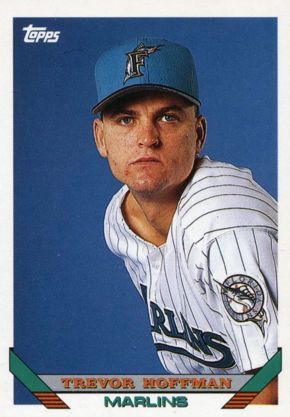
As for teal, the Florida Marlins made a real splash (pun?) when they joined the National League in 1993 becoming the first Major League ballclub to wear the suddenly hot colour; they continued to rock it for over a decade, though reducing its use considerably over that time, including during their two World Series titles in 1997 and 2003.
When the team moved into their new ballpark in 2012 the team did a total re-design, dropping the teal entirely (again… why?!?) and while they did adopt a relatively unique look to replace the original logo, a new look with hints of red, yellow, and blue giving the logo a bit of a Miami vibe, the uniforms were extraordinarily boring… a black cap, with a clean white jersey, with a “MIAMI” wordmark arched across the front. For a logo and colour scheme that suggested bold and vibrant, we got a plain white home, plain grey road, a black (colourful!) alternate, and a bright orange alternate (here we go!) which the team rarely wore before dropping it entirely (… of course).
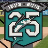
Miami surprised many with the 25th anniversary logo they introduced prior to the 2018 season, a logo which had nothing to do with the current branding and was all about the throwback look. It was our first look at a new design to come from the new ownership group, this teal throwback was the second… I’m sensing a theme, I like where this is going, hopefully we see a return to that full-time in the not-too-distant future.

