The Memphis Grizzlies appear to be making some tweaks and changes to at least a couple of their logos for the upcoming 2018-19 season.
Confirming what our Conrad Burry posted several weeks ago, we can now see that by looking at the Grizzlies 2018 NBA Draft cap there is a modified grizzly bear logo right on the front of the crown as well as a new basketball-claw (basketclaw?) logo on the side/rear.
Here’s the cap:
And a closeup of the logos in question…
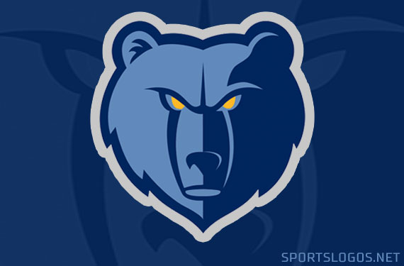
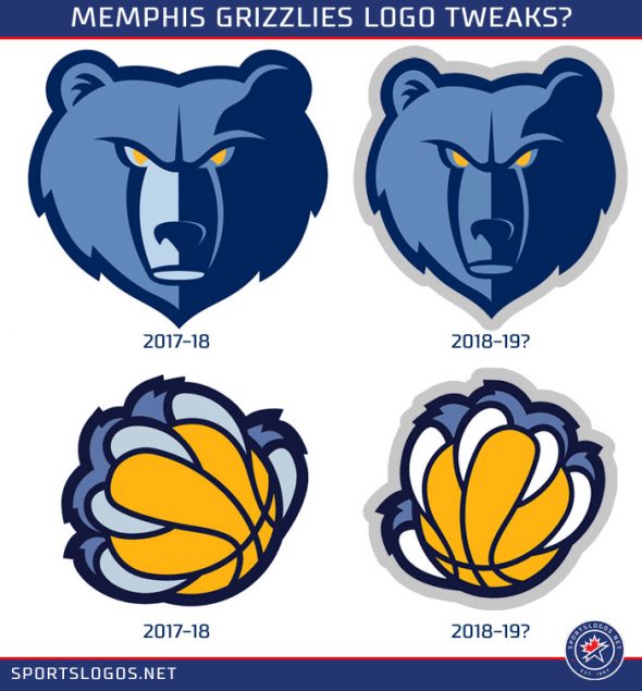
In case you’re sitting there saying “huh?”, I don’t blame you, the changes are very subtle and hard to notice. The bear face removes the extra splash of light blue on the snout/mouth, plays with the gold in the eyes to give the bear a more aggressive look, and adds a grey outline around the entire thing.
On the basketball-claw the logo has been rotated considerably, looks like the claws are now white, the grey outline is also added to this mark. There are also changes to the overall shape of the claw, in the fur and the claw itself, as well as the claw kind of forming an “M”, not sure if that is intentional.
Above is a side-by-side of what the new logos *could* look like compared with what they used last year. The new marks you see above are just my quick mockups based on what we see in the photos, they’re *not official*.
A step forward for the Grizzlies, even if it’s a very small one, in the right direction. We’ll wait and see if the team ever makes an announcement to make this official, ever since that Cleveland Browns orange-tweak debacle we’ve noticed that minor changes just don’t get announced like they used to; as ColorWerx noticed today on Twitter, the new look is already starting to appear on NBA.com:
#NBA.com now rolling out modified #Grizzlies logo…
FYI – dropping the lightest Blue (“Smoke Blue”) and adding Dark Gray.
(cc: @sportslogosnet @UniWatch @PhilHecken @conradburry ) pic.twitter.com/B2AKh1zhIC
— TruColor 🟥🟩🟦 (@TruColorNet) June 21, 2018

