Recently, Major League Soccer unveiled the uniforms they’ll be wearing for their 2018 MLS All-Star Game which will be played in Atlanta on August 1st.
There wasn’t much to the uniforms, a simple white top with a gigantic TARGET department store logo on the front (which… hey, not a bad idea for a goalkeeper’s jersey). But it was the back of the jersey which caught the attention of several of our readers and Twitter followers:
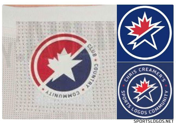
What’s that mark at the top? Let’s zoom in a little.
Ah, yes, I mean it does feel a little familiar. No?
Of course, we’ve been using as something similar as our logo here at SportsLogos.Net for 19 years; designed by that talented team at Torch Creative in Dallas our mark was first introduced in 1999 and then modernized to what you see now in 2015.
A side-by-side, I included the CCSLC logo in here as well since it includes the same word as the MLS logo, “Community” in order to compare fonts.
The idea of theirs is a tribute to both the USA and Canada, where the teams in MLS play; our logo is also a tribute to both the USA and Canada, a nod to where this site is based (the Toronto-area in Canada) and to our large American-based audience (that’s you!)
So the colours are the same, red/white/blue isn’t anything unique, especially for a Canada-USA hybrid.
The obvious similarity is shape of the main element of the logo, which is nearly identical, at the least extremely similar – even the split between the maple leaf and the star is the same diagonal line from bottom left to top right.
Here’s the shape of our logo overlaid onto theirs, just to compare that part of it: (ours is on the right)
That can mostly be explained away as the quick-and-obvious tribute to both Canada and the USA. Sure, okay, fine. That split happening in the same place that raised my eyebrow just a little bit but then I remembered the MLS logo splits a bit the same way, so, alright fine, that’s probably why it’s like that.
But why is the font so similar? I can’t explain that one. Any one of these similarities on their own wouldn’t be much to talk about… but when you mix them all together that’s a little interesting, isn’t it? Especially the font, as it has no connection at all to the intended “USA/Canada tribute”.
I reached out to the league to ask how it happened, if perhaps maybe it was an homage to the site by a designer who grew up a fan? I mean, that’s happened before. I wasn’t upset, just curious. They responded a day later via a phone call saying this is all just a big coincidence.
Ultimately I don’t care that much but too many people were bringing it up for me to totally ignore. Basically, if it was an homage it would’ve been nice to hear them say it and have that officially documented somewhere, and maybe with a jersey to hang up in the office.
Anyways — what do you think? Coincidence? Homage? Rip-off? Good excuse for content? Share your thoughts in the comments.


