
![]()
The Jacksonville University Dolphins today unveiled their entire new set of logos at Swisher Gymnasium, the home court of both their men’s and women’s basketball teams.
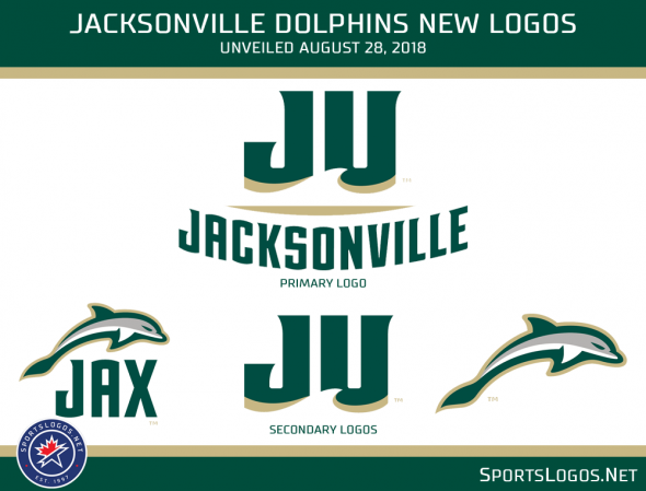
Designed by Joe Bosack & Co., the new marks highlight the pride the Dolphins have in calling Jacksonville their home, their physical location just a few miles from the Atlantic Ocean, their athletic history, and of course the dolphin mascot.
“Jacksonville University is an incredibly inspiring place,” designer Joe Bosack told us. “Their history, location on the water, and beautiful campus were all inspirations that are embodied in the new athletics identity. I’m thrilled with the results and can’t wait to see the great things the university does with its bold new look.”
The primary mark takes the “JU” ligature from their previous logo, cleans it up considerably and removes the dolphin mascot. The new look now features a wave and brings back the dolphin via a fin below the “JU”.

As a subtle nod to their athletic achievements of the past, the reverse arch on “JACKSONVILLE” is incorporated below the “JU”. This is specifically in tribute to the 1970 men’s basketball team which made it all the way to the championship game before being bested by the UCLA Bruins 80-69 while wearing jerseys featuring a reverse arch like this across the front.
Simplified, the “JU” carries over as one of several secondary marks used by the club, most of which are variations of both the “JU” logo and a new dolphin logo, based off of the dolphin statues seen at the center of campus at Jacksonville University.

“This was such a rewarding process,” said Scott Bacon, Senior Vice President for Marketing and Communications in the press release. “Countless people from our Jacksonville University family helped shape this new look. Thanks to this new identity our athletics department is perfectly positioned to help us enhance our brand perception and raise the profile of the University.”

The new set is a clear upgrade over the old look, one whose time had passed long ago; Bosack’s design is a leap forward for the Dolphins while also paying tribute to their previous design and the overall history of the university’s athletic department. You can’t ask for much more when it comes to a re-design. Kudos to all involved in the process.
Merchandise featuring the new look was made available immediately at the university bookstore as well as online.
Related stories:
 Jacksonville Dolphins Unveil New Black Uniforms
  ReliaQuest Named New Title Sponsor Of Former Outback Bowl
  Perspecta Named New Title Sponsor Of The Military Bowl
  Kansas State Wildcats Unveil New Lavender Throwback Uniforms Wisconsin Badgers Add ‘4Moore’ Patch in Honor of Family of Assistant Coach TCU Horned Frogs Unveil Alternate Uniforms With Blood Red Accents
  2018 Creamer Awards Winners: The Best New Sports Logos of 2018
  VCU Rams Unveil New Logos