The island has sprung a leak! Late Saturday night, the new alternate uniform of the New York Islanders was preemptively posted to Twitter by GothamSN contributor James Trotz (@TwoTurtleDuffs).
SportsLogos.Net can confirm via our anonymous reliable sources that this *indeed* the new Islanders third jersey for 2018-19.
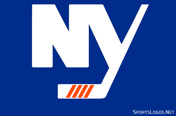
With just a few changes, the uniform is largely a throwback to their Stadium Series uniform, which was then adopted as their alternate uniform a year later, worn from 2013/14 to 2014/15. The uniform has a blue base with the “NY” from their primary logo on the chest in white, unlike the Stadium Series uniform the “NY” is not “chromified”, here it’s just the plain NY now with four orange diagonal lines (for four Stanley Cup victories) on the “Y”. This logo appears again on the pants.

This “NY” logo isn’t quite the same as what the Islanders have used in their primary logo and on their past “NY” alternate uniforms. The four diagonal orange stripes are the more obvious difference but the hockey stick part of the “Y” is straight here where it’s normally at a considerable slant.
A single thin orange stripe at the waist, orange and white stripes on each arm, a white, squared-off shoulder yoke which extends to the collar where it meets a very thin orange line at the neck. Numbers (on the sleeves at least) are orange with white trim, same goes for the captaincy patch.
What’s really new is that logo on the helmet, it’s tough to see here but if we blow up the photo we can make out that it’s a scripted “Isles” wordmark:
There’s no scheduled date that we know of yet for when the Islanders are officially unveiling these uniforms, at least then we’ll be able to get a look at the back of the jersey and a better shot of the new helmet logo.
At this point, it’s going to have to be a “nay” from me on this one, the Islanders seem to be a team destined to never have a decent (non-throwback) alternate uniform. They keep trying to re-invent the wheel despite already having a popular design which their fans have successfully demanded a return to *twice*, why they refuse to carry it over to their alternate uniform is a head-scratcher. Let’s just try it, take the current home/road style and tweak whatever’s necessary to make it orange instead of blue or white, easy peasy.
I think we're all guilty of overthinking when it comes to a New York Islanders alternate uniform; keep it simple, stick with the formula that's worked for decades and try an orange version of their usual home/roads.
Something like (but not necessarily) this: pic.twitter.com/I8nwM2NF5x
— SportsLogos.Net (@sportslogosnet) July 24, 2018
I mean, it’s not perfect, but I think it’s better than what we’ve been getting. Oh well.


