
Every two years, baseball fans get to witness one of the true wonders of the sports world: the expiration of player development contracts that Major League clubs have with the minor league teams in their farm systems. At most levels, there’s one minor league team for each Major League team, so if one team with an expiring PDC seeks a different partner, it sets off a musical-chairs scramble of other teams aligning themselves with new farm clubs. Based on criteria like geographical proximity to the Major League club, quality of minor league teams’ facilities, and the differences in the various leagues that make up the minors, there are perceived winners (like the Mets, whose Triple-A team is now in Syracuse instead of Las Vegas) and losers (like the Nationals, whose call-ups from Triple-A will now have to fly across the country from Fresno, California).
One of the worst-kept secrets leading up to this offseason has been that the Houston Astros would end their relationship with the Triple-A Fresno Grizzlies and sign on with the Round Rock Express. It didn’t just make sense geographically, but the Express are owned by Ryan Sanders Baseball, a group that includes Reid Ryan, son of Nolan Ryan and President of Business Operations for the Houston Astros.


In announcing their new affiliation last night, the Express unveiled a series of new logos designed by Brandiose. The new primary logo is an update to the previous brand (pictured at right) with updated type and a focus on Texas’s lone star, a prominent feature in the Astros logo.
One important factor in the new brand is a return to the franchise’s original colors from their inception in 2000, when they debuted as a Double-A Astros affiliate. When the team switched affiliations to the Texas Rangers in 2011, the Express adopted a color scheme that reflected their new parent club. For Jason Klein of Brandiose, the updated look and the return to the original color scheme is part of the increasing importance of giving minor league teams their own, unique brand.
“If you’ve built up equity in colors or imagery, and you find yourself in a PDC change, you’ve got to start over,” he said. “If you have the colors of your parent club and you switch, now you have to reestablish yourself in the market. The merry-go-round happens every couple years, and every time you do that, you lose equity in your identity.”
“I always say, never hang your hat on your parent brand,” Klein continued. “You should always have a hometown identity that represents the heart and soul of your community.”

The suite of logos includes an RR cattle brand set in a custom font that is the foundation of two new wordmarks.
“As we enter the next era of Round Rock Express baseball, it made all the sense in the world to give our brand a refresh,” Express General Manager Tim Jackson said, quoted on MiLB.com. “On the dawn of our 20th anniversary season and our rejoining the Houston organization, we’re excited to pay homage to our original color scheme while giving our look a major-league redesign.”

The biggest departure in the new suite is a logo that features the actual round rock of Round Rock, Texas, set against a sunset that combines Astros and the new Express colors. That mark is included in a logo that commemorates the franchise’s 20th year.
This rebrand announcement comes less than 48 hours after the final out of the final minor league game of the 2018 season, and is surely the first of many yet to come. Brandiose alone is working on five other projects this offseason, so expect a busy few months of minor league logo news.
Related stories:
 My God, It’s Full of Stars: Sugar Land Skeeters rebrand as Space Cowboys
  Round Rock Express promotion is alright, alright, alright
  Round Rock Express to don classic Astros fauxbacks
 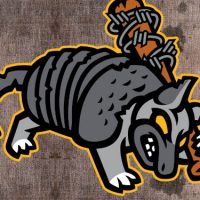 Round Rock Express take on role of zombie armadillos
  2016 Fresno Tacos promotion features a twist of lime
  Bearing Down: The Story Behind the Fresno Grizzlies
  Fresno Grizzlies: Astros May Not Win 2017 World Series After All
  Logo Links Mar 12, 2012: Colts Firearm Returns; New Minor League Logo

